Chart position — tracked daily by LaunchShots
Screenshot style breakdown
Sampled from 6 of DWR4THAI's App Store screenshots — background, accent and theme, measured by LaunchShots (not something Apple publishes).
#FCFCFC bg
#DDDDDD
#243C8C accent
#111111 text
Screenshots

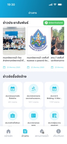
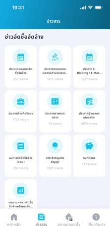
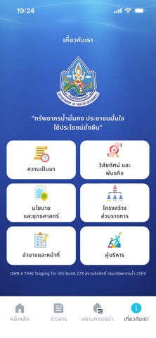
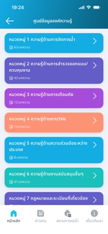
Icon palette
About this app
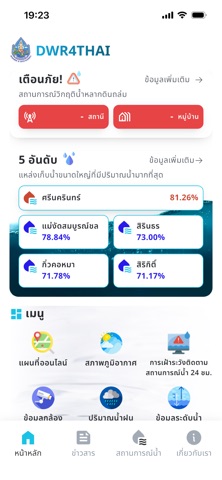
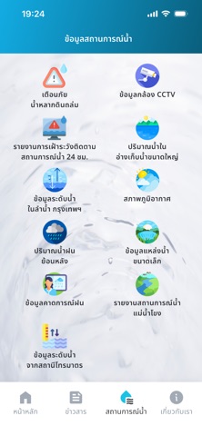
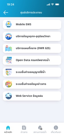
เนื่องจากรัฐบาลมีนโยบายขับเคลื่อนประเทศไทยด้วยเศรษฐกิจดิจิตอล โดยให้ความสำคัญกับการจัดทำแอปพลิเคชันของส่วนราชการ เพื่อให้ประชาชนสามารถดาวน์โหลดผ่านทางอุปกรณ์สื่อสารเคลื่อนที่ (Mobile Devices) ซึ่งการดำเนินการตามนโยบายดังกล่าวมีความจำเป็นต้องปรับปรุงประสิทธิภาพการดำเนินงานของหน่วยงานภาครัฐเพื่อปรับปรุงการให้บริการแก่ประชาชน โดยการพัฒนาช่องทางการเข้าถึงข้อมูลและบริการภาครัฐ จะช่วยให้ประชาชนผู้รับบริการภาครัฐสามารถเข้าถึงบริการได้สะดวก รวดเร็วได้ทุกที่ ทุกเวลาผ่านอุปกรณ์สื่อสารเคลื่อนที่ การขับเคลื่อนประเทศด้วยเศรษฐกิจดิจิตอลอย่างเป็นรูปธรรมโดยถือความต้องการของประชาชนเป็นที่ตั้ง เพื่อให้ประชาชนได้รับบริการที่มีความสะดวก รวดเร็ว และทั่วถึง รวมถึงประชาชนได้รับข้อมูลที่ถูกต้อง น่าเชื่อถือและสร้างความโปร่งใสในการทำงานของหน่วยงานภาครัฐ จากนโยบายดังกล่าวทำให้กรมทรัพยากรน้ำจำเป็นต้องดำเนินการพัฒนา Mobile Application สำหรับรายงานสถานการณ์น้ำเพื่อเชื่อมโยงข้อมูลจากระบบสารสนเทศทรัพยากรน้ำที่มีอยู่ …
App details
What you can learn from DWR4THAI
Every shipping app on the App Store has gone through the same decisions you're working through right now: which screenshot goes first, what caption sits over it, which device frame to show, what color the background should be. The 9 screenshots above are DWR4THAI's answers to those questions — they're public, they're real, and they made it through Apple's review.
What the numbers say: DWR4THAI runs a light set with one background colour (#FCFCFC) carried across every screenshot — the listing reads as a single poster when the shots sit side by side in search results. The accent colour we picked up, #243C8C, is the one to reuse for badges, arrows and highlighted words if you borrow this look. Hit Use this style to open the editor with these exact colours and drop your own screenshot in.
Notice the first screenshot in particular. It's the one users see in search results and on the product page, and it's where most apps spend their best caption and tightest design. Look at the proportion of background to phone, where the text sits, what one thing the image is trying to communicate.
Want to see how other Weather apps approach the same problem? Browse more Weather apps in the showcase.
Take what works into your own screenshots
Open LaunchShots and design your App Store & Google Play screenshots — pick a device frame, drop captions, ship in minutes. Free, in your browser.
Open the screenshot editor →Apps with a similar look
Closest background + accent colours among the listings we've analysed — useful when you want to see the same palette handled by a different team.