Chart position — tracked daily by LaunchShots
Screenshot style breakdown
Sampled from 6 of ФССП России: проверка и оплата's App Store screenshots — background, accent and theme, measured by LaunchShots (not something Apple publishes).
#0494FC bg
#27A2FC
#6CC4FC accent
#FFFFFF text
Screenshots

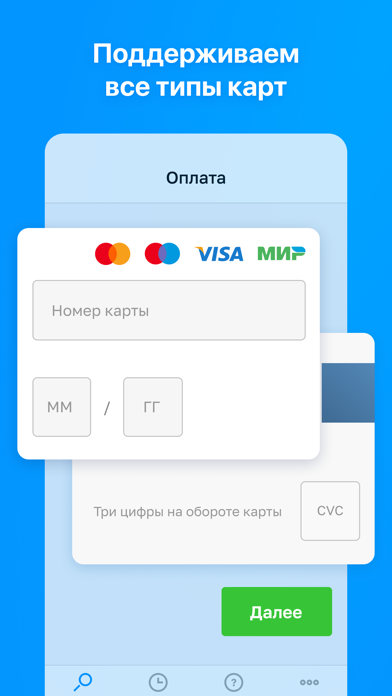
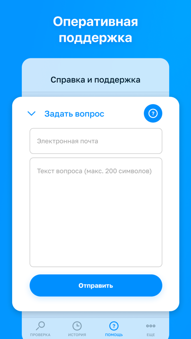
Icon palette
About this app
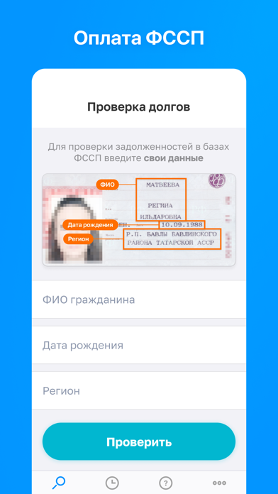
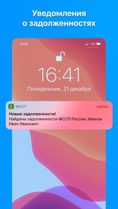
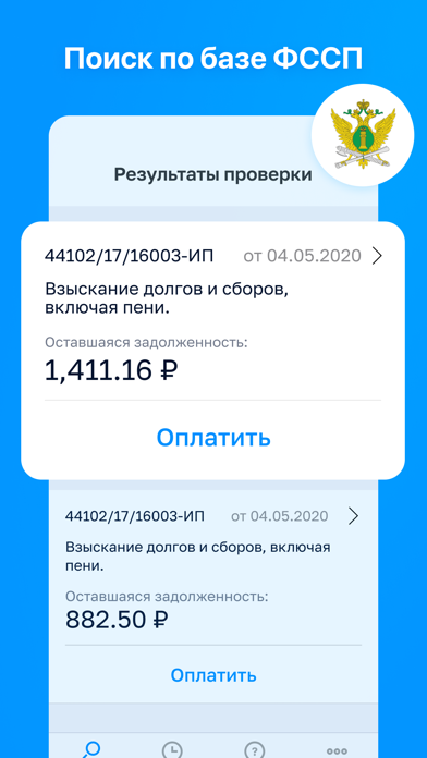
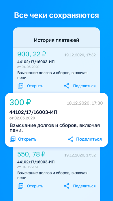
Приложение “Простые Платежи” - это ваш карманный помощник по проверке и оплате задолженностей ФССП. С ПОМОЩЬЮ ПРИЛОЖЕНИЯ ВАМ ДОСТУПНЫ: 1. Проверка без регистрации на наличие задолженностей перед судебными приставами в официальном “Банке данных исполнительных производств ФССП России”. 2. Быстрая оплата задолженностей ФССП. 3. Получение уведомлений о появлении новых задолженностей. 4. Хранение и доступность всей истории операций - чеки и квитанции прямо в приложении с возможностью "сохранить" и "поделиться". 5. Служба поддержки по вопросам, касающимся проверки и оплаты долгов ФССП. КАК ПРОВЕРИТЬ ДОЛГИ: Нужно всего лишь указать ФИО и дату рождения, выбрать из списка регион РФ. Для того чтобы ПОГАСИТЬ ЗАДОЛЖЕННОСТЬ, вам не нужно никуда ходить и стоять в очередях. Все платежи вы можете сделать дистанционно при помощи своего мобильного телефона и любой банковской карты БЕЗ РЕГИСТРАЦИИ. Пос…
App details
What you can learn from ФССП России: проверка и оплата
Every shipping app on the App Store has gone through the same decisions you're working through right now: which screenshot goes first, what caption sits over it, which device frame to show, what color the background should be. The 7 screenshots above are ФССП России: проверка и оплата's answers to those questions — they're public, they're real, and they made it through Apple's review.
What the numbers say: ФССП России: проверка и оплата runs a dark set with one background colour (#0494FC) carried across every screenshot — the listing reads as a single poster when the shots sit side by side in search results. The accent colour we picked up, #6CC4FC, is the one to reuse for badges, arrows and highlighted words if you borrow this look. Hit Use this style to open the editor with these exact colours and drop your own screenshot in.
Notice the first screenshot in particular. It's the one users see in search results and on the product page, and it's where most apps spend their best caption and tightest design. Look at the proportion of background to phone, where the text sits, what one thing the image is trying to communicate.
Want to see how other Finance apps approach the same problem? Browse more Finance apps in the showcase.
Take what works into your own screenshots
Open LaunchShots and design your App Store & Google Play screenshots — pick a device frame, drop captions, ship in minutes. Free, in your browser.
Open the screenshot editor →Apps with a similar look
Closest background + accent colours among the listings we've analysed — useful when you want to see the same palette handled by a different team.