Chart position — tracked daily by LaunchShots
Screenshot style breakdown
Sampled from 6 of دليلة البر's App Store screenshots — background, accent and theme, measured by LaunchShots (not something Apple publishes).
#FCECBC bg
#DDCFA5
#E4A474 accent
#111111 text
Screenshots
iPad screenshots


Icon palette
About this app
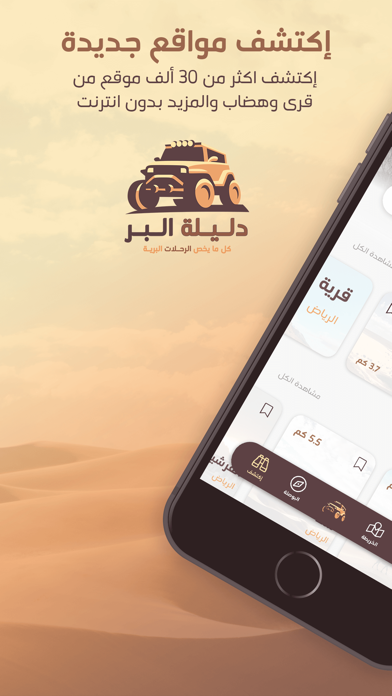
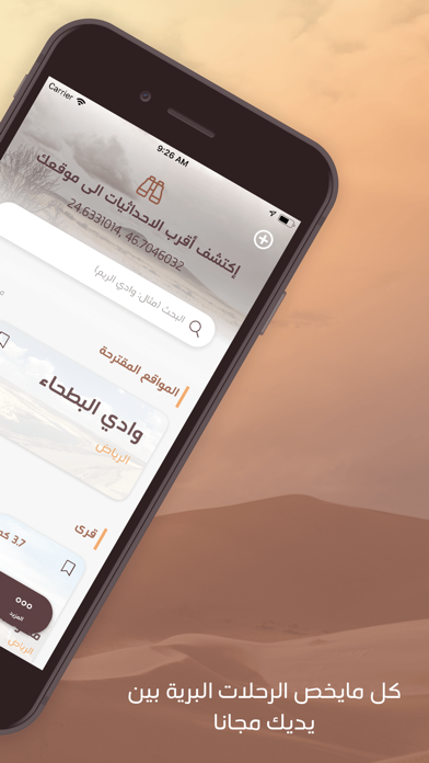
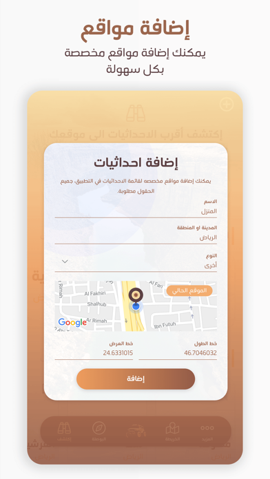
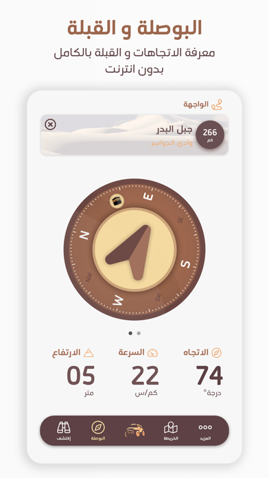
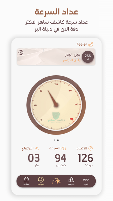
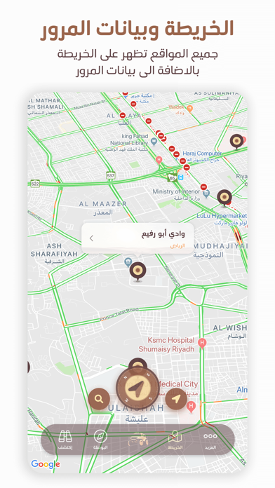
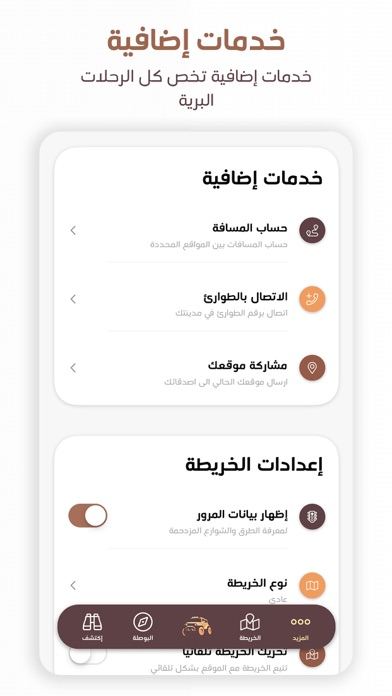
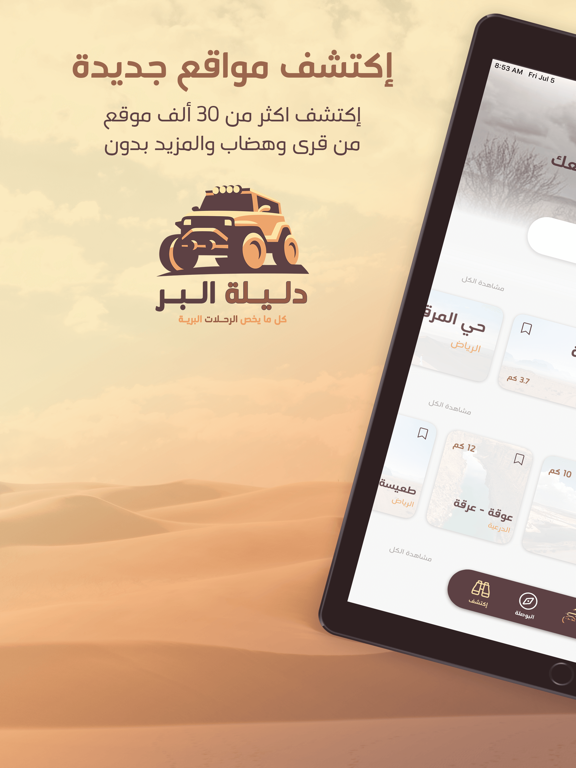
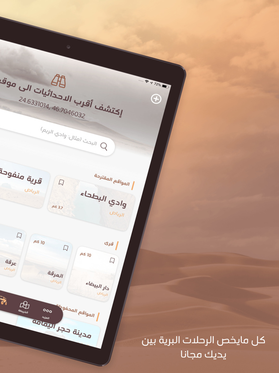
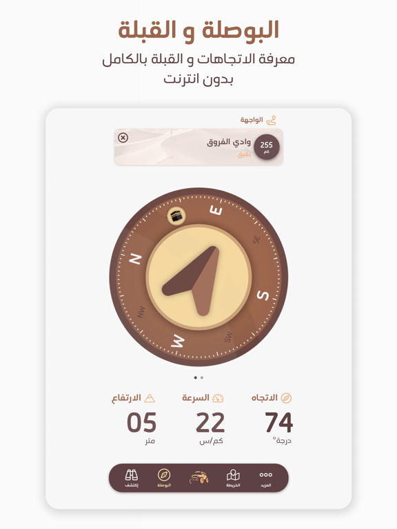
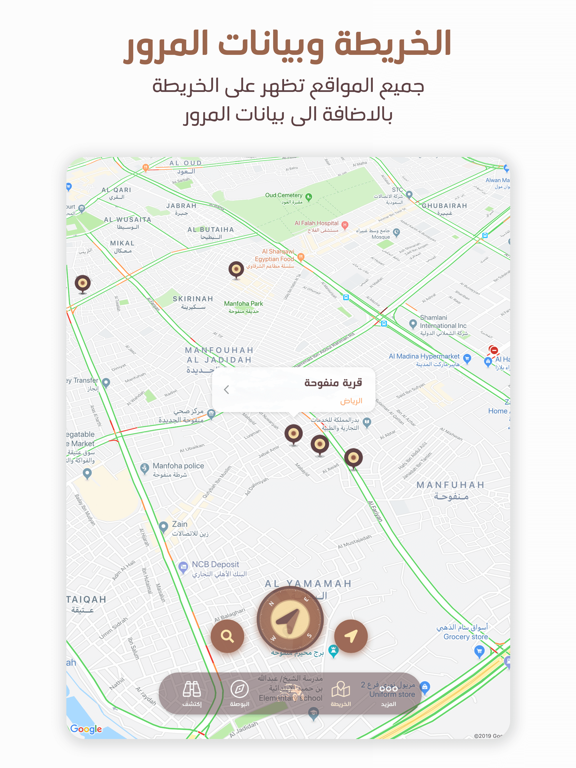
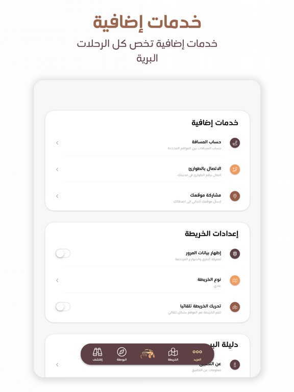
تطبيق دليلة البر هو التطبيق الافضل في الخليج لهواة البر و الرحلات البرية. التطبيق بكل بساطة يعتبر الصندوق الذهبي لكل هواة الرحلات البرية مع أكثر من ٢٠ ميزة توفِر لك بشكل مجاني خدمات لم تكن موجودة في تطبيق واحد من قبل. وطبعا افضل ما في الامر ان التطبيق بكل خدماته يعمل بشكل كامل بدون الوصول الى الانترنت و ١٠٠٪ مجاني. — مزايا التطبيق — ** إكتشف اماكن جديدة ** • التطبيق يستخدم خدمة الGPS بشكل تلقائي لتحديد موقعك بدون احتياج الوصول الى الانترنت. • قاعدة بيانات هي الاكبر على الاطلاق لأكثر من ٣٠ ألف موقع بري( قرى، مدن، اودية، جبال، هضاب، المزيد.. ) يمكنك تصفحهم على جهازك بالكامل بدون انترنت. • بالاضافة الى المواقع الموجودة في التطبيق، يمكنك إضافة احداثيات مواقع مخصصه لك لتتصفحها في المستقبل بكل سهولة. • يمكنك بكل سهولة مشاركة احداثيات ومعلومات المواقع( او موقعك انت ) بكل سهولة مع اصدقائك او اقاربك من خلال ضغطت زر. ** سهولة التنقل مع البوصلة ** • البوصلة الاكثر دقة على الاطلاق تمكنك بكل سهولة…
App details
What you can learn from دليلة البر
Every shipping app on the App Store has gone through the same decisions you're working through right now: which screenshot goes first, what caption sits over it, which device frame to show, what color the background should be. The 14 screenshots above are دليلة البر's answers to those questions — they're public, they're real, and they made it through Apple's review.
What the numbers say: دليلة البر runs a mixed light-and-dark set where the background shifts from screenshot to screenshot (first shot #FCECBC) — each image has to stand on its own, so the captions carry more of the story. The accent colour we picked up, #E4A474, is the one to reuse for badges, arrows and highlighted words if you borrow this look. Hit Use this style to open the editor with these exact colours and drop your own screenshot in.
Notice the first screenshot in particular. It's the one users see in search results and on the product page, and it's where most apps spend their best caption and tightest design. Look at the proportion of background to phone, where the text sits, what one thing the image is trying to communicate.
Want to see how other Navigation apps approach the same problem? Browse more Navigation apps in the showcase.
Take what works into your own screenshots
Open LaunchShots and design your App Store & Google Play screenshots — pick a device frame, drop captions, ship in minutes. Free, in your browser.
Open the screenshot editor →Apps with a similar look
Closest background + accent colours among the listings we've analysed — useful when you want to see the same palette handled by a different team.