Chart position — tracked daily by LaunchShots
Screenshot style breakdown
Sampled from 4 of WAONアプリ's App Store screenshots — background, accent and theme, measured by LaunchShots (not something Apple publishes).
#7CD4F4 bg
#6DBAD6
#F43C1C accent
#111111 text
Screenshots
Icon palette
About this app
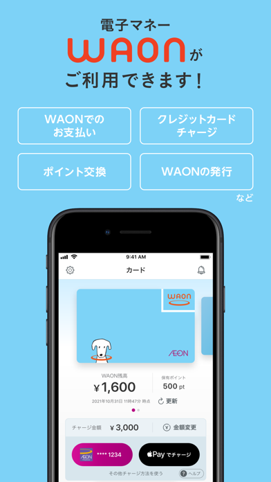
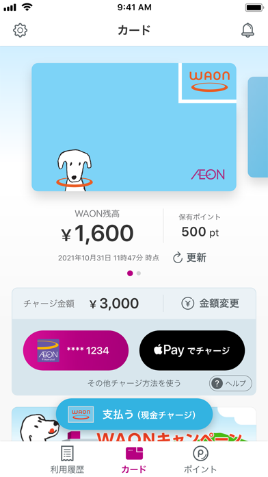
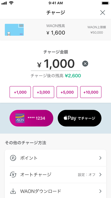
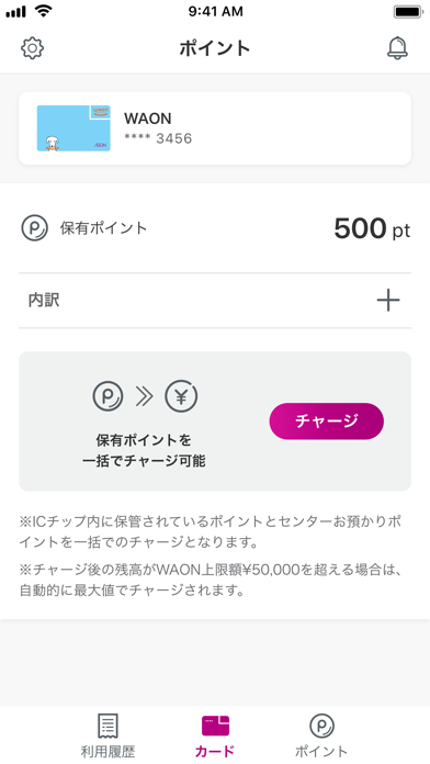
【このアプリの主な機能】 WAONの発行・WAONごとの残高確認およびポイント数確認、イオンカードからのチャージ、Apple Payからのチャージ、ポイントのダウンロード 【WAONの発行】 ご当地WAONなどのWAONがiPhone上で発行できます。 ※発行手数料は、無料です。 ※ご当地WAONは、ご利用金額に応じてイオンが自治体などへ寄付をし、地域の活性化にお役立ていただけるWAONです。 【チャージ方法】 以下の方法でWAONにチャージができます。 ・WAONアプリに登録したイオンマークのカード ・Apple Payに登録したクレジットカード ・現金チャージ ・ポイントチャージ 【お支払い方法】 1. お店でお会計時に「電子マネーWAONで支払います」と伝えてください。 2. ICカードタッチ機器にiPhoneやApple Watchをかざして「ワオン!」と鳴ったらお支払い完了です。 ※あらかじめウォレットアプリで支払うWAONを選択ください。 ※お支払い時にiPhoneの認証が解除されてしまう場合は、ヘルプモードをご活用ください。 ※Apple Watchの場合、サイドボタンをダブルクリックして支払うWA…
App details
What you can learn from WAONアプリ
Every shipping app on the App Store has gone through the same decisions you're working through right now: which screenshot goes first, what caption sits over it, which device frame to show, what color the background should be. The 4 screenshots above are WAONアプリ's answers to those questions — they're public, they're real, and they made it through Apple's review.
What the numbers say: WAONアプリ runs a light set where the background shifts from screenshot to screenshot (first shot #7CD4F4) — each image has to stand on its own, so the captions carry more of the story. The accent colour we picked up, #F43C1C, is the one to reuse for badges, arrows and highlighted words if you borrow this look. Hit Use this style to open the editor with these exact colours and drop your own screenshot in.
Notice the first screenshot in particular. It's the one users see in search results and on the product page, and it's where most apps spend their best caption and tightest design. Look at the proportion of background to phone, where the text sits, what one thing the image is trying to communicate.
Want to see how other Finance apps approach the same problem? Browse more Finance apps in the showcase.
Take what works into your own screenshots
Open LaunchShots and design your App Store & Google Play screenshots — pick a device frame, drop captions, ship in minutes. Free, in your browser.
Open the screenshot editor →Apps with a similar look
Closest background + accent colours among the listings we've analysed — useful when you want to see the same palette handled by a different team.