Screenshot style breakdown
Sampled from 6 of УрФУ.Учеба's App Store screenshots — background, accent and theme, measured by LaunchShots (not something Apple publishes).
#1C4494 bg
#3B5EA2
#748CBC accent
#FFFFFF text
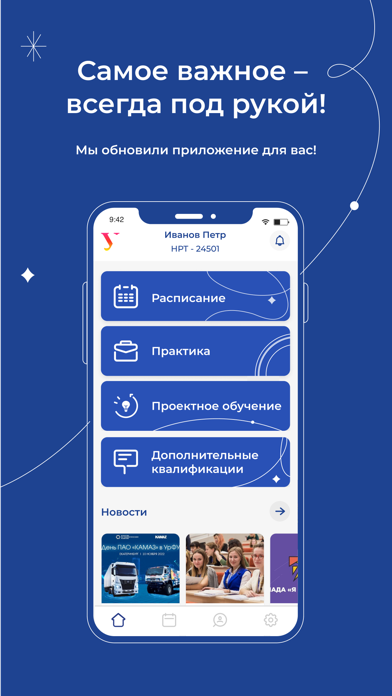
- #1Самое важное — всегда под рукой! Мы обновили приложение для вас! /
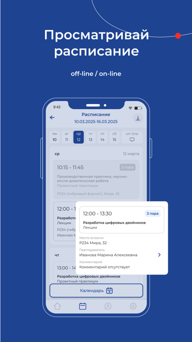
- #2Просматривай расписание off-line / on-line
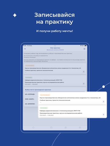
- #3+ Записывайся на практику
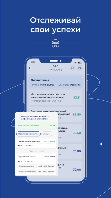
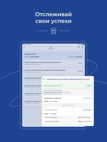
- #4Отслеживай свои успехи
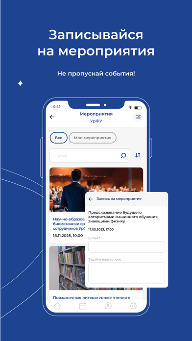
- #5Записывайся на мероприятия Не пропускай события!
- #6+ Узнай больше про любимый
Captions read from the screenshots (OCR, may contain small errors): 6 headlines, 5.8 words on average (longest 12).
Screenshots



iPad screenshots




Icon palette
About this app
Получите доступ к актуальному расписанию: - просмотр расписания аудиторных и онлайн-занятий; - поиск преподавателя и ознакомление с его нагрузкой: время, место, дисциплина и участвующие в занятии группы. Ознакомьтесь со своими баллами БРС: - комфортный доступ к данным Балльно-рейтинговой системы; - фильтр по году и семестру; - просмотр технологических карт по дисциплинам в начале семестра – узнайте, что необходимо сделать по дисциплине в первые учебные дни! Запишитесь на практику: - выберите организацию для прохождения практики; - ознакомьтесь с заявками предприятий и оставьте отклик на выбранную; - отслеживайте статус своего отклика и получайте шаблоны необходимых для прохождения практики документов. Узнайте больше о магистратуре: - анонсы мероприятий для будущих магистрантов с возможностью записи на них; - возможность задать интересующие вопросы о магистратуре через удобную форму…
App details
What you can learn from УрФУ.Учеба
Every shipping app on the App Store has gone through the same decisions you're working through right now: which screenshot goes first, what caption sits over it, which device frame to show, what color the background should be. The 16 screenshots above are УрФУ.Учеба's answers to those questions — they're public, they're real, and they made it through Apple's review.
What the numbers say: УрФУ.Учеба runs a dark set with one background colour (#1C4494) carried across every screenshot — the listing reads as a single poster when the shots sit side by side in search results. The accent colour we picked up, #748CBC, is the one to reuse for badges, arrows and highlighted words if you borrow this look. Hit Use this style to open the editor with these exact colours and drop your own screenshot in.
Notice the first screenshot in particular. It's the one users see in search results and on the product page, and it's where most apps spend their best caption and tightest design. Look at the proportion of background to phone, where the text sits, what one thing the image is trying to communicate.
Want to see how other Education apps approach the same problem? Browse more Education apps in the showcase.
Take what works into your own screenshots
Open LaunchShots and design your App Store & Google Play screenshots — pick a device frame, drop captions, ship in minutes. Free, in your browser.
Open the screenshot editor →Apps with a similar look
Closest background + accent colours among the listings we've analysed — useful when you want to see the same palette handled by a different team.