Chart position — tracked daily by LaunchShots
Screenshot style breakdown
Sampled from 6 of LiveTube: Новости и Заработок's App Store screenshots — background, accent and theme, measured by LaunchShots (not something Apple publishes).
#040404 bg
#272727
#044C84 accent
#FFFFFF text
Screenshots




Icon palette
About this app
ТРАНСЛИРУЙТЕ В ПРЯМОМ ЭФИРЕ, СОЗДАВАЙТЕ НОВОСТИ И ЗАРАБАТЫВАЙТЕ ДЕНЬГИ Скачайте LiveTube – лучший инструмент для трансляции новостей в режиме реального времени. Это абсолютно бесплатно и без внутренних покупок! Превратите свой смартфон в устройство для новостных репортажей. Станьте свидетелем последних новостей, транслируйте в прямом эфире, зарабатывайте деньги и оставайтесь в курсе последних событий. Присоединяйтесь к глобальному сообществу, которое революционизирует мир новостей и борется с фейковыми новостями. ПОЧЕМУ ВЫБИРАЮТ LIVETUBE? - ТРАНСЛИРУЙТЕ В ПРЯМОМ ЭФИРЕ В ЛЮБОЕ ВРЕМЯ И В ЛЮБОМ МЕСТЕ: Свидетель события? Нажмите "ТРАНСЛИРОВАТЬ В ПРЯМОМ ЭФИРЕ", опишите ситуацию и начните трансляцию с вашего уникального взгляда. В разделе "ТРАНСЛИРОВАТЬ В ПРЯМОМ ЭФИРЕ" вы можете увидеть информацию о текущих выплатах в режиме реального времени и узнать о специальных дополнительных выплатах в…
App details
What you can learn from LiveTube: Новости и Заработок
Every shipping app on the App Store has gone through the same decisions you're working through right now: which screenshot goes first, what caption sits over it, which device frame to show, what color the background should be. The 10 screenshots above are LiveTube: Новости и Заработок's answers to those questions — they're public, they're real, and they made it through Apple's review.
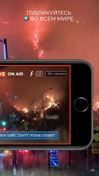
What the numbers say: LiveTube: Новости и Заработок runs a dark set where the background shifts from screenshot to screenshot (first shot #040404) — each image has to stand on its own, so the captions carry more of the story. The accent colour we picked up, #044C84, is the one to reuse for badges, arrows and highlighted words if you borrow this look. Hit Use this style to open the editor with these exact colours and drop your own screenshot in.
Notice the first screenshot in particular. It's the one users see in search results and on the product page, and it's where most apps spend their best caption and tightest design. Look at the proportion of background to phone, where the text sits, what one thing the image is trying to communicate.
Want to see how other News apps approach the same problem? Browse more News apps in the showcase.
Take what works into your own screenshots
Open LaunchShots and design your App Store & Google Play screenshots — pick a device frame, drop captions, ship in minutes. Free, in your browser.
Open the screenshot editor →Apps with a similar look
Closest background + accent colours among the listings we've analysed — useful when you want to see the same palette handled by a different team.