Chart position — tracked daily by LaunchShots
Screenshot style breakdown
Sampled from 6 of 易订PRO's App Store screenshots — background, accent and theme, measured by LaunchShots (not something Apple publishes).
#FCFCFC bg
#DDDDDD
#FC5C64 accent
#111111 text
Screenshots
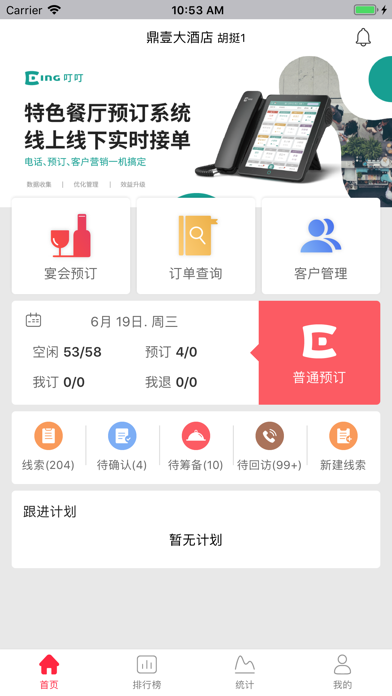
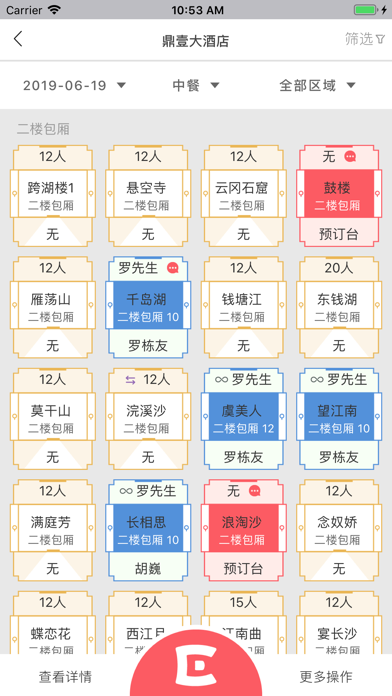
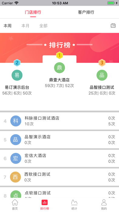
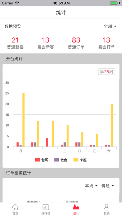
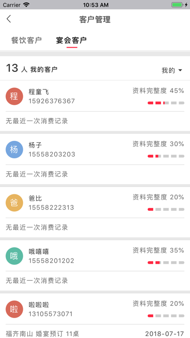
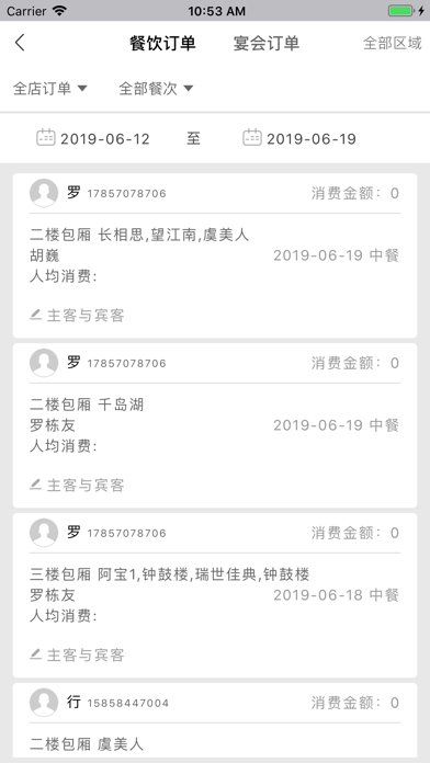
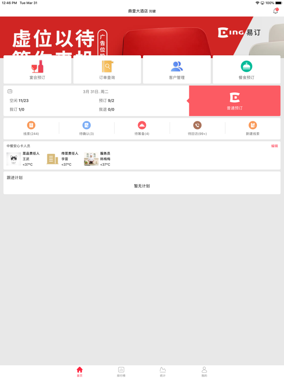
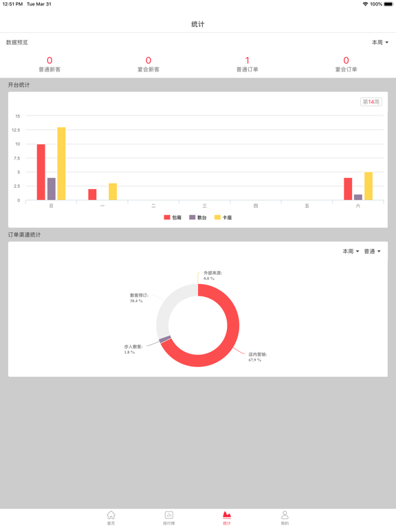
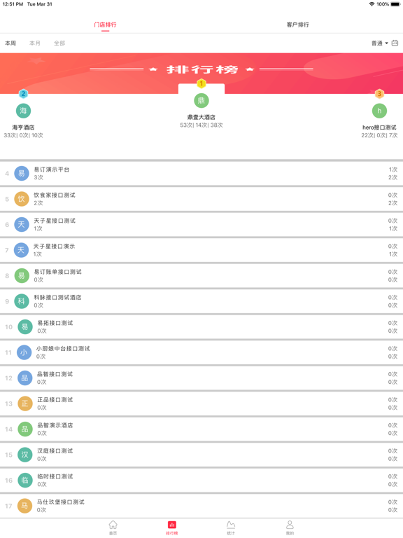
iPad screenshots


Icon palette
About this app
易订拥有哪些领先功能: 1、 全渠道整合预订中台,全自动预订接单。 1)、线上引流,无缝对接各大餐饮平台。 2)、方便快捷的操作界面。 3)、减少重复沟通,提高工作效率。 4)、桌位实时同步。 5)、方便实用功能:客人回访,存酒管理。 2、 客史客情自动收集,数据化服务升级。 1)、自动收集客户详细资料。 2)、活跃客户,沉睡客户,流失客户自动分类。 3)、主动提醒新客户和唤醒客户。 4)、按照消费金额,消费频次,人均等自动删选20%高价值客户。 5)、特殊客人标签。 3、宴会全流程管控系统,提升宴会成交率。 1)、宴会档期查询。 2)、宴会电子看板。 3)、线索留存。 4)、多订单筛选,厅位利益最大化。 5)、每日宴会线索,订单,金额报表自动推送。 4、餐企专属大数据平台,管理和营销赋能。 1)、退订率管理。 2)、经营报表推送。 3)、订单类型自动分析。 4)、客户多维度报表。 5)、销售经理月度,季度,年度报表。
App details
What you can learn from 易订PRO
Every shipping app on the App Store has gone through the same decisions you're working through right now: which screenshot goes first, what caption sits over it, which device frame to show, what color the background should be. The 11 screenshots above are 易订PRO's answers to those questions — they're public, they're real, and they made it through Apple's review.
What the numbers say: 易订PRO runs a light set with one background colour (#FCFCFC) carried across every screenshot — the listing reads as a single poster when the shots sit side by side in search results. The accent colour we picked up, #FC5C64, is the one to reuse for badges, arrows and highlighted words if you borrow this look. Hit Use this style to open the editor with these exact colours and drop your own screenshot in.
Notice the first screenshot in particular. It's the one users see in search results and on the product page, and it's where most apps spend their best caption and tightest design. Look at the proportion of background to phone, where the text sits, what one thing the image is trying to communicate.
Want to see how other Food & Drink apps approach the same problem? Browse more Food & Drink apps in the showcase.
Take what works into your own screenshots
Open LaunchShots and design your App Store & Google Play screenshots — pick a device frame, drop captions, ship in minutes. Free, in your browser.
Open the screenshot editor →Apps with a similar look
Closest background + accent colours among the listings we've analysed — useful when you want to see the same palette handled by a different team.