Screenshot style breakdown
Sampled from 6 of Обои на айфон - темы на iPhone's App Store screenshots — background, accent and theme, measured by LaunchShots (not something Apple publishes).
#A4B4CC bg
#909EB3
#EC5C04 accent
#111111 text
Screenshots


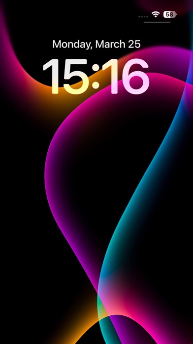
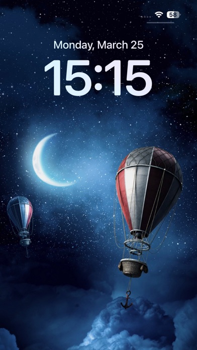


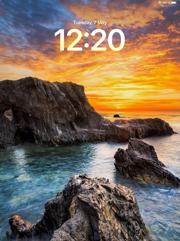
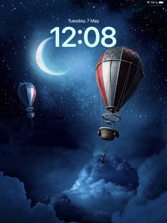
iPad screenshots


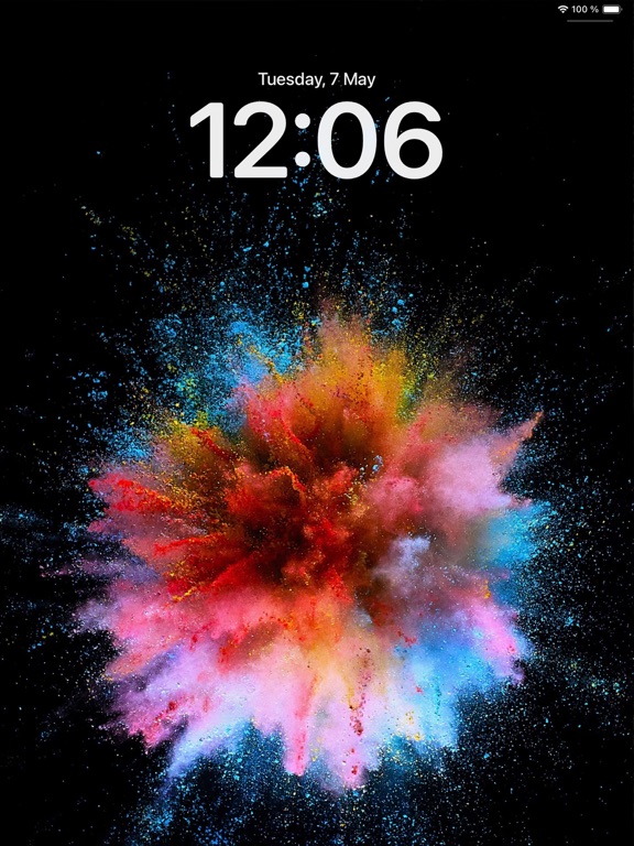

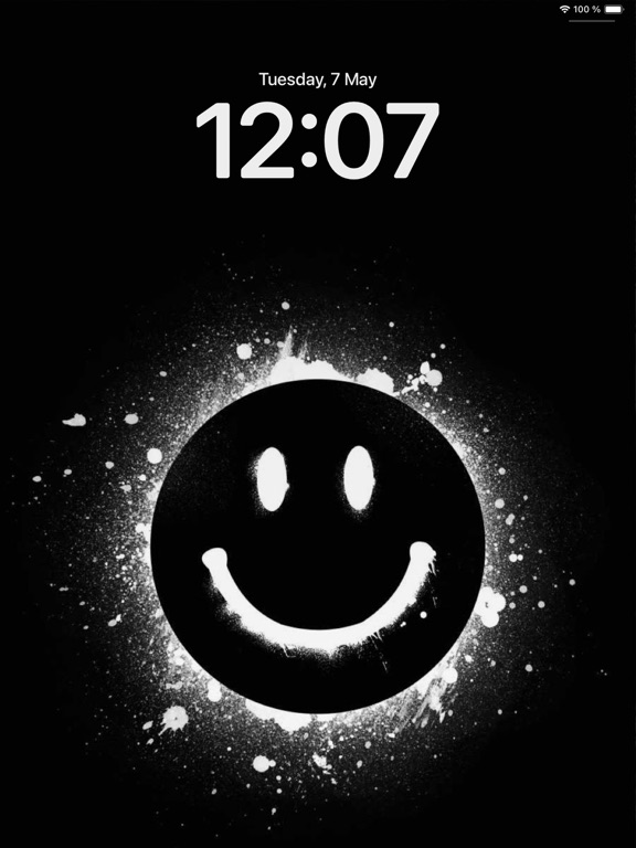


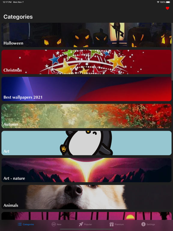
Icon palette
About this app
Преобразите свое устройство с помощью красивых HD и 4K обоев, качественных фонов и стильных тем, которые будут делать ваш экран эффектным каждый день. Wallpapers открывает доступ к огромной коллекции изображений для главного экрана и экрана блокировки, чтобы вы могли персонализировать устройство всего за несколько секунд и всегда поддерживать его внешний вид свежим, современным и привлекательным. Откройте для себя тысячи обоев в самых разных стилях, цветах и настроениях. Если вам нравятся минималистичные, абстрактные, природные, темные, эстетичные, неоновые, милые, яркие или современные дизайны, вы легко найдете идеальный фон для своего экрана. От элегантных статичных обоев до выразительных изображений, вдохновленных разными темами, Wallpapers помогает создать оформление, которое подходит именно вашему вкусу и настроению. Это не просто обычное приложение с обоями. Wallpapers создано д…
App details
What you can learn from Обои на айфон - темы на iPhone
Every shipping app on the App Store has gone through the same decisions you're working through right now: which screenshot goes first, what caption sits over it, which device frame to show, what color the background should be. The 20 screenshots above are Обои на айфон - темы на iPhone's answers to those questions — they're public, they're real, and they made it through Apple's review.
What the numbers say: Обои на айфон - темы на iPhone runs a mixed light-and-dark set where the background shifts from screenshot to screenshot (first shot #A4B4CC) — each image has to stand on its own, so the captions carry more of the story. The accent colour we picked up, #EC5C04, is the one to reuse for badges, arrows and highlighted words if you borrow this look. Hit Use this style to open the editor with these exact colours and drop your own screenshot in.
Notice the first screenshot in particular. It's the one users see in search results and on the product page, and it's where most apps spend their best caption and tightest design. Look at the proportion of background to phone, where the text sits, what one thing the image is trying to communicate.
Want to see how other Lifestyle apps approach the same problem? Browse more Lifestyle apps in the showcase.
Take what works into your own screenshots
Open LaunchShots and design your App Store & Google Play screenshots — pick a device frame, drop captions, ship in minutes. Free, in your browser.
Open the screenshot editor →Apps with a similar look
Closest background + accent colours among the listings we've analysed — useful when you want to see the same palette handled by a different team.