Chart position — tracked daily by LaunchShots
Screenshot style breakdown
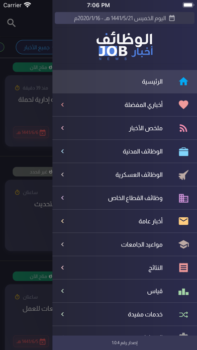
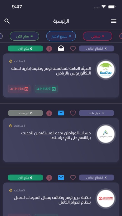
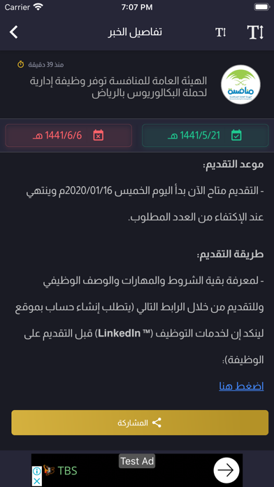
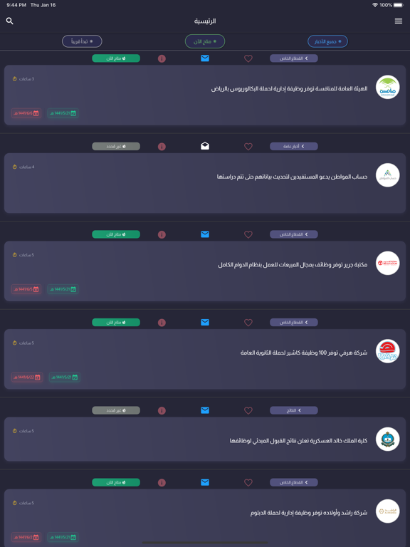
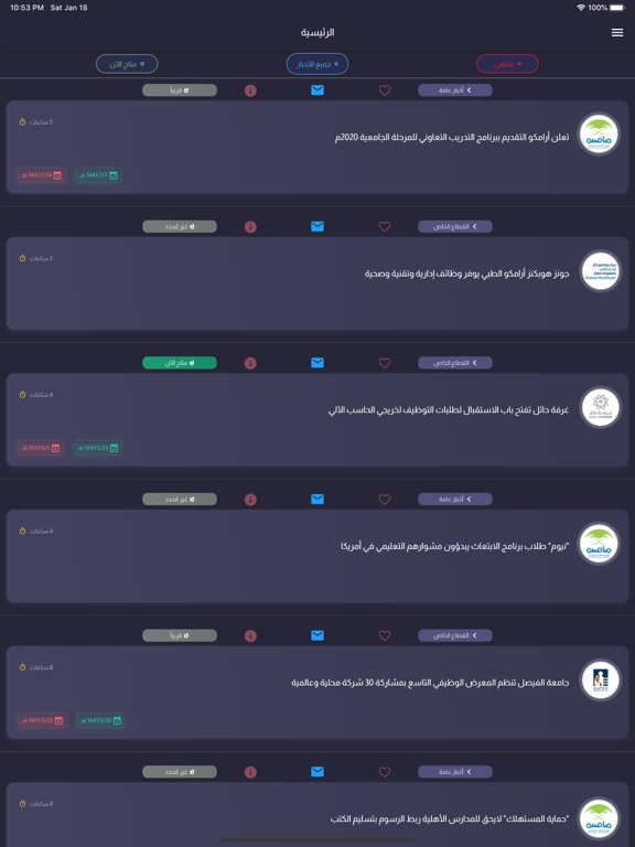
Sampled from 3 of أخبار الوظائف's App Store screenshots — background, accent and theme, measured by LaunchShots (not something Apple publishes).
#14141C bg
#34343B
#4C7CDC accent
#FFFFFF text
Screenshots
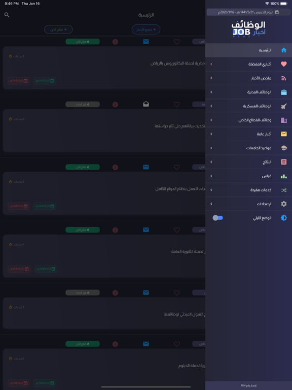
iPad screenshots
Icon palette
About this app
هل تبحث عن وظيفتك القادمة؟ تطبيق (أخبار الوظائف) هو وجهتك الأولى والموثوقة لمتابعة أحدث الفرص الوظيفية في المملكة العربية السعودية لحظة بلحظة. نحن نجمع لك كافة الوظائف من مصادرها الرسمية لنضعها بين يديك في مكان واحد. لماذا تختار تطبيق أخبار الوظائف؟ • موثوقية تامة: أخبار مستقاة بنسبة 100% من المصادر الرسمية والجهات الحكومية. • تنبيهات فورية: كن أول من يعلم! نظام إشعارات ذكي يرسل لك تنبيهاً فور صدور الوظيفة. تصنيف شامل ومتنوع: • وظائف مدنية (حكومية). • وظائف عسكرية. • وظائف القطاع الخاص (شركات وجعيات). • نتائج القبول والترشيح. • أخبار المركز الوطني للقياس (قياس). • أخبار عامة وخدمات مفيدة. أهم مميزات التطبيق: بحث و فلترة متقدمة: ابحث عن الوظائف بسهولة، وصنّفها حسب الحالة (متاحة الآن، قريباً، منتهية). تخصيص كامل: يدعم التطبيق الوضع الداكن (Dark Mode) والوضع الفاتح لراحة عينيك. شامل للجنسين: تصنيفات خاصة بوظائف الرجال ووظائف النساء. خيارات العمل: وظائف بدوام كامل، دوام جزئي، وعن بعد.…
App details
What you can learn from أخبار الوظائف
Every shipping app on the App Store has gone through the same decisions you're working through right now: which screenshot goes first, what caption sits over it, which device frame to show, what color the background should be. The 6 screenshots above are أخبار الوظائف's answers to those questions — they're public, they're real, and they made it through Apple's review.
What the numbers say: أخبار الوظائف runs a dark set with one background colour (#14141C) carried across every screenshot — the listing reads as a single poster when the shots sit side by side in search results. The accent colour we picked up, #4C7CDC, is the one to reuse for badges, arrows and highlighted words if you borrow this look. Hit Use this style to open the editor with these exact colours and drop your own screenshot in.
Notice the first screenshot in particular. It's the one users see in search results and on the product page, and it's where most apps spend their best caption and tightest design. Look at the proportion of background to phone, where the text sits, what one thing the image is trying to communicate.
Want to see how other News apps approach the same problem? Browse more News apps in the showcase.
Take what works into your own screenshots
Open LaunchShots and design your App Store & Google Play screenshots — pick a device frame, drop captions, ship in minutes. Free, in your browser.
Open the screenshot editor →Apps with a similar look
Closest background + accent colours among the listings we've analysed — useful when you want to see the same palette handled by a different team.