Chart position — tracked daily by LaunchShots
Screenshot style breakdown
Sampled from 4 of Bitfan Pass's App Store screenshots — background, accent and theme, measured by LaunchShots (not something Apple publishes).
#345C64 bg
#507279
#245CDC accent
#FFFFFF text
Screenshots

Icon palette
About this app
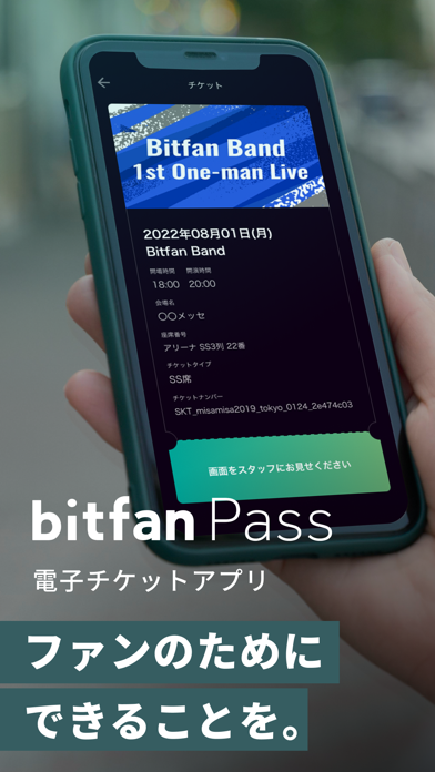
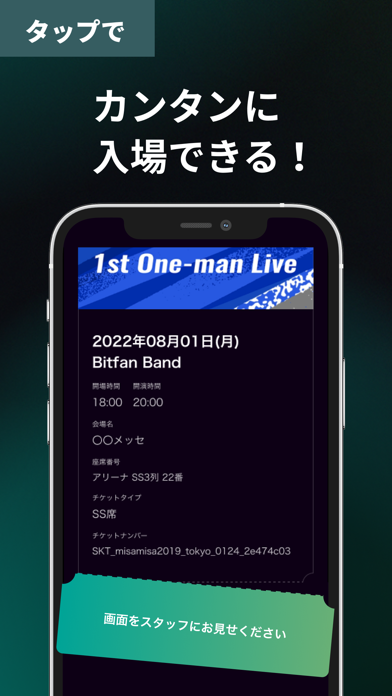
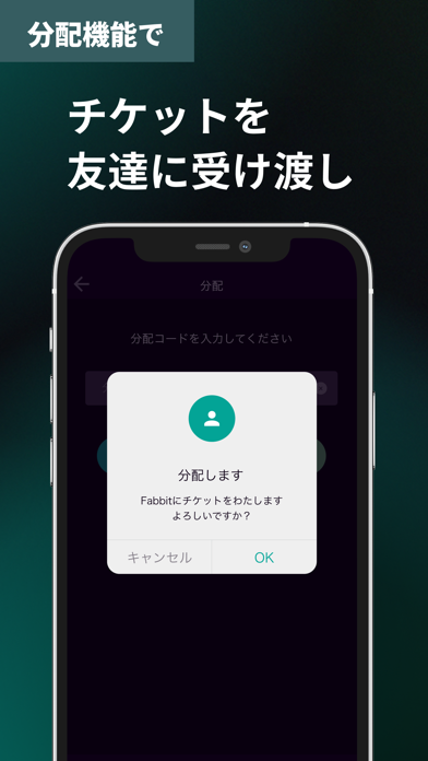
もぎるだけのカンタン入場! チケット購入から入場まで、 エンタメをこれひとつで楽しめる、電子チケットアプリです。 チケット発券の手間や、当日チケットを忘れるといった心配をせずに、 ライブやイベントにペーパーレスで入場が可能です。 ◆ 機能について 1)チケットの購入 ライブ・イベントの検索から購入まで、スマホひとつでOK! 行きたい公演を調べて、アプリで購入するだけ。 すぐにチケットが受け取れるので、 留守や住所変更など、郵送の心配もありません。 2)チケットの閲覧 いつでもどこでもチケットを確認できる! 一覧画面から、所有チケットの枚数や席番号、イベントの詳細情報を確認できます。 3)入場 もぎるだけのカンタン入場! 受付時に、購入したチケット画面を見せるだけ。 チケット発券の手間や、紛失の心配ゼロで、 スムーズに入場できます。 4)チケットの分配 スマートフォン同士であれば、友達にチケットを譲渡することができます。 一緒に入場できなくても、事前にチケットの受け渡しをすれば 別々での入場が可能です…
App details
What you can learn from Bitfan Pass
Every shipping app on the App Store has gone through the same decisions you're working through right now: which screenshot goes first, what caption sits over it, which device frame to show, what color the background should be. The 4 screenshots above are Bitfan Pass's answers to those questions — they're public, they're real, and they made it through Apple's review.
What the numbers say: Bitfan Pass runs a dark set where the background shifts from screenshot to screenshot (first shot #345C64) — each image has to stand on its own, so the captions carry more of the story. The accent colour we picked up, #245CDC, is the one to reuse for badges, arrows and highlighted words if you borrow this look. Hit Use this style to open the editor with these exact colours and drop your own screenshot in.
Notice the first screenshot in particular. It's the one users see in search results and on the product page, and it's where most apps spend their best caption and tightest design. Look at the proportion of background to phone, where the text sits, what one thing the image is trying to communicate.
Want to see how other Entertainment apps approach the same problem? Browse more Entertainment apps in the showcase.
Take what works into your own screenshots
Open LaunchShots and design your App Store & Google Play screenshots — pick a device frame, drop captions, ship in minutes. Free, in your browser.
Open the screenshot editor →Apps with a similar look
Closest background + accent colours among the listings we've analysed — useful when you want to see the same palette handled by a different team.