Chart position — tracked daily by LaunchShots
Screenshot style breakdown
Sampled from 6 of Coi Sổ Đỏ's App Store screenshots — background, accent and theme, measured by LaunchShots (not something Apple publishes).
#FCFCFC bg
#DDDDDD
#3C5C9C accent
#111111 text
Reading the caption text from the screenshots in your browser…
Screenshots
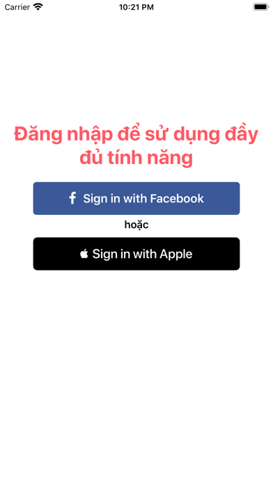
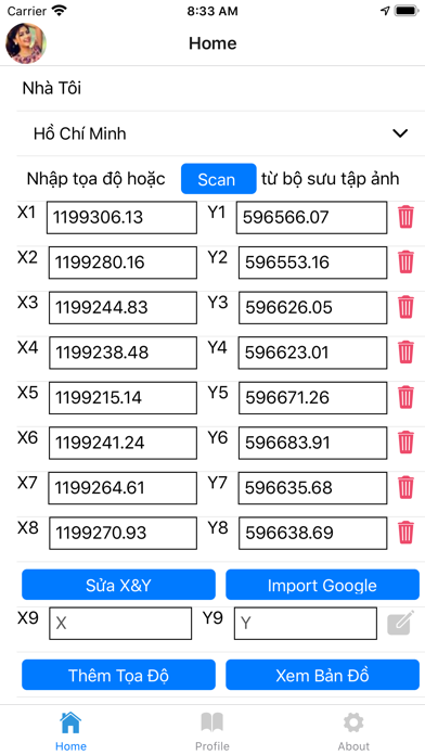
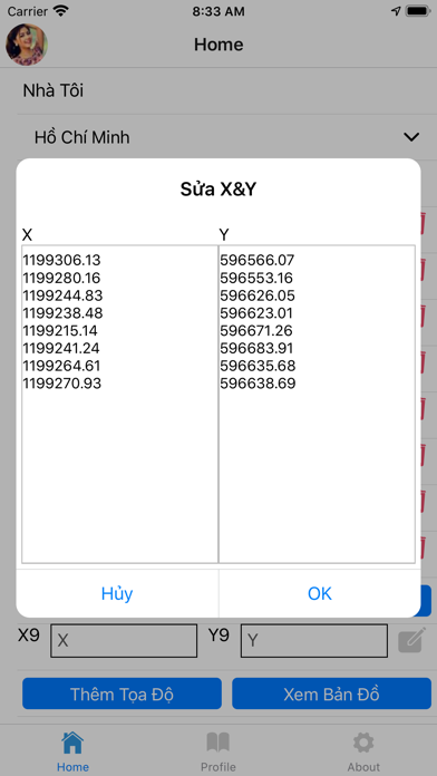

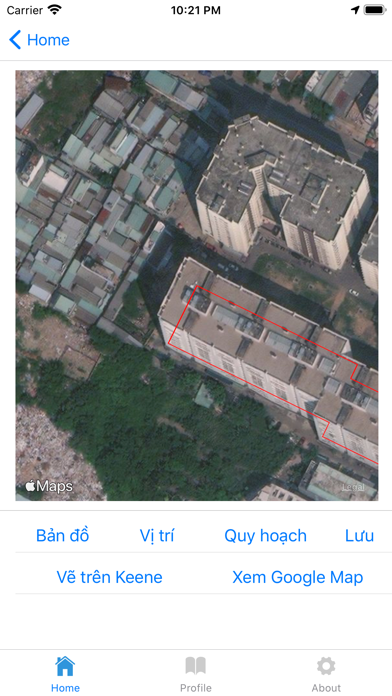

iPad screenshots


Icon palette
About this app
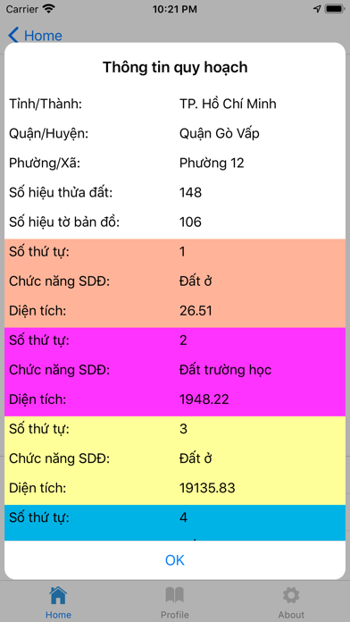
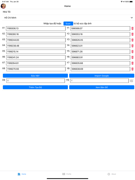
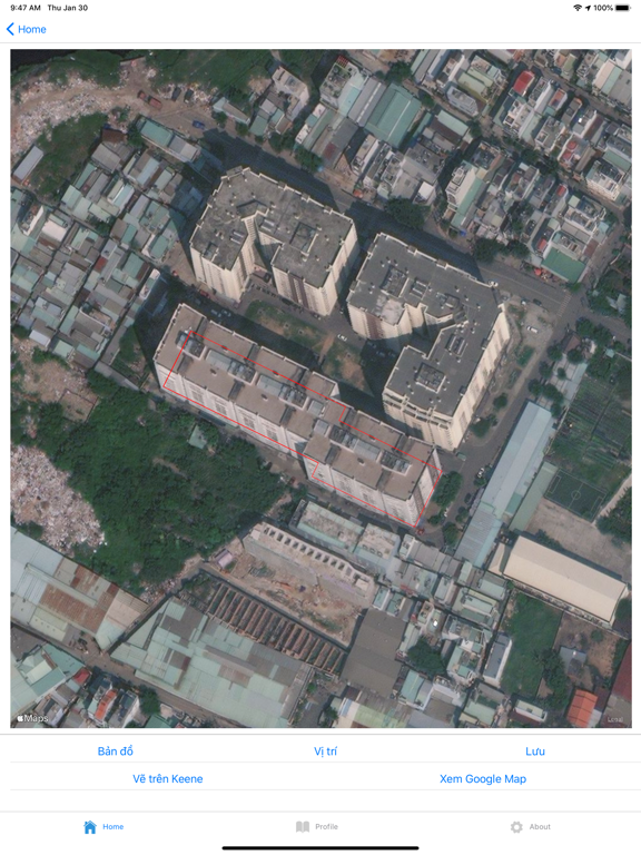
Định Vị Nhà Đất - VN2000 là công cụ mạnh mẽ dành cho các nhà môi giới, nhà đầu tư bất động sản và người dân để xác định vị trí chính xác của thửa đất dựa trên hệ tọa độ VN2000 (tọa độ trên sổ đỏ). **Tính năng nổi bật:** - **Chuyển đổi VN2000:** Chuyển đổi chính xác tọa độ VN2000 sang hệ WGS84 (Google Maps) cho tất cả 64 tỉnh thành tại Việt Nam. - **Quét tọa độ bằng AI (OCR):** Chỉ cần chụp ảnh trang sơ đồ thửa đất, ứng dụng sẽ tự động nhận diện và trích xuất tọa độ giúp bạn tiết kiệm thời gian nhập liệu. - **Xem Bản đồ chuyên sâu:** Hiển thị vị trí trên nền bản đồ vệ tinh, bản đồ giao thông với độ chính xác cao. - **Quản lý dự án:** Lưu lại danh sách các thửa đất đã tìm kiếm để dễ dàng xem lại bất cứ lúc nào. - **Công cụ chuyển đổi toạ độ:** Hỗ trợ chuyển đổi toạ độ VN2000 sang toạ độ quốc tế và hiển thị trên bản đồ Ứng dụng giúp bạn xóa bỏ nỗi lo không biết thửa đất nằm ở đâu khi ch…
App details
What you can learn from Coi Sổ Đỏ
Every shipping app on the App Store has gone through the same decisions you're working through right now: which screenshot goes first, what caption sits over it, which device frame to show, what color the background should be. The 11 screenshots above are Coi Sổ Đỏ's answers to those questions — they're public, they're real, and they made it through Apple's review.
What the numbers say: Coi Sổ Đỏ runs a light set where the background shifts from screenshot to screenshot (first shot #FCFCFC) — each image has to stand on its own, so the captions carry more of the story. The accent colour we picked up, #3C5C9C, is the one to reuse for badges, arrows and highlighted words if you borrow this look. Hit Use this style to open the editor with these exact colours and drop your own screenshot in.
Notice the first screenshot in particular. It's the one users see in search results and on the product page, and it's where most apps spend their best caption and tightest design. Look at the proportion of background to phone, where the text sits, what one thing the image is trying to communicate.
Want to see how other Navigation apps approach the same problem? Browse more Navigation apps in the showcase.
Take what works into your own screenshots
Open LaunchShots and design your App Store & Google Play screenshots — pick a device frame, drop captions, ship in minutes. Free, in your browser.
Open the screenshot editor →Apps with a similar look
Closest background + accent colours among the listings we've analysed — useful when you want to see the same palette handled by a different team.