Chart position — tracked daily by LaunchShots
Screenshot changes — detected by LaunchShots
Screenshot style breakdown
Sampled from 5 of Kitapyurdu Sesli Kitap's App Store screenshots — background, accent and theme, measured by LaunchShots (not something Apple publishes).
#FCF4D4 bg
#DDD6BA
#A42C24 accent
#111111 text
Screenshots
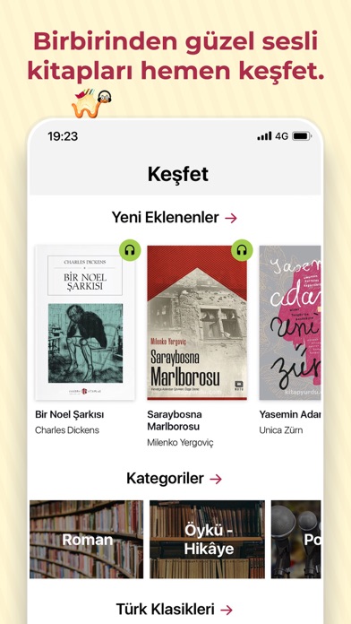
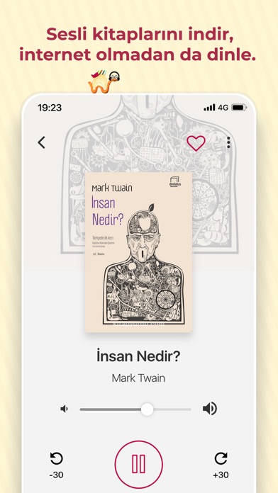

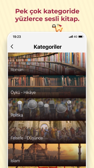
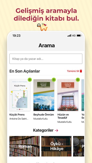
iPad screenshots


Icon palette
About this app
Spor yaparken, yolculukta, çalışırken veya kendinle kalmak istediğinde yüzlerce sesli kitap ile Kitapyurdu Sesli Kitap hep yanında! Doğu klasiklerinden modern öykülere, ekonomiden çocuk edebiyatına uzanan bu geniş külliyat, sizin ritminize uyum sağlamak için tasarlandı. Öne Çıkan Özellikler • Geniş Ürün Yelpazesi: Ürün yelpazemizde; 20'nin üzerinde farklı kategoride, farklı dillerde, yüzlerce sesli kitap bulunmaktadır. • Esnek Abonelik Seçenekleri: Avantajlı abonelik ücretleriyle uygulama içi satın alma yaparak kolayca abone olabilirsiniz. • Çevrimdışı Mod: Dış dünyadan koptuğunuz her an, kütüphanenizle baş başa kalın. Kitapları cihazınıza indirin; internet bağlantınız olmasa bile metroda, uçakta veya seyahatte kesintisiz dinlemeye devam edin. • Akıllı Arama ve Keşif: Yazara, yayınevine veya kategoriye göre filtreleme yaparak aradığınız kitaba saniyeler içinde ulaşın. • Engelsiz Edebi…
App details
What you can learn from Kitapyurdu Sesli Kitap
Every shipping app on the App Store has gone through the same decisions you're working through right now: which screenshot goes first, what caption sits over it, which device frame to show, what color the background should be. The 9 screenshots above are Kitapyurdu Sesli Kitap's answers to those questions — they're public, they're real, and they made it through Apple's review.
What the numbers say: Kitapyurdu Sesli Kitap runs a light set with one background colour (#FCF4D4) carried across every screenshot — the listing reads as a single poster when the shots sit side by side in search results. The accent colour we picked up, #A42C24, is the one to reuse for badges, arrows and highlighted words if you borrow this look. Hit Use this style to open the editor with these exact colours and drop your own screenshot in.
Notice the first screenshot in particular. It's the one users see in search results and on the product page, and it's where most apps spend their best caption and tightest design. Look at the proportion of background to phone, where the text sits, what one thing the image is trying to communicate.
Want to see how other Book apps approach the same problem? Browse more Book apps in the showcase.
Take what works into your own screenshots
Open LaunchShots and design your App Store & Google Play screenshots — pick a device frame, drop captions, ship in minutes. Free, in your browser.
Open the screenshot editor →Apps with a similar look
Closest background + accent colours among the listings we've analysed — useful when you want to see the same palette handled by a different team.