Chart position — tracked daily by LaunchShots
Screenshot style breakdown
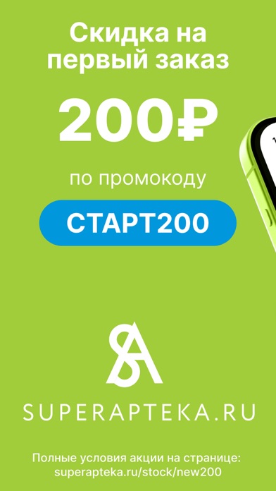
Sampled from 6 of Супераптека: заказ лекарств's App Store screenshots — background, accent and theme, measured by LaunchShots (not something Apple publishes).
#A4CC3C bg
#90B334
#0494DC accent
#111111 text
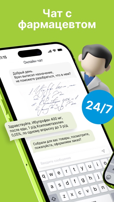
- #2Чат с фармацевтом
- #3Подберем аналоги поможем с заказом
- #4Двойные бонусы в приложении
- #5Акции и скидки до 80%
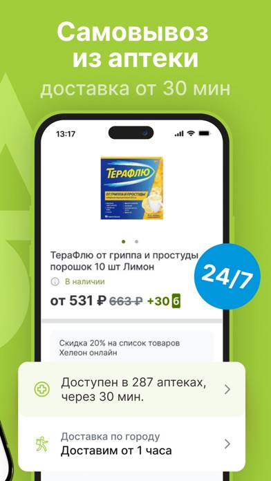
- #6Самовывоз из аптеки доставка от 30 мин
Captions read from the screenshots (OCR, may contain small errors): 5 headlines, 4.8 words on average (longest 7).
Screenshots


Icon palette
About this app
Интернет заказ и доставка лекарств из ваших любимых аптечных сетей. Доставка и заказ лекарств в сетях: • Супераптека (Superapteka.ru), • Аптеки «Озерки» • Аптеки «Самсон-Фарма», • Аптеки «Доктор Столетов», Аптеки «Радуга», • Аптеки «Первая Помощь» и другие. В приложении Супераптека можно заказать и получить на дом лекарства в таких городах и регионах России, как: Москва и область, Санкт-Петербург и Ленобласть, Новосибирск и область, Саратов и область, Краснодарский край, Вологда и область, Камчатский край, Красноярск, Пенза и область, Псков, Новая Адыгея, Ростов-на-Дону и область, Самара и область, Саранск, Ставропольский край, Тюмень, Ярославль, Тверь и область, Алтайский край, Владивосток и Приморский край (выберите регион после установки приложения). Кроме доставки доступен и самовывоз: оформляете заказ в приложении, а оплачиваете и забираете в удобное время в удобной аптеке. К…
App details
What you can learn from Супераптека: заказ лекарств
Every shipping app on the App Store has gone through the same decisions you're working through right now: which screenshot goes first, what caption sits over it, which device frame to show, what color the background should be. The 6 screenshots above are Супераптека: заказ лекарств's answers to those questions — they're public, they're real, and they made it through Apple's review.
What the numbers say: Супераптека: заказ лекарств runs a light set with one background colour (#A4CC3C) carried across every screenshot — the listing reads as a single poster when the shots sit side by side in search results. The accent colour we picked up, #0494DC, is the one to reuse for badges, arrows and highlighted words if you borrow this look. Hit Use this style to open the editor with these exact colours and drop your own screenshot in.
Notice the first screenshot in particular. It's the one users see in search results and on the product page, and it's where most apps spend their best caption and tightest design. Look at the proportion of background to phone, where the text sits, what one thing the image is trying to communicate.
Want to see how other Medical apps approach the same problem? Browse more Medical apps in the showcase.
Take what works into your own screenshots
Open LaunchShots and design your App Store & Google Play screenshots — pick a device frame, drop captions, ship in minutes. Free, in your browser.
Open the screenshot editor →Apps with a similar look
Closest background + accent colours among the listings we've analysed — useful when you want to see the same palette handled by a different team.