Screenshots


Icon palette
About this app
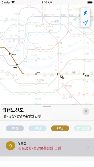
사용자 친화적인 UI/UX! 지하철 이용자 필수 앱! 깔끔한 노선도와 정확한 경로 안내, 지하철 내비게이션까지 지금 바로 경험해 보세요! ■ 노선도 - 최대 확대에서도 깨지지 않는 선명한 노선도 제공 - 경로 검색 결과를 노선도에서 한눈에 확인 가능 ■ 정확한 경로 안내 - 최단시간/최소환승 최대 5개의 추천 경로 제공 - 환승 시간, 빠른 환승, 내리는 문 등 기본 정보 제공 ■ 자세한 역 정보 - 위치 찾기 기능을 통해 현재 위치에서 가장 가까운 역을 확인할 수 있음 - 실시간 도착 정보 기능으로 몇 분 후 도착하는지 간편하게 확인 가능 - 주소, 출구 정보 및 시설 정보 제공 ■ 스케줄 - 실시간 열차 위치 기능으로 열차의 대략적인 위치를 확인할 수 있음 - 직관적인 공식 시간표를 통해 역 간 소요 시간을 노선도와 함께 확인할 수 있음 - 실시간 정보와 공식 시간표를 손쉽게 전환하며 확인할 수 있음 ■ 급행노선도 - 호선별,구간별로 정리된 급행 구간을 한눈에 확인할 수 있으며, 직관적인 급행 노선도를 제공 - 급행 구간만 별도로 노선도에서 쉽게 확…
App details
What you can learn from 지하철 노선도,경로 - 실시간 도착정보
Every shipping app on the App Store has gone through the same decisions you're working through right now: which screenshot goes first, what caption sits over it, which device frame to show, what color the background should be. The 5 screenshots above are 지하철 노선도,경로 - 실시간 도착정보's answers to those questions — they're public, they're real, and they made it through Apple's review.
Notice the first screenshot in particular. It's the one users see in search results and on the product page, and it's where most apps spend their best caption and tightest design. Look at the proportion of background to phone, where the text sits, what one thing the image is trying to communicate.
Want to see how other Navigation apps approach the same problem? Browse more Navigation apps in the showcase.
Take what works into your own screenshots
Open LaunchShots and design your App Store & Google Play screenshots — pick a device frame, drop captions, ship in minutes. Free, in your browser.
Open the screenshot editor →