Chart position — tracked daily by LaunchShots
Screenshot changes — detected by LaunchShots
Screenshot style breakdown
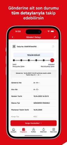
Sampled from 5 of Aras Kargo's App Store screenshots — background, accent and theme, measured by LaunchShots (not something Apple publishes).
#DC0C14 bg
#E02E34
#BC5454 accent
#FFFFFF text
Reading the caption text from the screenshots in your browser…
Screenshots



iPad screenshots


Icon palette
About this app
Türkiye’nin öncü ve yenilikçi kargo firması Aras Kargo’nun tüm imkân ve ayrıcalıkları, artık cebinizde! 900’e yakın şubesi, 4000’den fazla araç filosu, 14 bin kişilik kadrosuyla her ay 12 milyon kişiye hizmet götüren, Türkiye’nin en geniş dağıtım ağına sahip kuruluşu Aras Kargo, mobil uygulamasıyla kullanıcılarına ihtiyaç duydukları her hizmeti diledikleri zaman, diledikleri yerden ulaştırıyor. Ücretsiz indirip üye olarak kullanabileceğiniz Aras Kargo mobil uygulaması ile hızlı, pratik ve güvenli bir şekilde gerçekleştirebileceğiniz işlemlerden bazıları: • Kargo takip • E-ticaret takip • Geçmiş kargoların sorgulanması • En yakın şube bilgisi alma • Kurye çağırma • Kargo ücreti hesaplama Tüm bunların yanı sıra, uygulama sayesinde Aras Kargo’nun kaçırmamanız gereken indirim fırsatlarını ve kampanyalarını anında öğrenebilir, yeniliklerden ilk siz haberdar olabilirsiniz.
App details
What you can learn from Aras Kargo
Every shipping app on the App Store has gone through the same decisions you're working through right now: which screenshot goes first, what caption sits over it, which device frame to show, what color the background should be. The 10 screenshots above are Aras Kargo's answers to those questions — they're public, they're real, and they made it through Apple's review.
What the numbers say: Aras Kargo runs a mixed light-and-dark set where the background shifts from screenshot to screenshot (first shot #DC0C14) — each image has to stand on its own, so the captions carry more of the story. The accent colour we picked up, #BC5454, is the one to reuse for badges, arrows and highlighted words if you borrow this look. Hit Use this style to open the editor with these exact colours and drop your own screenshot in.
Notice the first screenshot in particular. It's the one users see in search results and on the product page, and it's where most apps spend their best caption and tightest design. Look at the proportion of background to phone, where the text sits, what one thing the image is trying to communicate.
Want to see how other Business apps approach the same problem? Browse more Business apps in the showcase.
Take what works into your own screenshots
Open LaunchShots and design your App Store & Google Play screenshots — pick a device frame, drop captions, ship in minutes. Free, in your browser.
Open the screenshot editor →Apps with a similar look
Closest background + accent colours among the listings we've analysed — useful when you want to see the same palette handled by a different team.