Chart position — tracked daily by LaunchShots
Screenshot style breakdown
Sampled from 6 of Running派's App Store screenshots — background, accent and theme, measured by LaunchShots (not something Apple publishes).
#FCFCFC bg
#DDDDDD
#DC7464 accent
#111111 text
Screenshots
Icon palette
About this app
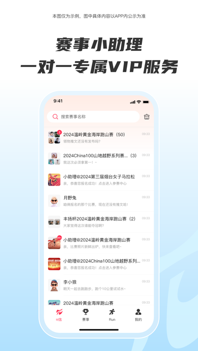
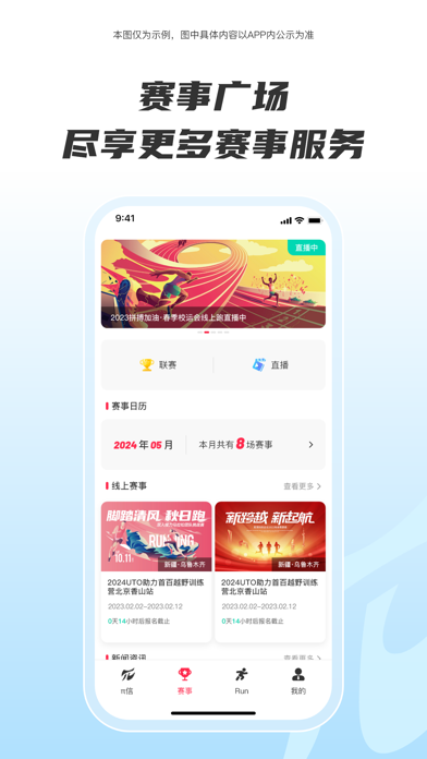
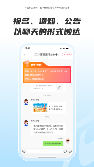
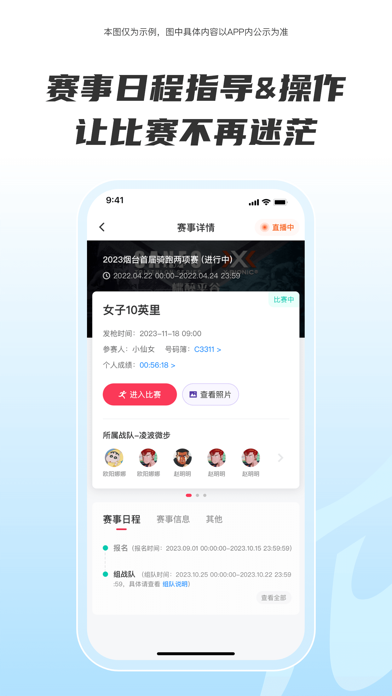
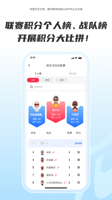
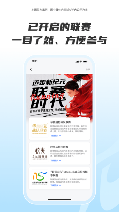
Running派,跑步爱好者的掌上乐园!多元的赛事活动精彩纷呈,从激情四射的线下马拉松、越野赛,到便捷自由的线上赛,满足不同跑者的需求。无论是专业跑者追求挑战,还是新手小白初涉跑步领域,都能找到属于自己的舞台。 核心功能强大而贴心:赛事一站式服务,从报名的便捷操作,到参赛过程中的贴心指引,再到赛后成绩、证书、照片的快速查询,全程无忧;丰富有趣的线上赛随时随地都能开启挑战;赛事交流群为大家搭建沟通桥梁,分享经验、交流心得;平台联赛激发你的竞争潜能,赢取丰厚奖励;赛事直播让你不错过每一场精彩赛事;赛事生涯记录你的每一次奔跑足迹,见证成长蜕变。快来下载 running 派 APP,拥抱活力跑步生活!
App details
What you can learn from Running派
Every shipping app on the App Store has gone through the same decisions you're working through right now: which screenshot goes first, what caption sits over it, which device frame to show, what color the background should be. The 6 screenshots above are Running派's answers to those questions — they're public, they're real, and they made it through Apple's review.
What the numbers say: Running派 runs a light set with one background colour (#FCFCFC) carried across every screenshot — the listing reads as a single poster when the shots sit side by side in search results. The accent colour we picked up, #DC7464, is the one to reuse for badges, arrows and highlighted words if you borrow this look. Hit Use this style to open the editor with these exact colours and drop your own screenshot in.
Notice the first screenshot in particular. It's the one users see in search results and on the product page, and it's where most apps spend their best caption and tightest design. Look at the proportion of background to phone, where the text sits, what one thing the image is trying to communicate.
Want to see how other Sports apps approach the same problem? Browse more Sports apps in the showcase.
Take what works into your own screenshots
Open LaunchShots and design your App Store & Google Play screenshots — pick a device frame, drop captions, ship in minutes. Free, in your browser.
Open the screenshot editor →Apps with a similar look
Closest background + accent colours among the listings we've analysed — useful when you want to see the same palette handled by a different team.