Chart position — tracked daily by LaunchShots
Screenshot changes — detected by LaunchShots
Screenshot style breakdown
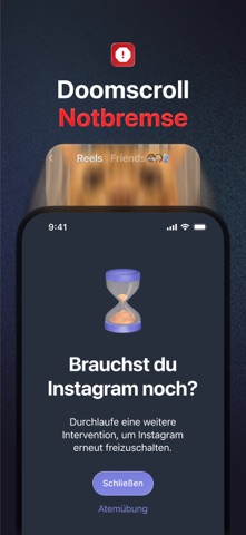
Sampled from 6 of one sec | App Zeitlimit Sperre's App Store screenshots — background, accent and theme, measured by LaunchShots (not something Apple publishes).
#142C4C bg
#344965
#BC2424 accent
#FFFFFF text
Screenshots




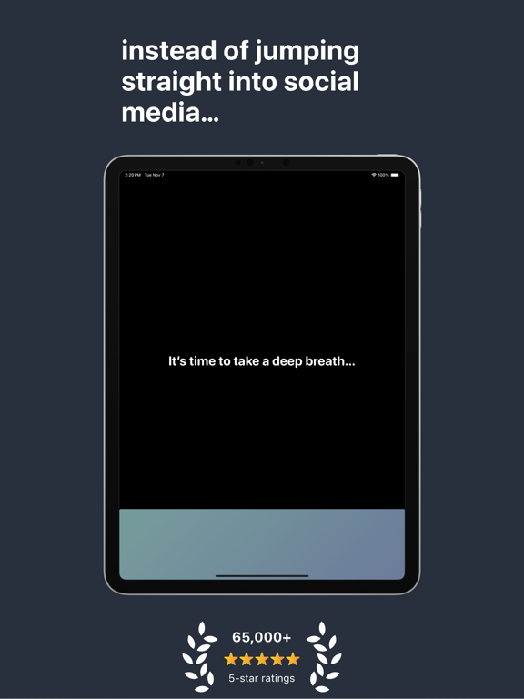
iPad screenshots



Icon palette
About this app
Willenskraft allein reicht gegen die Social Media Algorithmen nicht aus. Deshalb habe ich one sec programmiert: one sec fügt ablenkenden Apps bewusst eine Verzögerung hinzu, sodass sie langfristig weniger attraktiv werden. Und es funktioniert wirklich: In wissenschaftlichen Studien mit dem Max-Planck-Institut, mit der deutschen und der dänischen Regierung sowie in vielen weiteren wissenschaftlichen Kooperationen konnten wir zeigen: one sec hat enorme Auswirkungen auf deine Bildschirmzeit: Die Nutzung von Apps sinkt im Durchschnitt um 57 %! …lies einfach die App Store Bewertungen oder probiere one sec selber aus, wenn du mir nicht glaubst (…du solltest es wirklich ausprobieren ;) ). Worin unterscheidet sich one sec von Bildschirmzeit-Limits oder App-Blockern? • one sec verzögert den Zugriff auf ablenkende Apps, statt sie komplett zu blockieren – ein wichtiger psychologischer Unter…
App details
What you can learn from one sec | App Zeitlimit Sperre
Every shipping app on the App Store has gone through the same decisions you're working through right now: which screenshot goes first, what caption sits over it, which device frame to show, what color the background should be. The 18 screenshots above are one sec | App Zeitlimit Sperre's answers to those questions — they're public, they're real, and they made it through Apple's review.
What the numbers say: one sec | App Zeitlimit Sperre runs a dark set with one background colour (#142C4C) carried across every screenshot — the listing reads as a single poster when the shots sit side by side in search results. The accent colour we picked up, #BC2424, is the one to reuse for badges, arrows and highlighted words if you borrow this look. Hit Use this style to open the editor with these exact colours and drop your own screenshot in.
Notice the first screenshot in particular. It's the one users see in search results and on the product page, and it's where most apps spend their best caption and tightest design. Look at the proportion of background to phone, where the text sits, what one thing the image is trying to communicate.
Want to see how other Productivity apps approach the same problem? Browse more Productivity apps in the showcase.
Take what works into your own screenshots
Open LaunchShots and design your App Store & Google Play screenshots — pick a device frame, drop captions, ship in minutes. Free, in your browser.
Open the screenshot editor →Apps with a similar look
Closest background + accent colours among the listings we've analysed — useful when you want to see the same palette handled by a different team.