Chart position — tracked daily by LaunchShots
Screenshot style breakdown
Sampled from 6 of Domonap's App Store screenshots — background, accent and theme, measured by LaunchShots (not something Apple publishes).
#F4F4F4 bg
#D6D6D6
#FC4424 accent
#111111 text
Screenshots



Icon palette
About this app
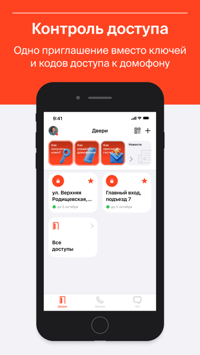
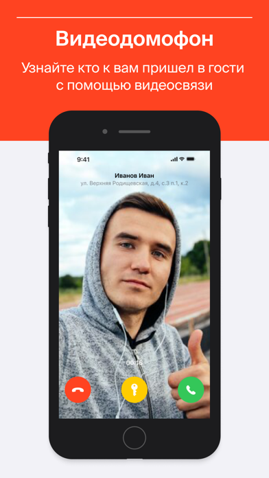
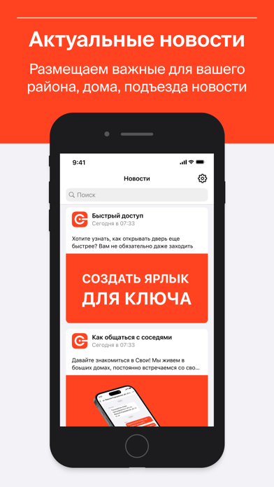
Domonap — это цифровой сервис, объединяющий все функции умного дома, ЖК, на экране вашего смартфона. Управляйте доступом в свой подъезд и на общих территориях ЖК из любой точки мира, принимайте видео-звонки от ваших посетителей, ходите в гости и приглашайте друзей к себе, используя электронные ключи! Больше не нужно запоминать, вводить коды доступа или идти к трубке домофона, чтобы открыть дверь своим гостям. Сервис "Свои!" поможет управлять доступом в подъезд прямо из мобильного приложения. Вы больше не пропустите важную информацию, даже в отъезде, благодаря электронной информационной доске и ленте новостей. Все жильцы ЖК смогут общаться и решать вопросы онлайн со своими соседями в приватных и групповых онлайн чатах. ВАШИ ВОЗМОЖНОСТИ: • Видео-вызов Вы всегда сможете увидеть кто хочет попасть в подъезд. Как это работает? Ваш гость подходить к подъезду, выбирает квартиру и сове…
App details
What you can learn from Domonap
Every shipping app on the App Store has gone through the same decisions you're working through right now: which screenshot goes first, what caption sits over it, which device frame to show, what color the background should be. The 6 screenshots above are Domonap's answers to those questions — they're public, they're real, and they made it through Apple's review.
What the numbers say: Domonap runs a light set with one background colour (#F4F4F4) carried across every screenshot — the listing reads as a single poster when the shots sit side by side in search results. The accent colour we picked up, #FC4424, is the one to reuse for badges, arrows and highlighted words if you borrow this look. Hit Use this style to open the editor with these exact colours and drop your own screenshot in.
Notice the first screenshot in particular. It's the one users see in search results and on the product page, and it's where most apps spend their best caption and tightest design. Look at the proportion of background to phone, where the text sits, what one thing the image is trying to communicate.
Want to see how other Lifestyle apps approach the same problem? Browse more Lifestyle apps in the showcase.
Take what works into your own screenshots
Open LaunchShots and design your App Store & Google Play screenshots — pick a device frame, drop captions, ship in minutes. Free, in your browser.
Open the screenshot editor →Apps with a similar look
Closest background + accent colours among the listings we've analysed — useful when you want to see the same palette handled by a different team.