Chart position — tracked daily by LaunchShots
Screenshot style breakdown
Sampled from 6 of 写真まとめて回転's App Store screenshots — background, accent and theme, measured by LaunchShots (not something Apple publishes).
#646464 bg
#797979
#EC8C0C accent
#FFFFFF text
Screenshots


Icon palette
About this app
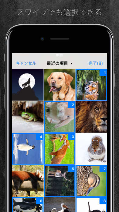
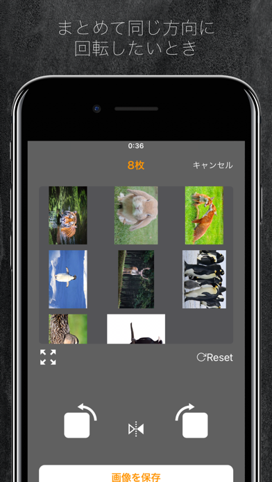
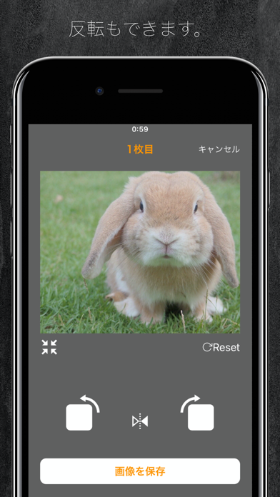
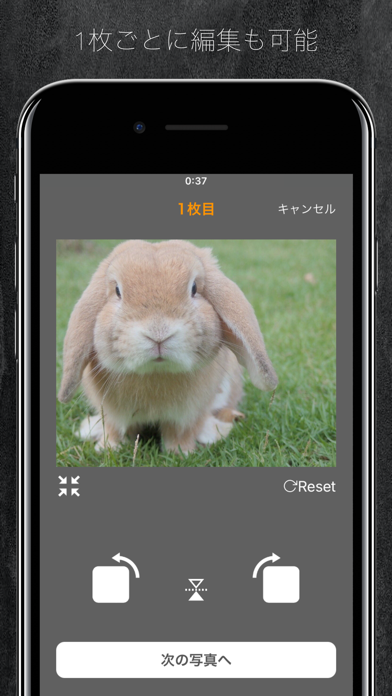
写真を撮ったけど向きが横になってしまった。 そんなことありますよね。 このアプリはそんな横向き、逆さまになってしまった写真などをカンタンに一括で回転させることができるアプリです。 iPhoneの純正写真アプリだと1つずつだしボタンを何回も押さないといけないので時間がかかってしまいますが、 このアプリを使えば大幅に時間を節約できます。 もちろん1つずつの回転にも対応しているので、1,2枚の写真でも気軽に回転できます! その他の機能 ・スワイプでカンタンにまとめて選択 ・ミラー(写真を反転)にすることも可能 ぜひ日常での利用、イラスト、画像編集、開発などにもお役に立てくださいませ。
App details
What you can learn from 写真まとめて回転
Every shipping app on the App Store has gone through the same decisions you're working through right now: which screenshot goes first, what caption sits over it, which device frame to show, what color the background should be. The 6 screenshots above are 写真まとめて回転's answers to those questions — they're public, they're real, and they made it through Apple's review.
What the numbers say: 写真まとめて回転 runs a mixed light-and-dark set where the background shifts from screenshot to screenshot (first shot #646464) — each image has to stand on its own, so the captions carry more of the story. The accent colour we picked up, #EC8C0C, is the one to reuse for badges, arrows and highlighted words if you borrow this look. Hit Use this style to open the editor with these exact colours and drop your own screenshot in.
Notice the first screenshot in particular. It's the one users see in search results and on the product page, and it's where most apps spend their best caption and tightest design. Look at the proportion of background to phone, where the text sits, what one thing the image is trying to communicate.
Want to see how other Developer Tools apps approach the same problem? Browse more Developer Tools apps in the showcase.
Take what works into your own screenshots
Open LaunchShots and design your App Store & Google Play screenshots — pick a device frame, drop captions, ship in minutes. Free, in your browser.
Open the screenshot editor →Apps with a similar look
Closest background + accent colours among the listings we've analysed — useful when you want to see the same palette handled by a different team.