Chart position — tracked daily by LaunchShots
Screenshot style breakdown
Sampled from 5 of 14 Дней Прогноз Погоды's App Store screenshots — background, accent and theme, measured by LaunchShots (not something Apple publishes).
#645C64 bg
#797279
#D45C14 accent
#FFFFFF text
Screenshots

iPad screenshots

Icon palette
About this app
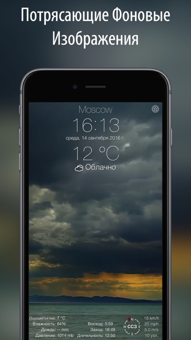
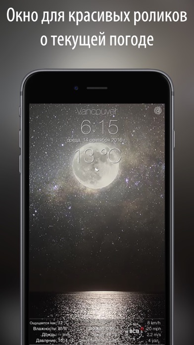
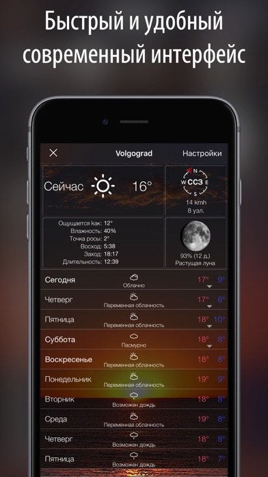
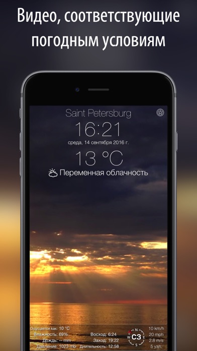
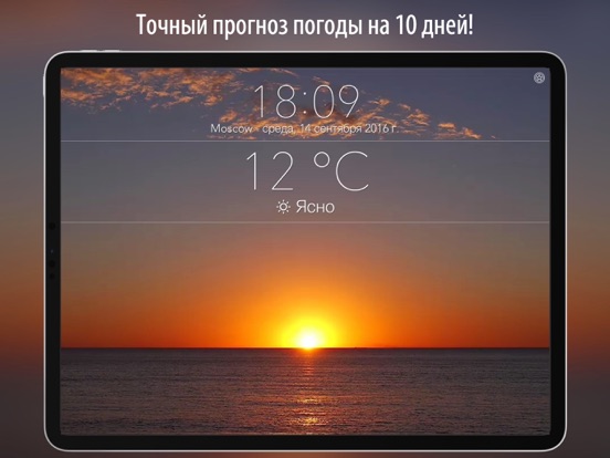
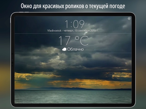
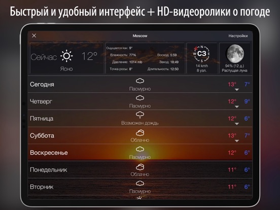
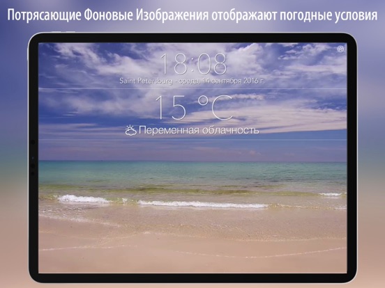
Всегда будьте на шаг впереди погоды с нашим приложением 14 Дней Прогноз Погоды. Учитывайте прогноз погоды, планируя выходные, вечеринку, спортивное соревнование или поездку на природу. Потрясающие сцены погодных явлений в высоком разрешении делают данное приложение идеальным выбором для офисного стола, прикроватной тумбочки или полки в гостиной. Широкий выбор анимированных фонов в высоком разрешении, которые можно выбирать в соответствии с текущими погодными условиями, вашим настроением или случайным образом. Прекрасные океанские пейзажи, успокаивающие сцены дождя, воздушный туман, волшебные грозовые облака оживляют прогноз погоды на вашем экране. Особенности: + Подробный прогноз на 14 дней, который можно открыть одним касанием. + Почасовой прогноз на 14 дня. + Эстетичный экран с информацией о погодных условиях на данный момент и анимированным фоном, выбираемым в соответствии с …
App details
What you can learn from 14 Дней Прогноз Погоды
Every shipping app on the App Store has gone through the same decisions you're working through right now: which screenshot goes first, what caption sits over it, which device frame to show, what color the background should be. The 10 screenshots above are 14 Дней Прогноз Погоды's answers to those questions — they're public, they're real, and they made it through Apple's review.
What the numbers say: 14 Дней Прогноз Погоды runs a dark set where the background shifts from screenshot to screenshot (first shot #645C64) — each image has to stand on its own, so the captions carry more of the story. The accent colour we picked up, #D45C14, is the one to reuse for badges, arrows and highlighted words if you borrow this look. Hit Use this style to open the editor with these exact colours and drop your own screenshot in.
Notice the first screenshot in particular. It's the one users see in search results and on the product page, and it's where most apps spend their best caption and tightest design. Look at the proportion of background to phone, where the text sits, what one thing the image is trying to communicate.
Want to see how other Weather apps approach the same problem? Browse more Weather apps in the showcase.
Take what works into your own screenshots
Open LaunchShots and design your App Store & Google Play screenshots — pick a device frame, drop captions, ship in minutes. Free, in your browser.
Open the screenshot editor →Apps with a similar look
Closest background + accent colours among the listings we've analysed — useful when you want to see the same palette handled by a different team.