Chart position — tracked daily by LaunchShots
Screenshot style breakdown
Sampled from 6 of moviLink 本格カーナビでドライブを快適に's App Store screenshots — background, accent and theme, measured by LaunchShots (not something Apple publishes).
#FCFCFC bg
#DDDDDD
#6C9CFC accent
#111111 text
Screenshots




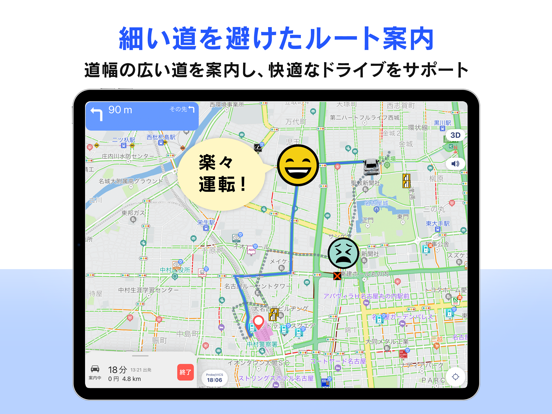
iPad screenshots



Icon palette
About this app
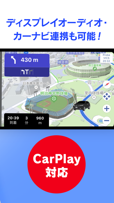
今日も、明日も、安心で快適なお出かけをサポートします。 日々進化を続ける無料ナビアプリ、「moviLink」。 みなさまから寄せられるお声を大切にしながら、アップデートをかさねています。 ----------------------------------------- ・安心して走行できるルート案内 ・シンプルで見やすい地図情報 ・目的地への正確な到着時刻を提供 ・Apple CarPlay対応 ・現在地アイコンの変更が可能 ----------------------------------------- ◆基本機能◆ ・「道幅の広い道」を優先してご案内 地図の自動拡大や最適なタイミングでのお知らせなど、 きめ細やかにドライブをサポートします。 ・「シンプルで見やすい地図」をご提供 道路や建物は種類ごとに色分け。無料で最新情報に自動更新されます。 ・トヨタ独自の「Tプローブ交通情報」と道路交通情報通信システム「VICS」 リアルタイムでの混雑状況をもとに、精度の高い到着予想時刻とともに最適ルートをご提案します。 ・「Apple CarPlay」でよりいっそう快適に みなさまのリクエストが多く寄せられた人気機能。 アプ…
App details
What you can learn from moviLink 本格カーナビでドライブを快適に
Every shipping app on the App Store has gone through the same decisions you're working through right now: which screenshot goes first, what caption sits over it, which device frame to show, what color the background should be. The 18 screenshots above are moviLink 本格カーナビでドライブを快適に's answers to those questions — they're public, they're real, and they made it through Apple's review.
What the numbers say: moviLink 本格カーナビでドライブを快適に runs a light set with one background colour (#FCFCFC) carried across every screenshot — the listing reads as a single poster when the shots sit side by side in search results. The accent colour we picked up, #6C9CFC, is the one to reuse for badges, arrows and highlighted words if you borrow this look. Hit Use this style to open the editor with these exact colours and drop your own screenshot in.
Notice the first screenshot in particular. It's the one users see in search results and on the product page, and it's where most apps spend their best caption and tightest design. Look at the proportion of background to phone, where the text sits, what one thing the image is trying to communicate.
Want to see how other Navigation apps approach the same problem? Browse more Navigation apps in the showcase.
Take what works into your own screenshots
Open LaunchShots and design your App Store & Google Play screenshots — pick a device frame, drop captions, ship in minutes. Free, in your browser.
Open the screenshot editor →Apps with a similar look
Closest background + accent colours among the listings we've analysed — useful when you want to see the same palette handled by a different team.