Screenshot style breakdown
Sampled from 6 of かぞくのおさいふアプリ's App Store screenshots — background, accent and theme, measured by LaunchShots (not something Apple publishes).
#DCF4EC bg
#C1D6CF
#FCB474 accent
#111111 text
Screenshots


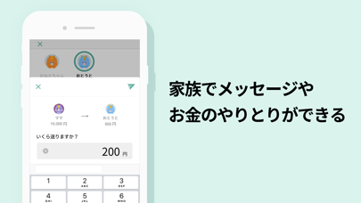
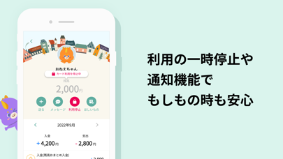


iPad screenshots


Icon palette
About this app
三井住友カードが提供する、Visaプリペイドカード「かぞくのおさいふ」の管理ができます。 夫婦の家計管理から、子供のおこづかいの管理まで、これ1つで簡単に! カードをお持ちでない方も、おこづかい帳としてご利用できます。 ■■■主な特徴■■■ 【家族のお金の管理が簡単にできる!】 ・家族の残高からご利用明細まで、一目で確認できます。 ・家族とのお金のやり取りもアプリで簡単に。 ・毎月の入出金額の確認ができ、お金の使いすぎもすぐに分かります。 ・ご利用明細にメモやアイコンを記入して、支出の内容を記録できます。 ・支出の内訳がグラフで表示され、用途の振り返りができます。 【安心して利用できる!】 ・カードの一時利用停止機能で、万が一のカードの紛失時にも安心です。 ・カード利用時の通知で、家族の見守りもできます。 【楽しく使える!】 ・メッセージ機能で、家族との会話から写真の共有までできます。 ・かぞくかいじゅう「みーモン」がお金の管理を見守り、サポートします。 ・ほしいものを登録し、おこづかいの使い道を楽し…
App details
What you can learn from かぞくのおさいふアプリ
Every shipping app on the App Store has gone through the same decisions you're working through right now: which screenshot goes first, what caption sits over it, which device frame to show, what color the background should be. The 8 screenshots above are かぞくのおさいふアプリ's answers to those questions — they're public, they're real, and they made it through Apple's review.
What the numbers say: かぞくのおさいふアプリ runs a light set with one background colour (#DCF4EC) carried across every screenshot — the listing reads as a single poster when the shots sit side by side in search results. The accent colour we picked up, #FCB474, is the one to reuse for badges, arrows and highlighted words if you borrow this look. Hit Use this style to open the editor with these exact colours and drop your own screenshot in.
Notice the first screenshot in particular. It's the one users see in search results and on the product page, and it's where most apps spend their best caption and tightest design. Look at the proportion of background to phone, where the text sits, what one thing the image is trying to communicate.
Want to see how other Finance apps approach the same problem? Browse more Finance apps in the showcase.
Take what works into your own screenshots
Open LaunchShots and design your App Store & Google Play screenshots — pick a device frame, drop captions, ship in minutes. Free, in your browser.
Open the screenshot editor →Apps with a similar look
Closest background + accent colours among the listings we've analysed — useful when you want to see the same palette handled by a different team.