Chart position — tracked daily by LaunchShots
Screenshot changes — detected by LaunchShots
Screenshot style breakdown
Sampled from 6 of ニッポンレンタカーアプリ's App Store screenshots — background, accent and theme, measured by LaunchShots (not something Apple publishes).
#ECECEC bg
#CFCFCF
#F46C6C accent
#111111 text
Reading the caption text from the screenshots in your browser…
Screenshots




Icon palette
About this app
ニッポンレンタカーアプリで、レンタカー予約がもっとスムーズに! ※アプリサービスご契約中のNBM以外の法人会員様はアプリをご利用いただけません※ ニッポンレンタカーアプリは、簡単検索&お得な予約ができる便利なツールです。 アプリからの予約ならベストレート!ニッポンレンタカーメンバーズクラブに無料登録すると、最もお得な料金でレンタカーをご利用いただけます。 ●ニッポンレンタカーの魅力 全国ネットワーク:空港や新幹線駅を幅広くカバー! 豊富な車種ラインナップ:乗用車、ワゴン車など目的に合わせて選べる! 標準装備:ナビ・ETC車載器付きで安心・快適なドライブをサポート! 旅行、出張、引っ越し、イベントなど、さまざまなシーンで活躍します。 ●アプリの特徴 簡単予約:スムーズな操作でストレスフリー! 重要事項の事前確認:出発手続きが簡略化! おきまり予約:以前の条件を使って素早く予約可能! 超得ワンウェイ:アプリ&ゴールド会員限定のお得な乗捨プランが予約できる! お得なクーポン:アプリ限定の割引で…
App details
What you can learn from ニッポンレンタカーアプリ
Every shipping app on the App Store has gone through the same decisions you're working through right now: which screenshot goes first, what caption sits over it, which device frame to show, what color the background should be. The 6 screenshots above are ニッポンレンタカーアプリ's answers to those questions — they're public, they're real, and they made it through Apple's review.
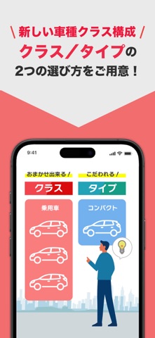
What the numbers say: ニッポンレンタカーアプリ runs a mixed light-and-dark set where the background shifts from screenshot to screenshot (first shot #ECECEC) — each image has to stand on its own, so the captions carry more of the story. The accent colour we picked up, #F46C6C, is the one to reuse for badges, arrows and highlighted words if you borrow this look. Hit Use this style to open the editor with these exact colours and drop your own screenshot in.
Notice the first screenshot in particular. It's the one users see in search results and on the product page, and it's where most apps spend their best caption and tightest design. Look at the proportion of background to phone, where the text sits, what one thing the image is trying to communicate.
Want to see how other Travel apps approach the same problem? Browse more Travel apps in the showcase.
Take what works into your own screenshots
Open LaunchShots and design your App Store & Google Play screenshots — pick a device frame, drop captions, ship in minutes. Free, in your browser.
Open the screenshot editor →Apps with a similar look
Closest background + accent colours among the listings we've analysed — useful when you want to see the same palette handled by a different team.