Chart position — tracked daily by LaunchShots
Screenshot style breakdown
Sampled from 6 of オイテル's App Store screenshots — background, accent and theme, measured by LaunchShots (not something Apple publishes).
#FCFCFC bg
#DDDDDD
#F494BC accent
#111111 text
Screenshots

Icon palette
About this app
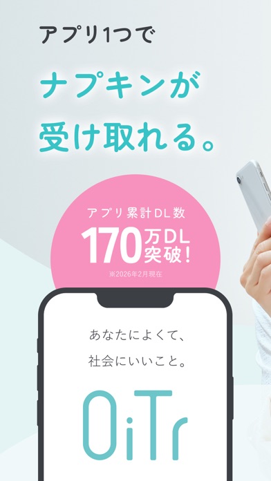
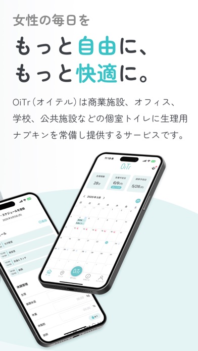
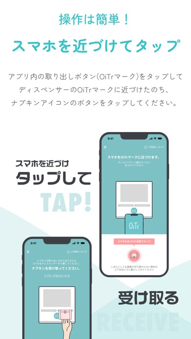
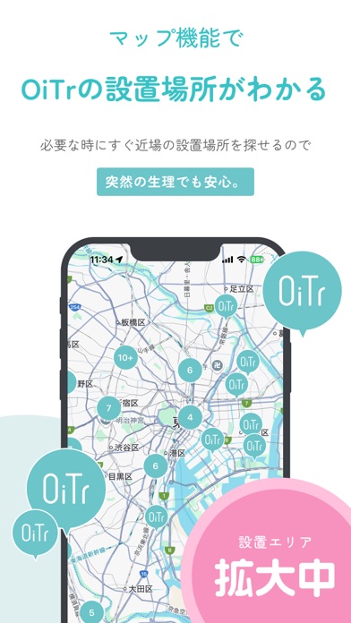
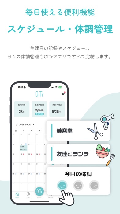
\OiTr(オイテル)公式アプリは、累計170万ダウンロード突破!/ OiTrは個室トイレに生理用ナプキンを常備し無料で提供する日本初のサービスです。 アプリでは「生理用ナプキンの受け取り」「生理日の管理と予測」「体調管理」などがご利用いただけます。 ■ナプキン受け取り **ご利用方法** 1) OiTrアプリ(無料)をインストールします。 2)アプリを起動し、アプリ画面の取り出しボタン(緑色)をタップします。 3) アプリ画面を開いたまま、スマートフォンをディスペンサーのOiTrのロゴマーク (緑色) に近づけてください。 4)スマートフォンを近づけたまま、「取り出し」ボタン(ピンク色)をタップします。 5)「ナプキンをリクエスト中」の画面が表示されるまでディスペンサーからスマートフォンを離さないでください。 6)通信が完了すると、左右の排出口のいずれかからナプキンが1枚出てきます。 7) 排出口から出てきたナプキンを手で引き抜いてご使用ください。 ~必要とする人に生理用品が行き届くように~ **初回はユーザー登録不要** 初めてナプキ…
App details
What you can learn from オイテル
Every shipping app on the App Store has gone through the same decisions you're working through right now: which screenshot goes first, what caption sits over it, which device frame to show, what color the background should be. The 7 screenshots above are オイテル's answers to those questions — they're public, they're real, and they made it through Apple's review.
What the numbers say: オイテル runs a light set with one background colour (#FCFCFC) carried across every screenshot — the listing reads as a single poster when the shots sit side by side in search results. The accent colour we picked up, #F494BC, is the one to reuse for badges, arrows and highlighted words if you borrow this look. Hit Use this style to open the editor with these exact colours and drop your own screenshot in.
Notice the first screenshot in particular. It's the one users see in search results and on the product page, and it's where most apps spend their best caption and tightest design. Look at the proportion of background to phone, where the text sits, what one thing the image is trying to communicate.
Want to see how other Health & Fitness apps approach the same problem? Browse more Health & Fitness apps in the showcase.
Take what works into your own screenshots
Open LaunchShots and design your App Store & Google Play screenshots — pick a device frame, drop captions, ship in minutes. Free, in your browser.
Open the screenshot editor →Apps with a similar look
Closest background + accent colours among the listings we've analysed — useful when you want to see the same palette handled by a different team.