Chart position — tracked daily by LaunchShots
Screenshot style breakdown
Sampled from 6 of QOLism(キュオリズム)'s App Store screenshots — background, accent and theme, measured by LaunchShots (not something Apple publishes).
#FCFCFC bg
#DDDDDD
#3CCCDC accent
#111111 text
Screenshots
Icon palette
About this app
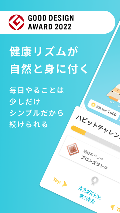
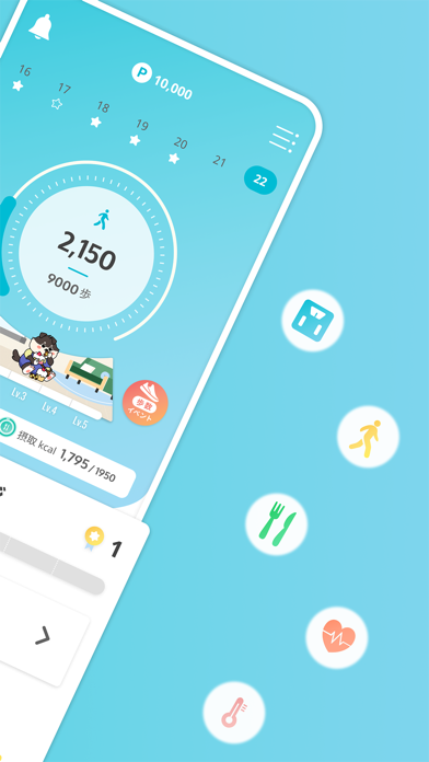
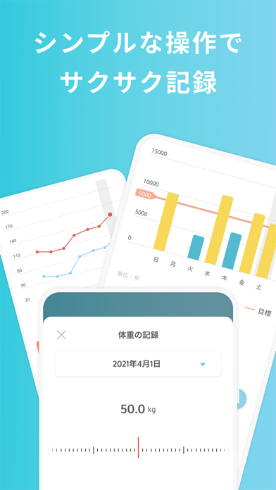
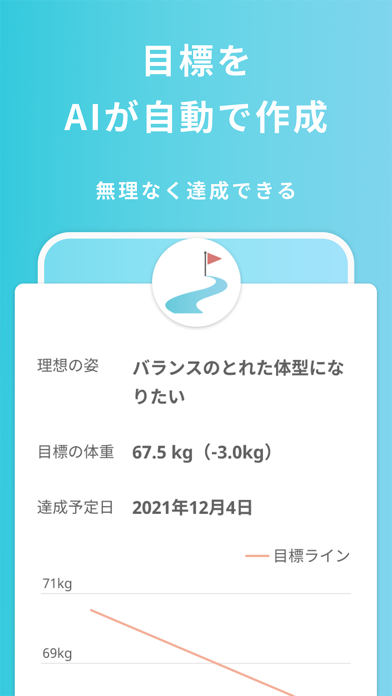
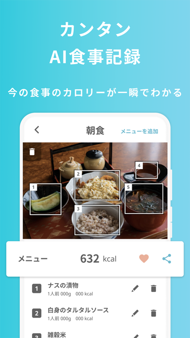
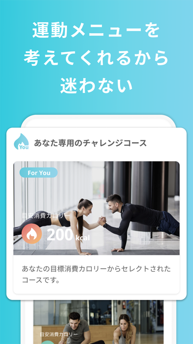
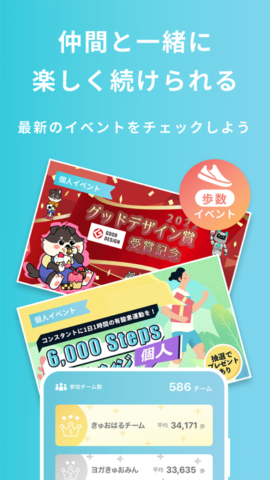
--------------------------- 「QOLism」は、健保組合・企業の従業員の方やそのご家族、市町村の自治体や団体の会員のみなさま向けの健康アプリです。 ご利用になるには、パスコードが必要です。 --------------------------- 「健康になればいいことぐらい私だってわかってる」 頭でわかっていても、健康にいいことを始めるってなんだか腰が重い。そういうとき、ありますよね。 QOLismは、健康的な生活習慣=「健康リズム」が自然と身に付く そんなあなたへのアプリです。 「どうせやることいっぱいなんでしょ?我慢ばかりは続かないよ。」 大丈夫、たくさんのことに追われる必要はありません。 QOLismは認知行動療法などのメソッドを取り入れ、少しずつ習慣が身に付くように設計されています。 シンプルだからこそ、習慣になり目標に辿り着けるんです。 健康リズムを手に入れたとき、理想のあなたは、どんなことをしたいですか? 本気で変わりたい人から、今の状態に満足な人まで、みんなで楽しく使える健康アプリが誕生しました。 -------------------------…
App details
What you can learn from QOLism(キュオリズム)
Every shipping app on the App Store has gone through the same decisions you're working through right now: which screenshot goes first, what caption sits over it, which device frame to show, what color the background should be. The 8 screenshots above are QOLism(キュオリズム)'s answers to those questions — they're public, they're real, and they made it through Apple's review.
What the numbers say: QOLism(キュオリズム) runs a light set where the background shifts from screenshot to screenshot (first shot #FCFCFC) — each image has to stand on its own, so the captions carry more of the story. The accent colour we picked up, #3CCCDC, is the one to reuse for badges, arrows and highlighted words if you borrow this look. Hit Use this style to open the editor with these exact colours and drop your own screenshot in.
Notice the first screenshot in particular. It's the one users see in search results and on the product page, and it's where most apps spend their best caption and tightest design. Look at the proportion of background to phone, where the text sits, what one thing the image is trying to communicate.
Want to see how other Health & Fitness apps approach the same problem? Browse more Health & Fitness apps in the showcase.
Take what works into your own screenshots
Open LaunchShots and design your App Store & Google Play screenshots — pick a device frame, drop captions, ship in minutes. Free, in your browser.
Open the screenshot editor →Apps with a similar look
Closest background + accent colours among the listings we've analysed — useful when you want to see the same palette handled by a different team.