Chart position — tracked daily by LaunchShots
Screenshot style breakdown
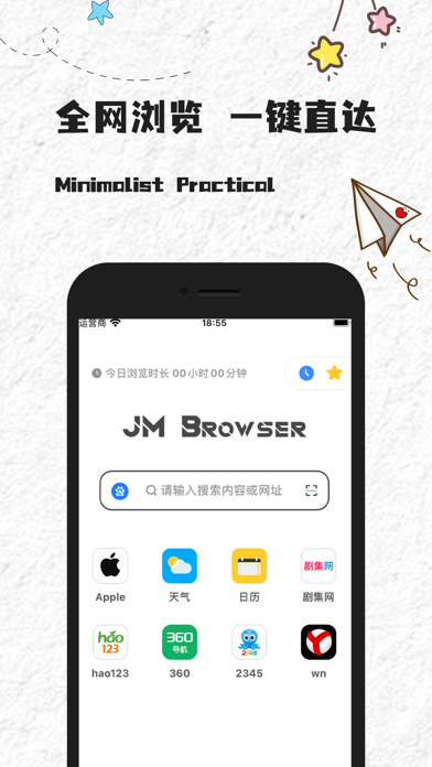
Sampled from 3 of JM浏览器 全球版's App Store screenshots — background, accent and theme, measured by LaunchShots (not something Apple publishes).
#FCFCFC bg
#DDDDDD
#FCCC2C accent
#111111 text
Screenshots


Icon palette
About this app
一款备受好评的网络浏览器. 产品设计人性化, 界面清新, 功能简洁, 运行流畅, 处处都有惊喜的体验. 温馨提示: 1. 主页 '收藏/历史' 是悬浮按钮, 可根据使用习惯调整其位置. 2. 开启'无图模式'可能导致个别网站白屏无法预览, 关闭'无图模式'即可正常预览.
App details
What you can learn from JM浏览器 全球版
Every shipping app on the App Store has gone through the same decisions you're working through right now: which screenshot goes first, what caption sits over it, which device frame to show, what color the background should be. The 3 screenshots above are JM浏览器 全球版's answers to those questions — they're public, they're real, and they made it through Apple's review.
What the numbers say: JM浏览器 全球版 runs a light set with one background colour (#FCFCFC) carried across every screenshot — the listing reads as a single poster when the shots sit side by side in search results. The accent colour we picked up, #FCCC2C, is the one to reuse for badges, arrows and highlighted words if you borrow this look. Hit Use this style to open the editor with these exact colours and drop your own screenshot in.
Notice the first screenshot in particular. It's the one users see in search results and on the product page, and it's where most apps spend their best caption and tightest design. Look at the proportion of background to phone, where the text sits, what one thing the image is trying to communicate.
Want to see how other Reference apps approach the same problem? Browse more Reference apps in the showcase.
Take what works into your own screenshots
Open LaunchShots and design your App Store & Google Play screenshots — pick a device frame, drop captions, ship in minutes. Free, in your browser.
Open the screenshot editor →Apps with a similar look
Closest background + accent colours among the listings we've analysed — useful when you want to see the same palette handled by a different team.