Chart position — tracked daily by LaunchShots
Screenshot style breakdown
Sampled from 6 of АнтиРадар GPS: радар камер's App Store screenshots — background, accent and theme, measured by LaunchShots (not something Apple publishes).
#047CFC bg
#278EFC
#6C84E4 accent
#FFFFFF text
Screenshots
Icon palette
About this app
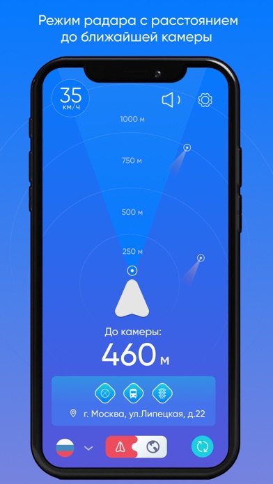
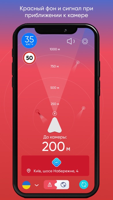
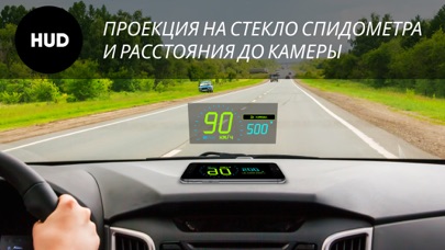
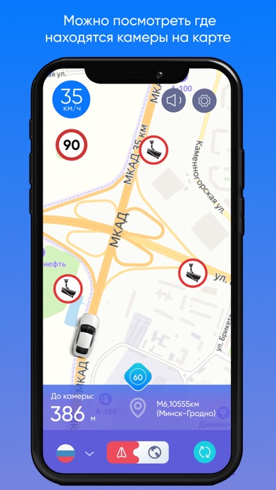
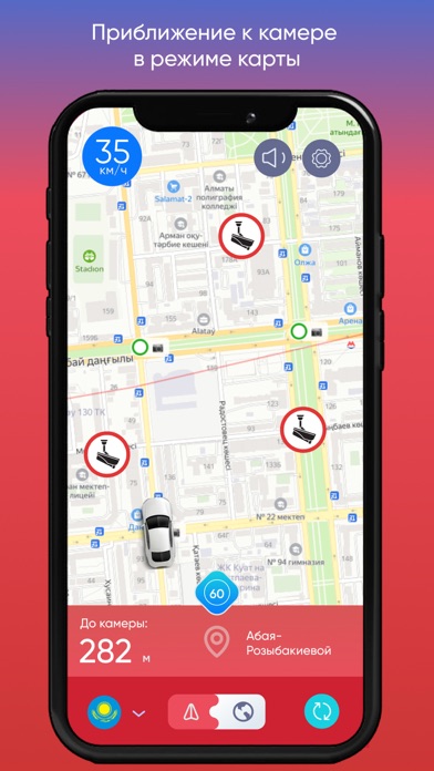
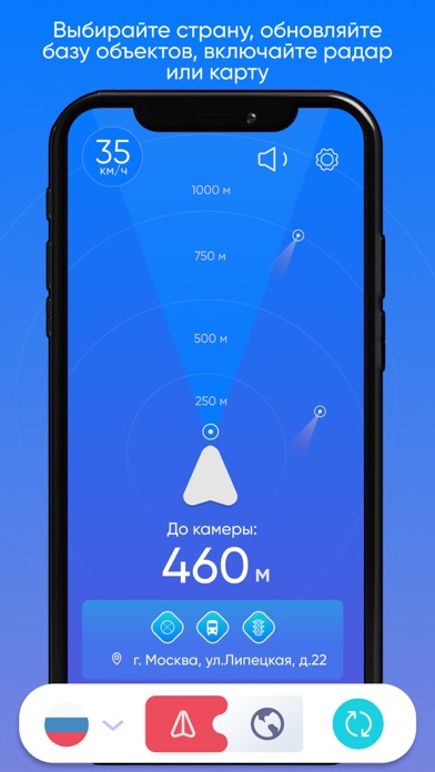
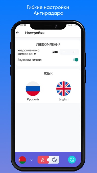
Лучший бесплатный (free) АнтиРадар с функцией GPS радар детектора и карты камер для России, Украины, Беларуси, Казахстана, Кыргызстана, Узбекистана! Приложение поддерживает фоновый режим работы. HUD (Head-up Display) - проекция на лобовое стекло спидометра и расстояния до камер фотовидеофиксации, очень удобно использовать в вечернее и темное время суток. Режим Радара и Карты Антирадара предупредит Вас о тысячах камер на дорогах и избавит от штрафов, если впереди есть камера. Используйте Антирадар, обновляйте базу по камерам в Вашей стране в любое удобное время (всего несколько секунд и наличие Интернета), узнавайте о камерах на дорогах онлайн. База радаров в данном приложении - это официальные данные с государственных баз ГИБДД (ГАИ, Полиции), которым можно доверять. Россия - более 28500 камер из базы ГИБДД во всех регионах, крупных городах и на основных дорогах. Speed и стоп радар…
App details
What you can learn from АнтиРадар GPS: радар камер
Every shipping app on the App Store has gone through the same decisions you're working through right now: which screenshot goes first, what caption sits over it, which device frame to show, what color the background should be. The 7 screenshots above are АнтиРадар GPS: радар камер's answers to those questions — they're public, they're real, and they made it through Apple's review.
What the numbers say: АнтиРадар GPS: радар камер runs a mixed light-and-dark set where the background shifts from screenshot to screenshot (first shot #047CFC) — each image has to stand on its own, so the captions carry more of the story. The accent colour we picked up, #6C84E4, is the one to reuse for badges, arrows and highlighted words if you borrow this look. Hit Use this style to open the editor with these exact colours and drop your own screenshot in.
Notice the first screenshot in particular. It's the one users see in search results and on the product page, and it's where most apps spend their best caption and tightest design. Look at the proportion of background to phone, where the text sits, what one thing the image is trying to communicate.
Want to see how other Navigation apps approach the same problem? Browse more Navigation apps in the showcase.
Take what works into your own screenshots
Open LaunchShots and design your App Store & Google Play screenshots — pick a device frame, drop captions, ship in minutes. Free, in your browser.
Open the screenshot editor →Apps with a similar look
Closest background + accent colours among the listings we've analysed — useful when you want to see the same palette handled by a different team.