Chart position — tracked daily by LaunchShots
Screenshot changes — detected by LaunchShots
Screenshot style breakdown
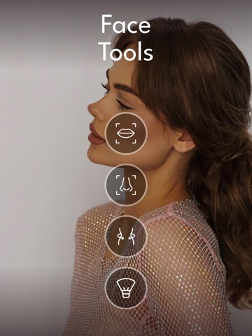
Sampled from 6 of Persona: Beauty Camera's App Store screenshots — background, accent and theme, measured by LaunchShots (not something Apple publishes).
#040404 bg
#272727
#CC947C accent
#FFFFFF text
Screenshots
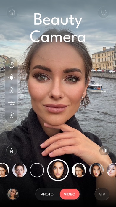
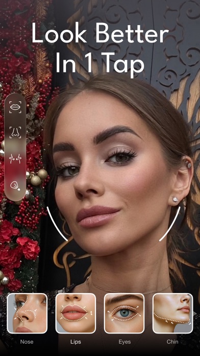
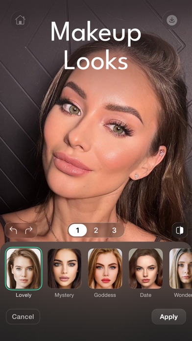
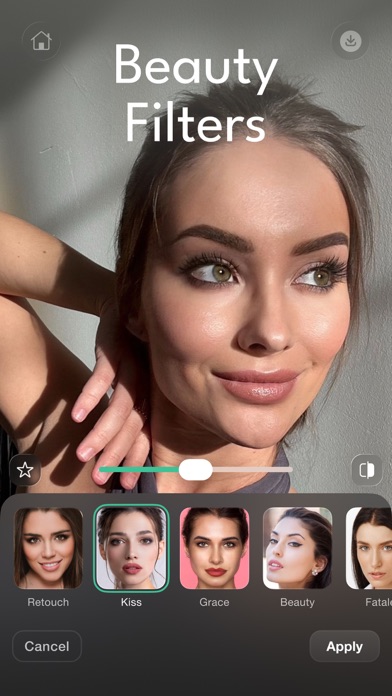
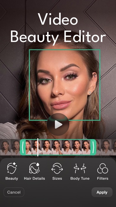

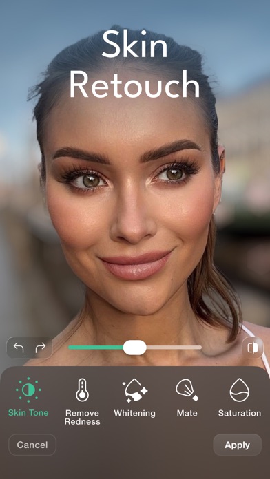

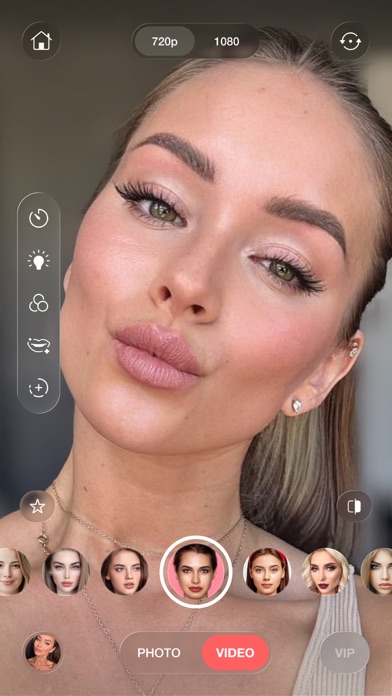
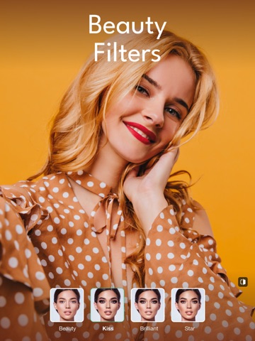
iPad screenshots




Icon palette
About this app
Овладей своим образом с Persona - профессиональной бьюти-камерой и редактором, созданным для совершенства. Умный ИИ и мощные инструменты позволяют легко получать безупречные фото и видео — в режиме реального времени или при редактировании. ОСНОВНЫЕ ФУНКЦИИ: • Фильтры для лица: Выбирай из десятков фильтров для сглаживания кожи, придания сияния или естественного улучшения внешности - одним нажатием, для фото и видео. • Изменение прически: Увеличь объем или быстро измени стиль — работает с любым кадром. • Коррекция тела: Подкорректируй фигуру для естественного и четкого результата — в фото и видео. • Улучшение кожи: Сделай легкий загар, выровняй текстуру или убери блеск одним касанием. • Параметры редактирования: Настраивай яркость, контрастность и резкость как профессионал — для фото и видео. • Коррекция черт лица: Легко подправляй глаза, нос, губы или линию подбородка в любое время. • …
App details
What you can learn from Persona: Beauty Camera
Every shipping app on the App Store has gone through the same decisions you're working through right now: which screenshot goes first, what caption sits over it, which device frame to show, what color the background should be. The 19 screenshots above are Persona: Beauty Camera's answers to those questions — they're public, they're real, and they made it through Apple's review.
What the numbers say: Persona: Beauty Camera runs a dark set where the background shifts from screenshot to screenshot (first shot #040404) — each image has to stand on its own, so the captions carry more of the story. The accent colour we picked up, #CC947C, is the one to reuse for badges, arrows and highlighted words if you borrow this look. Hit Use this style to open the editor with these exact colours and drop your own screenshot in.
Notice the first screenshot in particular. It's the one users see in search results and on the product page, and it's where most apps spend their best caption and tightest design. Look at the proportion of background to phone, where the text sits, what one thing the image is trying to communicate.
Want to see how other Photo & Video apps approach the same problem? Browse more Photo & Video apps in the showcase.
Take what works into your own screenshots
Open LaunchShots and design your App Store & Google Play screenshots — pick a device frame, drop captions, ship in minutes. Free, in your browser.
Open the screenshot editor →Apps with a similar look
Closest background + accent colours among the listings we've analysed — useful when you want to see the same palette handled by a different team.