Chart position — tracked daily by LaunchShots
Screenshot style breakdown
Sampled from 6 of HD Status: Без размытия's App Store screenshots — background, accent and theme, measured by LaunchShots (not something Apple publishes).
#F4F4EC bg
#D6D6CF
#EC3474 accent
#111111 text
Reading the caption text from the screenshots in your browser…
Screenshots



Icon palette
About this app
Ваш статус должен выглядеть так же хорошо, как момент, который вы запечатлели. Каждое фото и видео, которое вы публикуете в статус, по пути сжимается заново. Видео размывается, текст теряет чёткость, цвета тускнеют, а небо покрывается полосами. HD Status помогает этого избежать. КАК ЭТО РАБОТАЕТ 1. Выберите фото или видео в HD Status. 2. Обрежьте его, кадрируйте и при желании добавьте подпись. 3. Оно приходит в ваш собственный чат в полном качестве. Перешлите его оттуда в статус — и качество сохранится. ЧТО ВЫ ПОЛУЧАЕТЕ • Полное качество: фото до 2048 px и видео до 1080p, без искусственного увеличения и без пережатия по пути. • Обрезка видео: оставьте самое главное. Чем короче ролик, тем больше в нём деталей. • Кадрирование для статуса: квадрат, 4:5 или полноэкранный 9:16. • Подписи: напишите один раз — и подпись отправится вместе с фото или видео. • Правильный HDR: HDR-записи с iPho…
App details
What you can learn from HD Status: Без размытия
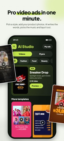
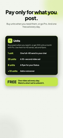
Every shipping app on the App Store has gone through the same decisions you're working through right now: which screenshot goes first, what caption sits over it, which device frame to show, what color the background should be. The 9 screenshots above are HD Status: Без размытия's answers to those questions — they're public, they're real, and they made it through Apple's review.
What the numbers say: HD Status: Без размытия runs a mixed light-and-dark set where the background shifts from screenshot to screenshot (first shot #F4F4EC) — each image has to stand on its own, so the captions carry more of the story. The accent colour we picked up, #EC3474, is the one to reuse for badges, arrows and highlighted words if you borrow this look. Hit Use this style to open the editor with these exact colours and drop your own screenshot in.
Notice the first screenshot in particular. It's the one users see in search results and on the product page, and it's where most apps spend their best caption and tightest design. Look at the proportion of background to phone, where the text sits, what one thing the image is trying to communicate.
Want to see how other Photo & Video apps approach the same problem? Browse more Photo & Video apps in the showcase.
Take what works into your own screenshots
Open LaunchShots and design your App Store & Google Play screenshots — pick a device frame, drop captions, ship in minutes. Free, in your browser.
Open the screenshot editor →Apps with a similar look
Closest background + accent colours among the listings we've analysed — useful when you want to see the same palette handled by a different team.