Screenshot changes — detected by LaunchShots
Screenshot style breakdown
Sampled from 6 of أذكار بلس - Athkar Plus's App Store screenshots — background, accent and theme, measured by LaunchShots (not something Apple publishes).
#FCFCFC bg
#DDDDDD
#3494DC accent
#111111 text
Reading the caption text from the screenshots in your browser…
Screenshots
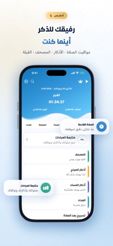


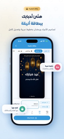


iPad screenshots


Icon palette
About this app
أذكار بلس: رفيقك للذكر أينما كنت الأذكار والأدعية أذكار الصباح والمساء بصوت مشاري العفاسي وأحمد النفيس، مع فضل كل ذكر ومصدره. أذكار النوم والاستيقاظ والوضوء وبعد الصلاة. أدعية المواقف اليومية وأدعية السفر. قسم خاص بيوم الجمعة وسننه. مفضلة تحفظ فيها أذكارك المختارة. الصلاة مواقيت صلاة دقيقة حسب موقعك، مع عدّ تنازلي للصلاة القادمة. إشعارات الأذان وأوقات الإقامة. منتصف الليل والثلث الأخير لقيام الليل. اتجاه القبلة. المساجد القريبة منك. تسبيح بعد كل صلاة. القرآن الكريم مصحف كامل بالرسم العثماني. فهرس للسور والأجزاء والأحزاب. ختمة يومية تتابع فيها وردك حتى الختم. آية كل يوم بتلاوة خاشعة وخلفيات هادئة، ويمكنك مشاركتها. العبادات المسبحة: حبّات تسحبها بإصبعك، مع أهداف وإحصائيات يومية. متابعة العبادات: الصلوات والأذكار والقرآن والنوافل يوماً بيوم. دليل الحج والعمرة خطوة بخطوة، بالصور والأدعية الموثّقة. أدوات إضافية بطاقات معايدة للأعياد ورمضان، بخطوط عربية وتعديل كامل. محوّل التاريخ بين ال…
App details
What you can learn from أذكار بلس - Athkar Plus
Every shipping app on the App Store has gone through the same decisions you're working through right now: which screenshot goes first, what caption sits over it, which device frame to show, what color the background should be. The 20 screenshots above are أذكار بلس - Athkar Plus's answers to those questions — they're public, they're real, and they made it through Apple's review.
What the numbers say: أذكار بلس - Athkar Plus runs a light set with one background colour (#FCFCFC) carried across every screenshot — the listing reads as a single poster when the shots sit side by side in search results. The accent colour we picked up, #3494DC, is the one to reuse for badges, arrows and highlighted words if you borrow this look. Hit Use this style to open the editor with these exact colours and drop your own screenshot in.
Notice the first screenshot in particular. It's the one users see in search results and on the product page, and it's where most apps spend their best caption and tightest design. Look at the proportion of background to phone, where the text sits, what one thing the image is trying to communicate.
Want to see how other Reference apps approach the same problem? Browse more Reference apps in the showcase.
Take what works into your own screenshots
Open LaunchShots and design your App Store & Google Play screenshots — pick a device frame, drop captions, ship in minutes. Free, in your browser.
Open the screenshot editor →Apps with a similar look
Closest background + accent colours among the listings we've analysed — useful when you want to see the same palette handled by a different team.