Chart position — tracked daily by LaunchShots
Screenshot style breakdown
Sampled from 6 of Игры для детей Буквы Цифры 1С's App Store screenshots — background, accent and theme, measured by LaunchShots (not something Apple publishes).
#FCBC2C bg
#DDA526
#CC249C accent
#111111 text
Screenshots


iPad screenshots


Icon palette
About this app
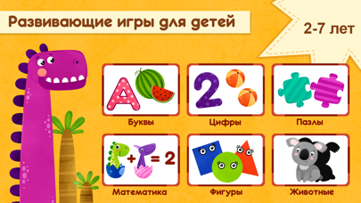
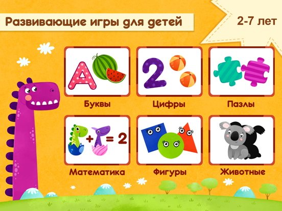
Развивающие игры для детей разработаны для дошкольного обучения в возрасте 2–7 лет и понравятся мальчикам и девочкам. Веселые и интересные задания учим буквы, звуки, цифры, азбука. Детские игры для малышей содержат пазлы, логические задания на память и внимание, овощи и фрукты, дикие и домашние животные. Для дошкольного обучения важен игровой подход, который мы и применили в своем приложении. Проходи весь букварь, алфавит, осваивай счет, тренируй память и внимание и получай в награду динозавров. Учим буквы, цифры, собираем пазлы и играем с динозаврами. Система наград делает обучающий процесс более увлекательным, ребенок радуется каждой награде и учится с удовольствием. Все развивашки с динозавриками доступны бесплатно и без рекламы. Игры для малышей – это развивашки для 2-4 лет в детском телефоне, которые в игровой форме разовьют творчество, память, внимание, научат решать логи…
App details
What you can learn from Игры для детей Буквы Цифры 1С
Every shipping app on the App Store has gone through the same decisions you're working through right now: which screenshot goes first, what caption sits over it, which device frame to show, what color the background should be. The 16 screenshots above are Игры для детей Буквы Цифры 1С's answers to those questions — they're public, they're real, and they made it through Apple's review.
What the numbers say: Игры для детей Буквы Цифры 1С runs a light set where the background shifts from screenshot to screenshot (first shot #FCBC2C) — each image has to stand on its own, so the captions carry more of the story. The accent colour we picked up, #CC249C, is the one to reuse for badges, arrows and highlighted words if you borrow this look. Hit Use this style to open the editor with these exact colours and drop your own screenshot in.
Notice the first screenshot in particular. It's the one users see in search results and on the product page, and it's where most apps spend their best caption and tightest design. Look at the proportion of background to phone, where the text sits, what one thing the image is trying to communicate.
Want to see how other Education apps approach the same problem? Browse more Education apps in the showcase.
Take what works into your own screenshots
Open LaunchShots and design your App Store & Google Play screenshots — pick a device frame, drop captions, ship in minutes. Free, in your browser.
Open the screenshot editor →Apps with a similar look
Closest background + accent colours among the listings we've analysed — useful when you want to see the same palette handled by a different team.