Chart position — tracked daily by LaunchShots
Screenshot style breakdown
Sampled from 6 of 画像文字入れアプリ's App Store screenshots — background, accent and theme, measured by LaunchShots (not something Apple publishes).
#FCAC3C bg
#DD9734
#AC7C34 accent
#111111 text
Screenshots
iPad screenshots
Icon palette
About this app
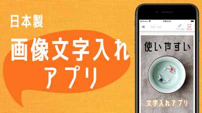
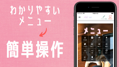
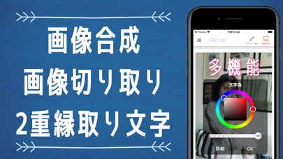
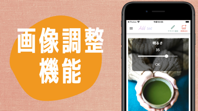
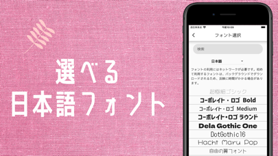
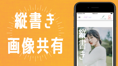
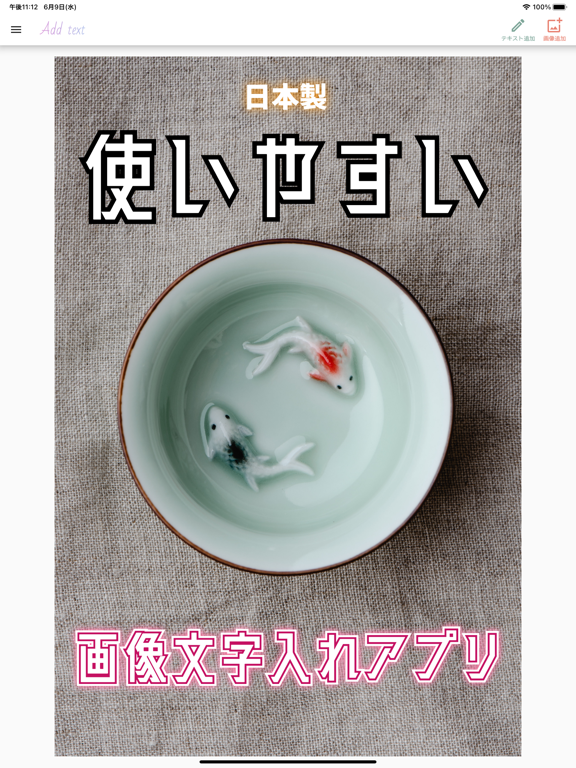
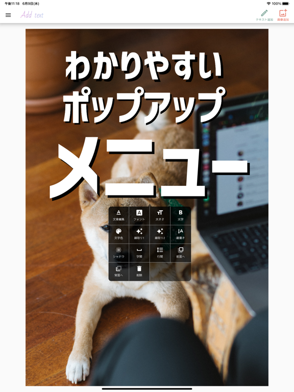
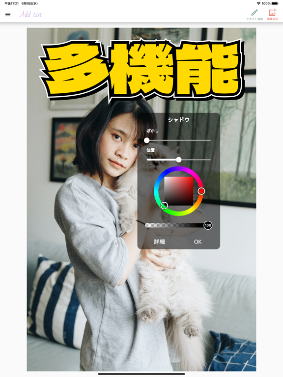
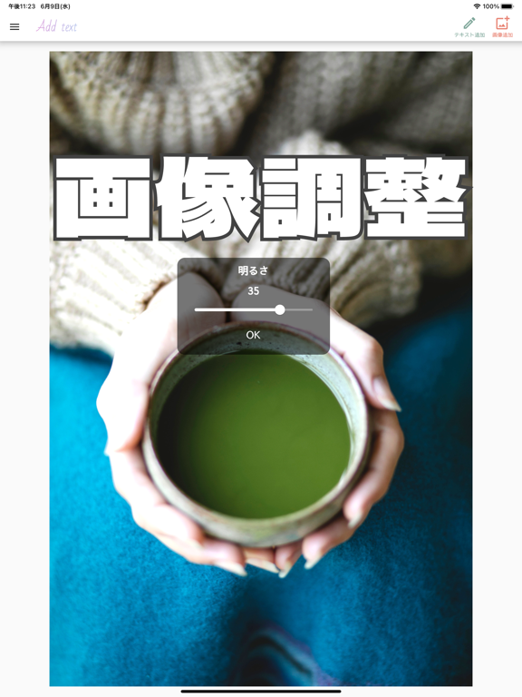
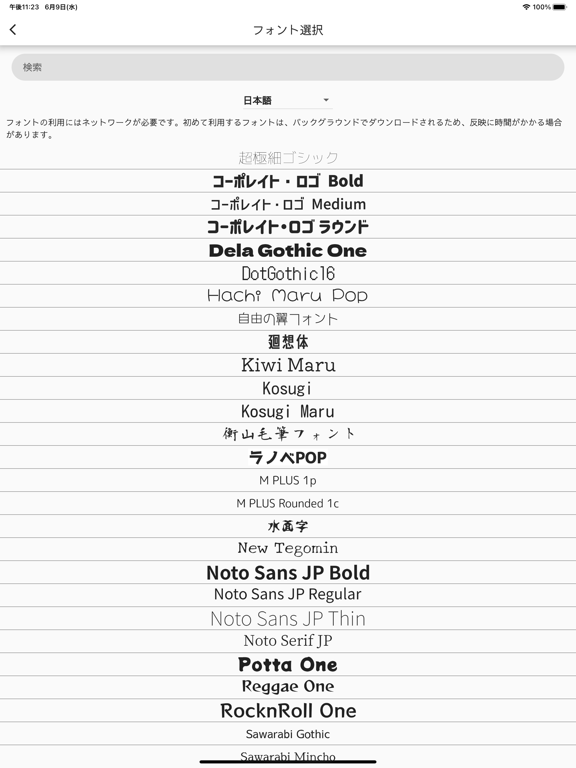
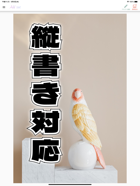
特徴: - 日本製アプリ - 900種類以上のフォント - 日本語フォントも多数収録 - 縦書き - 2重縁取り文字 - 位置合わせガイド機能 - グラデーション - PNG, JPG, GIF形式での保存に対応 - 画像素材検索機能 - 画像切り取り - 画像合成 - 明るさ調整 - コントラスト調整 - 彩度調整 - わかりやすいポップアップメニュー - 透過 - テキストシャドウ - 字間や行間の調整 - 図形の描画 - 回転 - コピー - 元に戻す、やり直す機能 - フォントファイルの追加 - プロジェクトの履歴自動保存 - プロジェクトの共有 - 画像フィルター 簡単に使えて多機能、使いやすい画像文字入れアプリの決定版! ・多数のフォントを収録 900以上のフォントがあり、日本語のフォントも多数収録しています。またWebからダウンロードしてきたフォントを、このアプリで読み込むことができます。 ・文字を自由にカスタマイズできる 縦書きや2重のアウトラインの挿入にも対応!グラデーションやシャドウを使って文字を自由に装飾することができます。テキストの配置ガイド機能を使ってテキスト…
App details
What you can learn from 画像文字入れアプリ
Every shipping app on the App Store has gone through the same decisions you're working through right now: which screenshot goes first, what caption sits over it, which device frame to show, what color the background should be. The 12 screenshots above are 画像文字入れアプリ's answers to those questions — they're public, they're real, and they made it through Apple's review.
What the numbers say: 画像文字入れアプリ runs a mixed light-and-dark set where the background shifts from screenshot to screenshot (first shot #FCAC3C) — each image has to stand on its own, so the captions carry more of the story. The accent colour we picked up, #AC7C34, is the one to reuse for badges, arrows and highlighted words if you borrow this look. Hit Use this style to open the editor with these exact colours and drop your own screenshot in.
Notice the first screenshot in particular. It's the one users see in search results and on the product page, and it's where most apps spend their best caption and tightest design. Look at the proportion of background to phone, where the text sits, what one thing the image is trying to communicate.
Want to see how other Graphics & Design apps approach the same problem? Browse more Graphics & Design apps in the showcase.
Take what works into your own screenshots
Open LaunchShots and design your App Store & Google Play screenshots — pick a device frame, drop captions, ship in minutes. Free, in your browser.
Open the screenshot editor →Apps with a similar look
Closest background + accent colours among the listings we've analysed — useful when you want to see the same palette handled by a different team.