Chart position — tracked daily by LaunchShots
Screenshot style breakdown
Sampled from 6 of Avis Türkiye - Araç Kiralama's App Store screenshots — background, accent and theme, measured by LaunchShots (not something Apple publishes).
#AC0C24 bg
#B72E42
#BC6C74 accent
#FFFFFF text
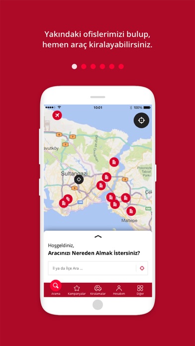
- #1Yakindaki ofislerimizi bulup, hemen arag kiralayabilirsiniz.
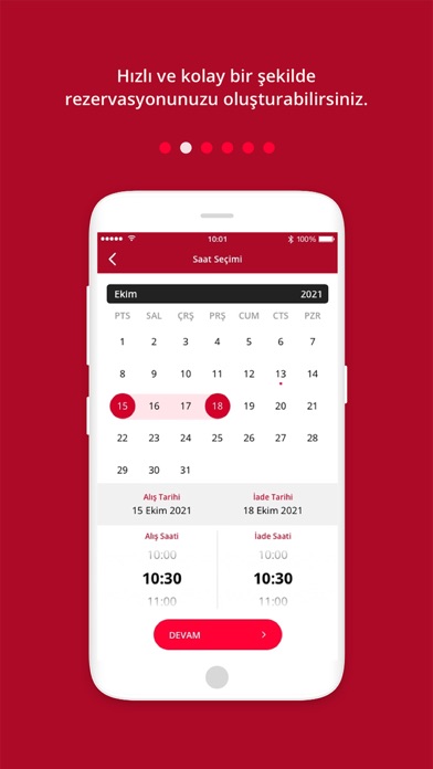
- #2Hızlı ve kolay bir şekilde rezervasyonunuzu oluşturabilirsiniz.
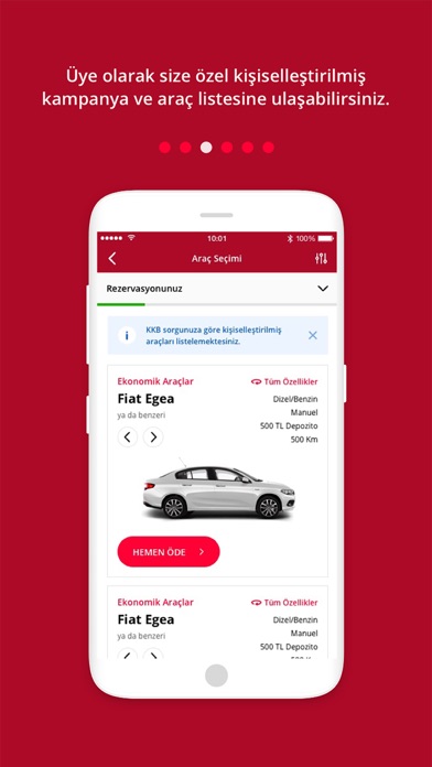
- #3Üye olarak size özel kisisellestirilmis kampanya ve arag listesine ulasabilirsiniz.
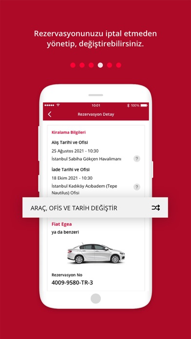
- #4Rezervasyonunuzu iptal etmeden yönetip, degistirebilirsiniz.
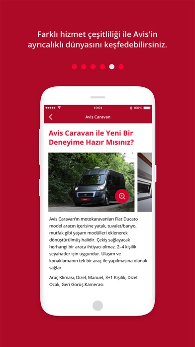
- #5Farklı hizmet çeşitliliği ile Avis'in ayrıcalıklı dünyasını keşfedebilirsiniz.
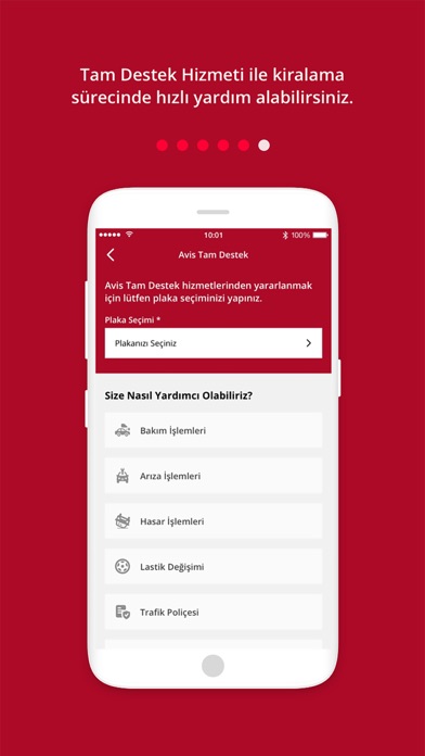
- #6Tam Destek Hizmeti ile kiralama sürecinde hızlı yardım alabilirsiniz.
Captions read from the screenshots (OCR, may contain small errors): 6 headlines, 7.5 words on average (longest 10).
Screenshots
Icon palette
About this app
Türkiye'nin ilk ve lider araç kiralama markası Avis, şimdi cebinizde! 1974'ten bu yana Türkiye'nin öncü araç kiralama şirketi olan Avis; en yaygın araç kiralama ağı, en geniş araç filosu ve EMEA bölgesinde 11 kez üst üste kazandığı müşteri memnuniyeti birinciliğiyle 50 yıldır yanınızda. NEDEN AVİS TÜRKİYE? - 1974'ten bu yana Türkiye'nin lider araç kiralama markası - EMEA bölgesinde 11 kez üst üste müşteri memnuniyeti birincisi - ABG Group'tan 4 kez "Yılın Lisansiyesi" ödülü - Türkiye, Yunanistan, Kazakistan, Azerbaycan ve Kuzey Irak'ta 100+ ofis - Dünya genelinde 5.000'den fazla lokasyon - En geniş araç filosu: ekonomikten lükse, SUV'dan karavana - Otokoç Otomotiv güvencesiyle 1928'den bu yana hizmet KÜRESEL GÜÇ, YEREL ÖNCÜ 1946'da Warren Avis tarafından kurulan Avis, bugün dünyanın en büyük araç kiralama markalarından biri. Türkiye'de ise sektörün kurucu markası — araç kira…
App details
What you can learn from Avis Türkiye - Araç Kiralama
Every shipping app on the App Store has gone through the same decisions you're working through right now: which screenshot goes first, what caption sits over it, which device frame to show, what color the background should be. The 6 screenshots above are Avis Türkiye - Araç Kiralama's answers to those questions — they're public, they're real, and they made it through Apple's review.
What the numbers say: Avis Türkiye - Araç Kiralama runs a dark set with one background colour (#AC0C24) carried across every screenshot — the listing reads as a single poster when the shots sit side by side in search results. The accent colour we picked up, #BC6C74, is the one to reuse for badges, arrows and highlighted words if you borrow this look. Hit Use this style to open the editor with these exact colours and drop your own screenshot in.
Notice the first screenshot in particular. It's the one users see in search results and on the product page, and it's where most apps spend their best caption and tightest design. Look at the proportion of background to phone, where the text sits, what one thing the image is trying to communicate.
Want to see how other Travel apps approach the same problem? Browse more Travel apps in the showcase.
Take what works into your own screenshots
Open LaunchShots and design your App Store & Google Play screenshots — pick a device frame, drop captions, ship in minutes. Free, in your browser.
Open the screenshot editor →Apps with a similar look
Closest background + accent colours among the listings we've analysed — useful when you want to see the same palette handled by a different team.