Chart position — tracked daily by LaunchShots
Screenshot style breakdown
Sampled from 6 of 3D Mobil's App Store screenshots — background, accent and theme, measured by LaunchShots (not something Apple publishes).
#340404 bg
#502727
#940404 accent
#FFFFFF text
Screenshots


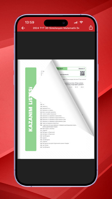


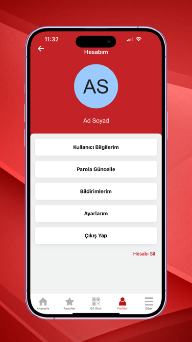
iPad screenshots


Icon palette
About this app
3D Mobil Uygulama, öğrencilere özel olarak geliştirilmiş, dijital eğitim deneyimini zenginleştiren yenilikçi bir platformdur. Video Çözümler Kitap içerisinde yer alan QR kodları, ilgili sorunun detaylı video çözümüne kolayca ulaşmanızı sağlar. Zorlandığınız veya anlamadığınız bir sorunun çözümünü anında izleyebilirsiniz. Bildirim Hizmeti Türkiye Geneli deneme tarihleri, yeni kitap duyuruları, kampanyalar hakkında anlık bildirimlerle bilgilendirilirsiniz. Eğitim gündemini yakından takip edin, hiçbir fırsatı kaçırmayın. Koyu Tema Uzun süreli kullanımda göz yorgunluğunu azaltmak için geliştirilmiş koyu tema seçeneği ile uygulamayı dilediğiniz gibi kişiselleştirebilirsiniz. Modern ve şık bir arayüz ile sade ama güçlü bir kullanıcı deneyimi sunar. Kitap Tanıtımları ve Örnek Sayfalar Yeni bir kaynak almak isteyen kullanıcılar için kitapların detaylı açıklamaları ve örnek sayfaları sunulur…
App details
What you can learn from 3D Mobil
Every shipping app on the App Store has gone through the same decisions you're working through right now: which screenshot goes first, what caption sits over it, which device frame to show, what color the background should be. The 18 screenshots above are 3D Mobil's answers to those questions — they're public, they're real, and they made it through Apple's review.
What the numbers say: 3D Mobil runs a mixed light-and-dark set where the background shifts from screenshot to screenshot (first shot #340404) — each image has to stand on its own, so the captions carry more of the story. The accent colour we picked up, #940404, is the one to reuse for badges, arrows and highlighted words if you borrow this look. Hit Use this style to open the editor with these exact colours and drop your own screenshot in.
Notice the first screenshot in particular. It's the one users see in search results and on the product page, and it's where most apps spend their best caption and tightest design. Look at the proportion of background to phone, where the text sits, what one thing the image is trying to communicate.
Want to see how other Education apps approach the same problem? Browse more Education apps in the showcase.
Take what works into your own screenshots
Open LaunchShots and design your App Store & Google Play screenshots — pick a device frame, drop captions, ship in minutes. Free, in your browser.
Open the screenshot editor →Apps with a similar look
Closest background + accent colours among the listings we've analysed — useful when you want to see the same palette handled by a different team.