Chart position — tracked daily by LaunchShots
Screenshot style breakdown
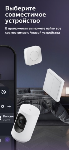
Sampled from 6 of Дом с Алисой's App Store screenshots — background, accent and theme, measured by LaunchShots (not something Apple publishes).
#2C243C bg
#494257
#7C4CFC accent
#FFFFFF text
Screenshots



Icon palette
About this app
Дом с Алисой — приложение, в котором удобно настраивать умный дом и управлять им даже в дороге. Подключайте лампочки, пылесосы, датчики и тысячи других устройств — и контролируйте их здесь или через колонку. • ВСЁ В ОДНОМ ПРИЛОЖЕНИИ Добавляйте и удаляйте самые разные устройства, от колонок с Алисой до кондиционеров, меняйте названия и расположение — и настраивайте, как вам нравится. • УДАЛЁННОЕ УПРАВЛЕНИЕ Дом под контролем, даже если вы далеко: скажем, по дороге на дачу можно заранее включить обогреватель. • ОДНА КОМАНДА ДЛЯ ВСЕГО Запускайте нескольких устройств одной фразой — например, «Алиса, скоро буду дома». Настройте сценарий, и по этой команде включится кондиционер, пылесос начнёт уборку, а в коридоре зажжётся свет. • ДОМ, КОТОРЫЙ САМ О ВАС ЗАБОТИТСЯ Подключайте датчики — к примеру, температуры и влажности, — и проверяйте, как дела дома. Создайте сценарий, добавьте обогревател…
App details
What you can learn from Дом с Алисой
Every shipping app on the App Store has gone through the same decisions you're working through right now: which screenshot goes first, what caption sits over it, which device frame to show, what color the background should be. The 6 screenshots above are Дом с Алисой's answers to those questions — they're public, they're real, and they made it through Apple's review.
What the numbers say: Дом с Алисой runs a dark set where the background shifts from screenshot to screenshot (first shot #2C243C) — each image has to stand on its own, so the captions carry more of the story. The accent colour we picked up, #7C4CFC, is the one to reuse for badges, arrows and highlighted words if you borrow this look. Hit Use this style to open the editor with these exact colours and drop your own screenshot in.
Notice the first screenshot in particular. It's the one users see in search results and on the product page, and it's where most apps spend their best caption and tightest design. Look at the proportion of background to phone, where the text sits, what one thing the image is trying to communicate.
Want to see how other Lifestyle apps approach the same problem? Browse more Lifestyle apps in the showcase.
Take what works into your own screenshots
Open LaunchShots and design your App Store & Google Play screenshots — pick a device frame, drop captions, ship in minutes. Free, in your browser.
Open the screenshot editor →Apps with a similar look
Closest background + accent colours among the listings we've analysed — useful when you want to see the same palette handled by a different team.