Chart position — tracked daily by LaunchShots
Screenshot style breakdown
Sampled from 5 of Kimberly's App Store screenshots — background, accent and theme, measured by LaunchShots (not something Apple publishes).
#2474BC bg
#4287C5
#FC7C44 accent
#FFFFFF text
Screenshots
Icon palette
About this app
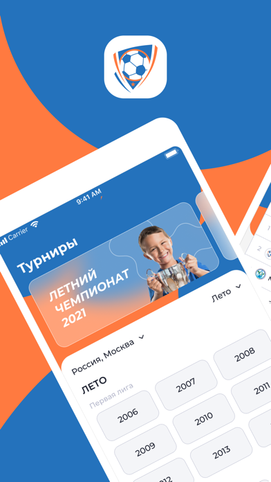
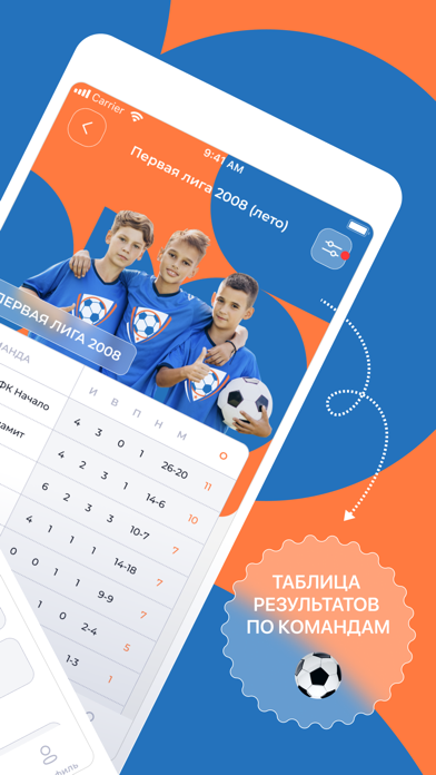
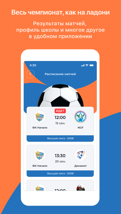
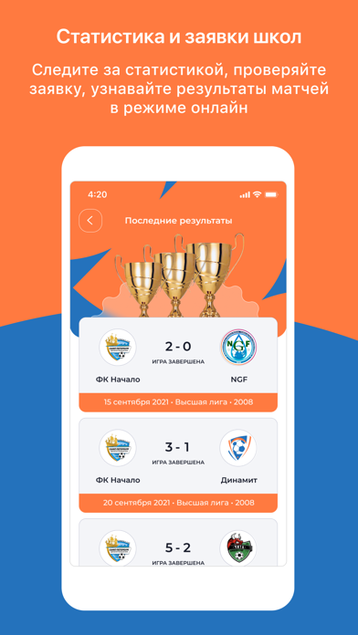
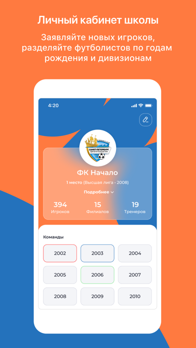
Приложение “Kimberly” – это футбольный дом для участников детской футбольной лиги. Теперь вы можете отслеживать статистику чемпионата, рейтинг, расписание в одном месте. Профиль школы и заявка Благодаря приложению, все школы и футболисты будут полностью оцифрованы. Заходите и проверяйте расписание матчей вашей школы, следите за таблицами, отслеживайте мгновенные результаты Бомбардиры В течении матча судья регистрирует голы прямо во время матча. Что позволит формировать таблицу бомбардиров, которую все так долго ждали. Заявка Вы можете проверять игроков команды онлайн. Школы добавляют игроков с фотографиями и годом рождения. Школам Приложение “Kimberly-Cup” может стать средством маркетинга для школ. Делитесь вашими результатами благодаря нашему удобному интерфейсу. Репостите статистику в Instagram и другие социальные сети. Используйте описание о своей школе и ссылки на соц. сети…
App details
What you can learn from Kimberly
Every shipping app on the App Store has gone through the same decisions you're working through right now: which screenshot goes first, what caption sits over it, which device frame to show, what color the background should be. The 5 screenshots above are Kimberly's answers to those questions — they're public, they're real, and they made it through Apple's review.
What the numbers say: Kimberly runs a mixed light-and-dark set where the background shifts from screenshot to screenshot (first shot #2474BC) — each image has to stand on its own, so the captions carry more of the story. The accent colour we picked up, #FC7C44, is the one to reuse for badges, arrows and highlighted words if you borrow this look. Hit Use this style to open the editor with these exact colours and drop your own screenshot in.
Notice the first screenshot in particular. It's the one users see in search results and on the product page, and it's where most apps spend their best caption and tightest design. Look at the proportion of background to phone, where the text sits, what one thing the image is trying to communicate.
Want to see how other Sports apps approach the same problem? Browse more Sports apps in the showcase.
Take what works into your own screenshots
Open LaunchShots and design your App Store & Google Play screenshots — pick a device frame, drop captions, ship in minutes. Free, in your browser.
Open the screenshot editor →Apps with a similar look
Closest background + accent colours among the listings we've analysed — useful when you want to see the same palette handled by a different team.