Screenshot style breakdown
Sampled from 6 of 2人でできるゲーム - マルチプレイ 対戦ゲーム's App Store screenshots — background, accent and theme, measured by LaunchShots (not something Apple publishes).
#242424 bg
#424242
#ECE47C accent
#FFFFFF text
Screenshots


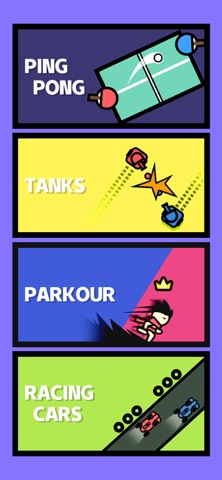
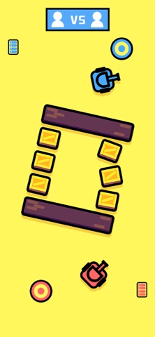
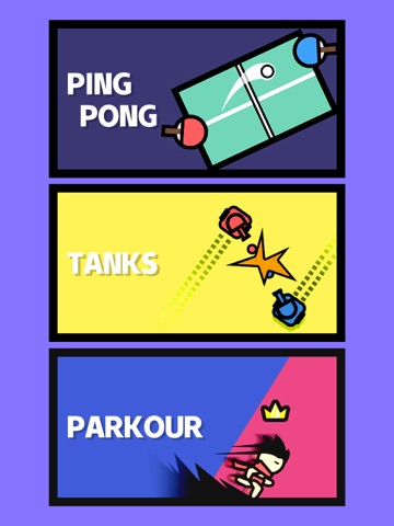
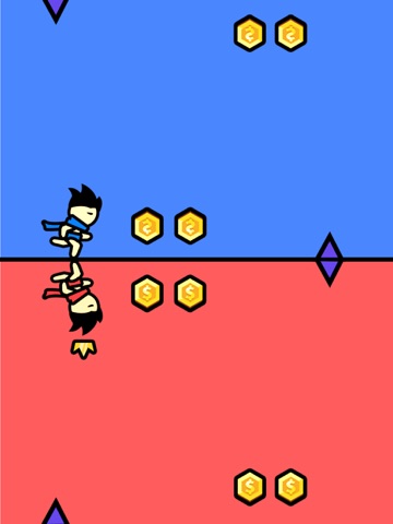
iPad screenshots




Icon palette
About this app
あなたとあなたの友達、どっちが得意? これは多人数同時プレイのゲームで、あなたの反応をテストするため、指を使う様々なミニゲームを用意しております。リアルタイムで2人の挑戦を完了し、最もエキサイティングな指勝負を楽しむことができます! ゲーム紹介 -卓球、指を使用してラケットを移動させ、ボールを打ちます。先に11点取った方が勝ちです! -タンク大戦、タップして点火して、ボタン長押しで前進、相手のタンクを破壊してタンクスターを勝ち取りましょう! -パルクール、タップして重力の方向を変え、キャラクターを操作してより多くのコインを集めて勝利しましょう! -レーシング、指を動かして車を運転して、対戦相手と競い合い、1位を目指します。 スピードの限界に挑戦し、レースの楽しさを味わいましょう!パーティーのホットスポットには欠かせないミニゲーム、あなたの指で制覇して!
App details
What you can learn from 2人でできるゲーム - マルチプレイ 対戦ゲーム
Every shipping app on the App Store has gone through the same decisions you're working through right now: which screenshot goes first, what caption sits over it, which device frame to show, what color the background should be. The 14 screenshots above are 2人でできるゲーム - マルチプレイ 対戦ゲーム's answers to those questions — they're public, they're real, and they made it through Apple's review.
What the numbers say: 2人でできるゲーム - マルチプレイ 対戦ゲーム runs a mixed light-and-dark set where the background shifts from screenshot to screenshot (first shot #242424) — each image has to stand on its own, so the captions carry more of the story. The accent colour we picked up, #ECE47C, is the one to reuse for badges, arrows and highlighted words if you borrow this look. Hit Use this style to open the editor with these exact colours and drop your own screenshot in.
Notice the first screenshot in particular. It's the one users see in search results and on the product page, and it's where most apps spend their best caption and tightest design. Look at the proportion of background to phone, where the text sits, what one thing the image is trying to communicate.
Want to see how other Games apps approach the same problem? Browse more Games apps in the showcase.
Take what works into your own screenshots
Open LaunchShots and design your App Store & Google Play screenshots — pick a device frame, drop captions, ship in minutes. Free, in your browser.
Open the screenshot editor →Apps with a similar look
Closest background + accent colours among the listings we've analysed — useful when you want to see the same palette handled by a different team.