Chart position — tracked daily by LaunchShots
Screenshot changes — detected by LaunchShots
Screenshot style breakdown
Sampled from 3 of ChildRoo's App Store screenshots — background, accent and theme, measured by LaunchShots (not something Apple publishes).
#FCFCFC bg
#DDDDDD
#145CDC accent
#111111 text
Screenshots


iPad screenshots


Icon palette
About this app
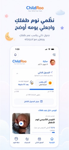
صمم تطبيق تشايلدرو خبراء واستشاريي نوم الأطفال للأمهات ليساعد على تنظيم نوم أطفالهن سواء نهارًأ بتنظيم القيلولات أو ليلًا بالتدريج بالإضافة إلى المساعدة على تنظيم وتقليل الرضعات والنوم في سرير منفصل عن الوالدين للوصول إلى نوم عميق وصحي. تدريب نوم الأطفال الرضع تشايلدرو هو أول تطبيق عربي يساعد الأمهات على تنظيم ساعات نوم الأطفال الرضع بشكل علمي وآمن من خلال طرق ناجحة وتدريجية بدون الإعتماد على أساليب سريعة تزيد من بكاء الرضع. مناسب للأطفال من سن 0 وحتى 3 سنوات لدينا برامج متنوعة لتنظيم النوم بالتدريج وتقليل الرضعات لتناسب عمر طفلك وشخصيته وظروف بيتك أي أنك ستحصلين على خطة مخصصة تلائمك تمامًا وتلائم طفلك. جدول يومي تفاعلي فقط بإدخال موعد استيقاظ طفلك يوميًا سيساعدك التطبيق على معرفة أفضل الأوقات المناسبة للنوم والأكل واللعب من خلال الجدول الذكي.وبالإضافة لذلك ستجدين قوائم عمل يومية حسب البرنامج الخاص بطفلك. مدربيي واستشاريي نوم معتمدين لدينا مدربيي ومقدمي رعاية للأطفال معتمدين من استر…
App details
What you can learn from ChildRoo
Every shipping app on the App Store has gone through the same decisions you're working through right now: which screenshot goes first, what caption sits over it, which device frame to show, what color the background should be. The 6 screenshots above are ChildRoo's answers to those questions — they're public, they're real, and they made it through Apple's review.
What the numbers say: ChildRoo runs a light set with one background colour (#FCFCFC) carried across every screenshot — the listing reads as a single poster when the shots sit side by side in search results. The accent colour we picked up, #145CDC, is the one to reuse for badges, arrows and highlighted words if you borrow this look. Hit Use this style to open the editor with these exact colours and drop your own screenshot in.
Notice the first screenshot in particular. It's the one users see in search results and on the product page, and it's where most apps spend their best caption and tightest design. Look at the proportion of background to phone, where the text sits, what one thing the image is trying to communicate.
Want to see how other Medical apps approach the same problem? Browse more Medical apps in the showcase.
Take what works into your own screenshots
Open LaunchShots and design your App Store & Google Play screenshots — pick a device frame, drop captions, ship in minutes. Free, in your browser.
Open the screenshot editor →Apps with a similar look
Closest background + accent colours among the listings we've analysed — useful when you want to see the same palette handled by a different team.