Chart position — tracked daily by LaunchShots
Screenshot style breakdown
Sampled from 6 of єТривога: Повітряна Тривога's App Store screenshots — background, accent and theme, measured by LaunchShots (not something Apple publishes).
#242424 bg
#424242
#34CC54 accent
#FFFFFF text
Screenshots




Icon palette
About this app
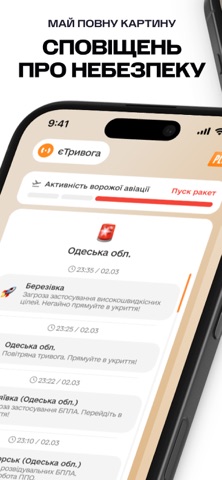
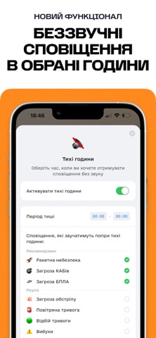
єТривога — це волонтерський додаток, який відправляє на ваш телефон push-сповіщення про загрозу у вибраній вами області або місті України. Ви отримаєте з додатку звуковий сигнал сирени, коли у вашому місті або області буде оголошена повітряна тривога, загроза ракетного удару або ж артобстрілу. Також додаток сповіщає про вибухи та планові вибухові роботи, й також про іншу критично важливу інформацію. У додатку є можливість підписатися на декілька міст або областей одночасно, тому ви зможете тримати руку на пульсі, якщо ваші родичі знаходяться у іншій локації ніж ви. Проєкт функціонує цілодобово завдяки підтримці понад 30 волонтерів, які працюють безоплатно. Ми уважно стежимо за сотнями інформаційних джерел, аби забезпечити оперативне та точне інформування. Усі сповіщення ми надсилаємо власноруч. єТривога — це перша діджиталізована система сповіщення населення про повітряну тривогу, …
App details
What you can learn from єТривога: Повітряна Тривога
Every shipping app on the App Store has gone through the same decisions you're working through right now: which screenshot goes first, what caption sits over it, which device frame to show, what color the background should be. The 6 screenshots above are єТривога: Повітряна Тривога's answers to those questions — they're public, they're real, and they made it through Apple's review.
What the numbers say: єТривога: Повітряна Тривога runs a mixed light-and-dark set where the background shifts from screenshot to screenshot (first shot #242424) — each image has to stand on its own, so the captions carry more of the story. The accent colour we picked up, #34CC54, is the one to reuse for badges, arrows and highlighted words if you borrow this look. Hit Use this style to open the editor with these exact colours and drop your own screenshot in.
Notice the first screenshot in particular. It's the one users see in search results and on the product page, and it's where most apps spend their best caption and tightest design. Look at the proportion of background to phone, where the text sits, what one thing the image is trying to communicate.
Want to see how other News apps approach the same problem? Browse more News apps in the showcase.
Take what works into your own screenshots
Open LaunchShots and design your App Store & Google Play screenshots — pick a device frame, drop captions, ship in minutes. Free, in your browser.
Open the screenshot editor →Apps with a similar look
Closest background + accent colours among the listings we've analysed — useful when you want to see the same palette handled by a different team.