Screenshot style breakdown
Sampled from 5 of YesWork's App Store screenshots — background, accent and theme, measured by LaunchShots (not something Apple publishes).
#F4FCFC bg
#D6DDDD
#24BCCC accent
#111111 text
Reading the caption text from the screenshots in your browser…
Screenshots


Icon palette
About this app
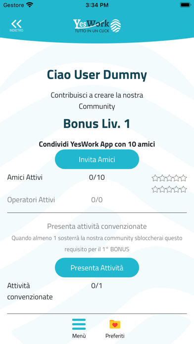
YesWork offre l’incontro tra il cliente e l’operatore occasionale per risolvere i problemi di tutti i giorni, IN TEMPI RAPIDI E PREZZI VANTAGGIOSI. Registrazione gratuita sia come operatore sia come cliente. L’intento di YesWork è digitalizzare il classico biglietto “fai da te” che il lavoratore occasionale utilizza per pubblicizzare la sua disponibilità nei piccoli lavoretti: Hai un rubinetto che perde o un sanitario da cambiare? Devi tinteggiare o decorare una parete? Ti serve una mano per sistemare un garage? Hai appena acquistato un mobiletto, una scrivania e non sai assemblarli? Domani hai un compito a scuola e ti serve un aiuto? Vorresti avere cura del tuo giardino ma non puoi farlo? Hai bisogno di un aiuto per traslocare? Organizzi una cerimonia, un evento e ti serve un fotografo? Vuoi qualcuno che ti dia una mano per i tuoi lavori domestici, preparazione del pranzo …
App details
What you can learn from YesWork
Every shipping app on the App Store has gone through the same decisions you're working through right now: which screenshot goes first, what caption sits over it, which device frame to show, what color the background should be. The 5 screenshots above are YesWork's answers to those questions — they're public, they're real, and they made it through Apple's review.
What the numbers say: YesWork runs a light set with one background colour (#F4FCFC) carried across every screenshot — the listing reads as a single poster when the shots sit side by side in search results. The accent colour we picked up, #24BCCC, is the one to reuse for badges, arrows and highlighted words if you borrow this look. Hit Use this style to open the editor with these exact colours and drop your own screenshot in.
Notice the first screenshot in particular. It's the one users see in search results and on the product page, and it's where most apps spend their best caption and tightest design. Look at the proportion of background to phone, where the text sits, what one thing the image is trying to communicate.
Want to see how other Business apps approach the same problem? Browse more Business apps in the showcase.
Take what works into your own screenshots
Open LaunchShots and design your App Store & Google Play screenshots — pick a device frame, drop captions, ship in minutes. Free, in your browser.
Open the screenshot editor →Apps with a similar look
Closest background + accent colours among the listings we've analysed — useful when you want to see the same palette handled by a different team.