Screenshot style breakdown
Sampled from 5 of Пинго от Где мои дети's App Store screenshots — background, accent and theme, measured by LaunchShots (not something Apple publishes).
#54ACFC bg
#4997DD
#FCD404 accent
#111111 text
Screenshots
Icon palette
About this app
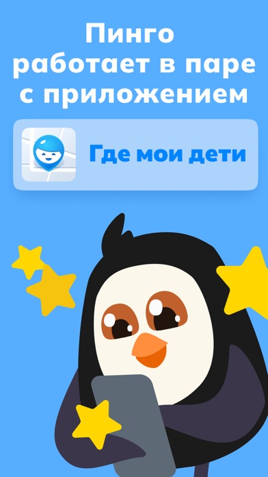
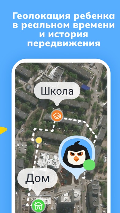
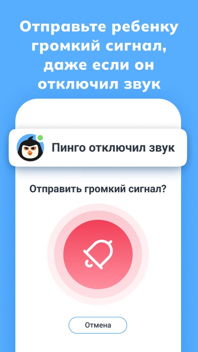
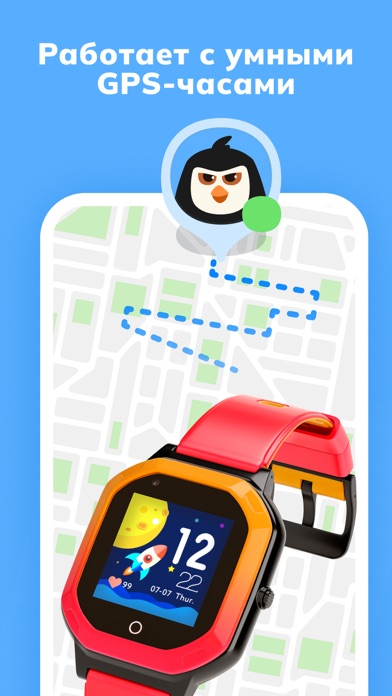
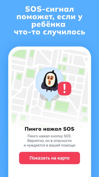
Установите «Пинго» ребёнку, чтобы видеть его на карте и не беспокоиться. «Пинго» работает в паре с родительским приложением «Где мои дети». Настроить просто! Сперва установите «Где мои дети» на свой телефон. Затем «Пинго» на телефон вашего ребёнка. И введите там полученный код из «Где мои дети». Больше не беспокойтесь, где ваш ребёнок! ОСНОВНЫЕ ФУНКЦИИ: • Местоположение и маршрут ребёнка Просматривайте текущее местоположение и список посещенных ребёнком мест в течение дня. • Уведомления о передвижениях Добавляйте места (школа, дом, секция и т. д.) и получайте уведомления, когда ребёнок приходит или уходит из них. • SOS-сигнал В чрезвычайной ситуации и в случае опасности ребёнок сможет оповестить вас, нажав кнопку SOS. • Обход беззвучного режима Отправляйте громкий сигнал, который слышно, даже если телефон в режиме без звука или в рюкзаке. • Контроль заряда батареи Получайте сооб…
App details
What you can learn from Пинго от Где мои дети
Every shipping app on the App Store has gone through the same decisions you're working through right now: which screenshot goes first, what caption sits over it, which device frame to show, what color the background should be. The 5 screenshots above are Пинго от Где мои дети's answers to those questions — they're public, they're real, and they made it through Apple's review.
What the numbers say: Пинго от Где мои дети runs a light set with one background colour (#54ACFC) carried across every screenshot — the listing reads as a single poster when the shots sit side by side in search results. The accent colour we picked up, #FCD404, is the one to reuse for badges, arrows and highlighted words if you borrow this look. Hit Use this style to open the editor with these exact colours and drop your own screenshot in.
Notice the first screenshot in particular. It's the one users see in search results and on the product page, and it's where most apps spend their best caption and tightest design. Look at the proportion of background to phone, where the text sits, what one thing the image is trying to communicate.
Want to see how other Lifestyle apps approach the same problem? Browse more Lifestyle apps in the showcase.
Take what works into your own screenshots
Open LaunchShots and design your App Store & Google Play screenshots — pick a device frame, drop captions, ship in minutes. Free, in your browser.
Open the screenshot editor →Apps with a similar look
Closest background + accent colours among the listings we've analysed — useful when you want to see the same palette handled by a different team.