Chart position — tracked daily by LaunchShots
Screenshot changes — detected by LaunchShots
Screenshot style breakdown
Sampled from 6 of 凯格尔运动-定制训练计划's App Store screenshots — background, accent and theme, measured by LaunchShots (not something Apple publishes).
#B4D4EC bg
#9EBACF
#B4846C accent
#111111 text
Screenshots
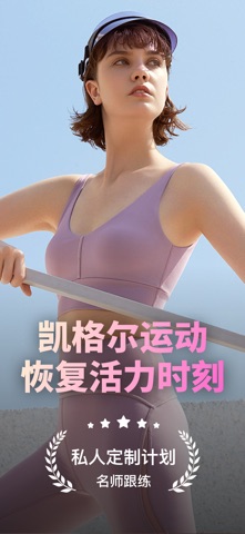
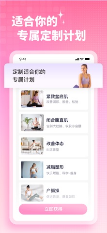


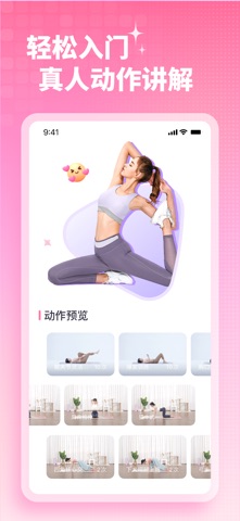
Icon palette
About this app
凯格尔运动市场介绍 凯格尔运动是一款盆底肌(PC肌)运动跟练APP,是你的口袋盆底肌训练助手,让你可以随时随地开启运动课程,查看产后功能食谱,让我们陪你一起变好,(坚持)运动。 应用特色: 【专属计划】 你不仅是一个瑜伽者。我们针对不同的人群,设计了不同的训练计划。产褥期到理想修复期,都有对应的真人计划跟练。 【真人跟练】 真人视频演示,详细的锻炼动作讲解,让你轻松学会如何进行正确的运动 【新手视频教程】 收集了大家关心的呼吸、发力技巧等训练问题,用视频的方式演示教学,在这里你能找到所有训练问题的答案 【定时提醒】 自由设定提醒时间,还支持懒人自动提醒,在早、中、晚唤醒你,将训练进行到底 【每日记录】 填写个人数据,准确计算BMI,36条产后修复计划,全方位辅助你的产褥期。 体重:每天记录体重变化,上传照片可以更直观地感受到不一样的自己。 腹直肌:用正确的方式测量腹直肌分离,并判断腹直肌分离类型,给你正确有效的修复方式。 三维记录:腰围、大腿围、小腿围、臀围、胸围、手臂围......全方位记录你的身材数据!…
App details
What you can learn from 凯格尔运动-定制训练计划
Every shipping app on the App Store has gone through the same decisions you're working through right now: which screenshot goes first, what caption sits over it, which device frame to show, what color the background should be. The 6 screenshots above are 凯格尔运动-定制训练计划's answers to those questions — they're public, they're real, and they made it through Apple's review.
What the numbers say: 凯格尔运动-定制训练计划 runs a light set where the background shifts from screenshot to screenshot (first shot #B4D4EC) — each image has to stand on its own, so the captions carry more of the story. The accent colour we picked up, #B4846C, is the one to reuse for badges, arrows and highlighted words if you borrow this look. Hit Use this style to open the editor with these exact colours and drop your own screenshot in.
Notice the first screenshot in particular. It's the one users see in search results and on the product page, and it's where most apps spend their best caption and tightest design. Look at the proportion of background to phone, where the text sits, what one thing the image is trying to communicate.
Want to see how other Health & Fitness apps approach the same problem? Browse more Health & Fitness apps in the showcase.
Take what works into your own screenshots
Open LaunchShots and design your App Store & Google Play screenshots — pick a device frame, drop captions, ship in minutes. Free, in your browser.
Open the screenshot editor →Apps with a similar look
Closest background + accent colours among the listings we've analysed — useful when you want to see the same palette handled by a different team.