Chart position — tracked daily by LaunchShots
Screenshot style breakdown
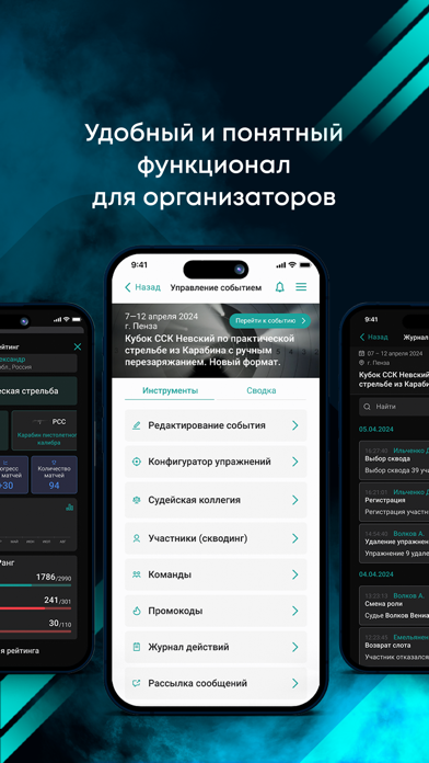
Sampled from 6 of Atlima's App Store screenshots — background, accent and theme, measured by LaunchShots (not something Apple publishes).
#04141C bg
#27343B
#044C64 accent
#FFFFFF text
Screenshots




iPad screenshots


Icon palette
About this app
Чем полезно! Ты можешь найти мероприятия по выбранному виду спорта, зарегистрироваться, взаимодействовать с организаторами. Слоты! В твоём профиле Atlima собрана информация обо всех твоих регистрациях на соревнования и не только. Рейтинги! Рассчитывается информативный рейтинг спортсмена, отображается официальная спортивная, инструкторская или судейская квалификация. А также другие функции! Реализованы в дружественном интерфейсе современного мобильного приложения с привязкой банковских карт и другими удобными опциями. Организаторам Atlima предоставляет регистрационный сервис под ключ. Вы размещаете информацию о своих событиях в системе, указываете в удобном интерфейсе параметры стоимости участия, настройки промокодов и прочие детали, и мероприятие попадает в календарь событий и рекомендации для спортсменов. Участники приобретают слоты, могут осуществлять с ними некоторые операции,…
App details
What you can learn from Atlima
Every shipping app on the App Store has gone through the same decisions you're working through right now: which screenshot goes first, what caption sits over it, which device frame to show, what color the background should be. The 20 screenshots above are Atlima's answers to those questions — they're public, they're real, and they made it through Apple's review.
What the numbers say: Atlima runs a dark set with one background colour (#04141C) carried across every screenshot — the listing reads as a single poster when the shots sit side by side in search results. The accent colour we picked up, #044C64, is the one to reuse for badges, arrows and highlighted words if you borrow this look. Hit Use this style to open the editor with these exact colours and drop your own screenshot in.
Notice the first screenshot in particular. It's the one users see in search results and on the product page, and it's where most apps spend their best caption and tightest design. Look at the proportion of background to phone, where the text sits, what one thing the image is trying to communicate.
Want to see how other Sports apps approach the same problem? Browse more Sports apps in the showcase.
Take what works into your own screenshots
Open LaunchShots and design your App Store & Google Play screenshots — pick a device frame, drop captions, ship in minutes. Free, in your browser.
Open the screenshot editor →Apps with a similar look
Closest background + accent colours among the listings we've analysed — useful when you want to see the same palette handled by a different team.