Screenshot style breakdown
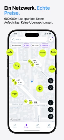
Sampled from 5 of Cariqa - Elektroauto laden's App Store screenshots — background, accent and theme, measured by LaunchShots (not something Apple publishes).
#F4F4F4 bg
#D6D6D6
#7CB4EC accent
#111111 text
- #1128 sessions 12249 = Charging Reduced CO2
- #3Added Range Estimated Price © Prices v
- #4Trip overview © ® © Da © 2stops 6h42m 594km 48.5€
Captions read from the screenshots (OCR, may contain small errors): 3 headlines, 8.3 words on average (longest 11).
Screenshots



Icon palette
About this app
Laden, das einfach, fair und für Fahrende gemacht ist. Cariqa verbindet dich direkt mit Ladestationsbetreibern und sorgt für klare, verlässliche Informationen bei jedem Ladevorgang. Keine Reseller, keine Aufschläge, keine Überraschungen - einfach ein unkompliziertes Ladeerlebnis. Denn Laden sollte nicht kompliziert sein. Wichtige Vorteile: Echte Preise, keine Aufschläge. Sieh schon vor dem Einstecken, was du zahlst – mit direkten Betreiberpreisen. Keine Zwischenhändler, keine Überraschungen. Intelligente Routenplanung Plane Fahrten, die sich quasi selbst laden. Cariqa fügt automatisch passende Ladestopps hinzu und zeigt kompatible Stationen, Live-Verfügbarkeit und immer die schnellste Route. Nahtloses Laden Starte Ladevorgänge über die App oder mit unsere ChargeCard, eine praktische Tap-to-Charge-Option für alle, die lieber eine physische Karte nutzen. Leistungsübersicht Behalte den Z…
App details
What you can learn from Cariqa - Elektroauto laden
Every shipping app on the App Store has gone through the same decisions you're working through right now: which screenshot goes first, what caption sits over it, which device frame to show, what color the background should be. The 5 screenshots above are Cariqa - Elektroauto laden's answers to those questions — they're public, they're real, and they made it through Apple's review.
What the numbers say: Cariqa - Elektroauto laden runs a light set with one background colour (#F4F4F4) carried across every screenshot — the listing reads as a single poster when the shots sit side by side in search results. The accent colour we picked up, #7CB4EC, is the one to reuse for badges, arrows and highlighted words if you borrow this look. Hit Use this style to open the editor with these exact colours and drop your own screenshot in.
Notice the first screenshot in particular. It's the one users see in search results and on the product page, and it's where most apps spend their best caption and tightest design. Look at the proportion of background to phone, where the text sits, what one thing the image is trying to communicate.
Want to see how other Navigation apps approach the same problem? Browse more Navigation apps in the showcase.
Take what works into your own screenshots
Open LaunchShots and design your App Store & Google Play screenshots — pick a device frame, drop captions, ship in minutes. Free, in your browser.
Open the screenshot editor →Apps with a similar look
Closest background + accent colours among the listings we've analysed — useful when you want to see the same palette handled by a different team.