Chart position — tracked daily by LaunchShots
Screenshot style breakdown
Sampled from 6 of 饥饿鲨:世界's App Store screenshots — background, accent and theme, measured by LaunchShots (not something Apple publishes).
#04548C bg
#276B9C
#4C441C accent
#FFFFFF text
Screenshots
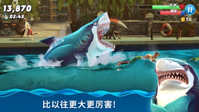
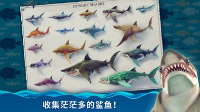

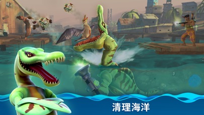


iPad screenshots


Icon palette
About this app
想活命就得吃!席卷海洋中各式各样的生物、从可以吞下的小鱼和小鸟,到美味的鲸鱼,甚至是毫无防备的人类! 【深渊魔鲨,伤害爆炸】 -来自深海的魔化鲨鱼自带恐怖的超能力,竟能轻易驾驭各种元素? -深渊鲨加入PVP活动,跟鲨鱼爱好者一起竞争,赢得巨额奖励吧! 【超多福利,诚意满满】 -全新喷溅通行证上线,每天参与各种趣味活动,白拿无数福利! -升级通行证,获取珍稀套装,限量装备,高额返利和独家奖励。 【天外飞鲨,奇异宠物】 -外表凶恶的全新变异级鲨鱼加入战场,听说TA是刷分利器哦~ -奇形怪状的呆萌宠物悉数登场,特殊能力帮助鲨鱼大闹整片海洋! 【全新鲨鱼,强势入侵】 -赛博朋克风已然吹到了海洋之中,机甲鲨吉拉等你来操控! -憨憨蠢蠢的“玩具鲨”外形和能力都很弱,但却又无限潜能,快帮TA变强吧! 特性: + 充满地域特色的开放式世界 + 超过百种各式各样的生物 + 彰显个性的自定义造型 + 丰富的游戏模式和任务挑战 + 超酷的鲨鱼道具和狩猎宠物
App details
What you can learn from 饥饿鲨:世界
Every shipping app on the App Store has gone through the same decisions you're working through right now: which screenshot goes first, what caption sits over it, which device frame to show, what color the background should be. The 12 screenshots above are 饥饿鲨:世界's answers to those questions — they're public, they're real, and they made it through Apple's review.
What the numbers say: 饥饿鲨:世界 runs a mixed light-and-dark set where the background shifts from screenshot to screenshot (first shot #04548C) — each image has to stand on its own, so the captions carry more of the story. The accent colour we picked up, #4C441C, is the one to reuse for badges, arrows and highlighted words if you borrow this look. Hit Use this style to open the editor with these exact colours and drop your own screenshot in.
Notice the first screenshot in particular. It's the one users see in search results and on the product page, and it's where most apps spend their best caption and tightest design. Look at the proportion of background to phone, where the text sits, what one thing the image is trying to communicate.
Want to see how other Games apps approach the same problem? Browse more Games apps in the showcase.
Take what works into your own screenshots
Open LaunchShots and design your App Store & Google Play screenshots — pick a device frame, drop captions, ship in minutes. Free, in your browser.
Open the screenshot editor →Apps with a similar look
Closest background + accent colours among the listings we've analysed — useful when you want to see the same palette handled by a different team.