Chart position — tracked daily by LaunchShots
Screenshot style breakdown
Sampled from 6 of e METRO's App Store screenshots — background, accent and theme, measured by LaunchShots (not something Apple publishes).
#1C2484 bg
#3B4295
#7474B4 accent
#FFFFFF text
Screenshots




Icon palette
About this app
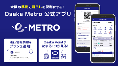
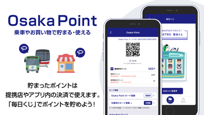
大阪の移動と暮らしを便利にするアプリ。Osaka Metroは都市型MaaS構想「e METRO」を掲げ、様々なサービスを交通と組み合わせることで新たな価値を創出し、大阪のまちづくりへ貢献します。 【アプリの主な機能】 ■地下鉄運行情報 Osaka Metroの遅延情報をプッシュ通知にてお届けし、遅延発生区間を路線図上で確認いただけます。また遅延証明書の発行や、過去一週間の運行情報履歴も確認いただけます。 ■MY駅・MYバス停 よく利用する駅やバス停を登録すると、直近の発車時刻や列車走行位置、路線バス接近情報などをホーム画面から簡単にご確認いただけます。列車走行位置では各車両がどこを走っているかがリアルタイムで分かるだけでなく、御堂筋線や中央線では車両内の混雑状況など、様々な情報を見える化しております。 ■モバイルチケット QRや顔認証で地下鉄に乗れるチケットをはじめ、オンデマンドバスでは1日乗車券や1カ月定期券、路線バスやシェアサイクルとセットになったチケットを販売中です。時期によって販売するチケットは異なるので是非チェックして…
App details
What you can learn from e METRO
Every shipping app on the App Store has gone through the same decisions you're working through right now: which screenshot goes first, what caption sits over it, which device frame to show, what color the background should be. The 8 screenshots above are e METRO's answers to those questions — they're public, they're real, and they made it through Apple's review.
What the numbers say: e METRO runs a mixed light-and-dark set where the background shifts from screenshot to screenshot (first shot #1C2484) — each image has to stand on its own, so the captions carry more of the story. The accent colour we picked up, #7474B4, is the one to reuse for badges, arrows and highlighted words if you borrow this look. Hit Use this style to open the editor with these exact colours and drop your own screenshot in.
Notice the first screenshot in particular. It's the one users see in search results and on the product page, and it's where most apps spend their best caption and tightest design. Look at the proportion of background to phone, where the text sits, what one thing the image is trying to communicate.
Want to see how other Navigation apps approach the same problem? Browse more Navigation apps in the showcase.
Take what works into your own screenshots
Open LaunchShots and design your App Store & Google Play screenshots — pick a device frame, drop captions, ship in minutes. Free, in your browser.
Open the screenshot editor →Apps with a similar look
Closest background + accent colours among the listings we've analysed — useful when you want to see the same palette handled by a different team.