Chart position — tracked daily by LaunchShots
Screenshot changes — detected by LaunchShots
Screenshot style breakdown
Sampled from 5 of mopla's App Store screenshots — background, accent and theme, measured by LaunchShots (not something Apple publishes).
#141C54 bg
#343B6B
#4C5CA4 accent
#FFFFFF text
- #1Deutschland-Ticket: Einfach buchen, individuell stornieren & kündigen mit
- #2mopla Mobilitétsplattform: Deutschlandticket, myway Fahrten, On-Demand-Verkehr,
- #3Alles in mopla App: Suchen, buchen, alles im Blick zu jeder Zeit.
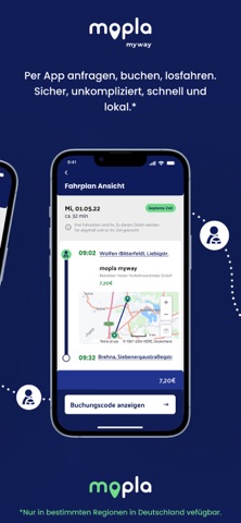
- #4myway Per App anfragen, buchen, losfahren. Sicher, unkompliziert, schnell und
- #5Die Zukunft der Mobilität: Die Mobilitatsplattform, die dich smart durchs Land bewegt.
Captions read from the screenshots (OCR, may contain small errors): 5 headlines, 9.6 words on average (longest 12).
Screenshots



iPad screenshots


Icon palette
About this app
mopla bewegt HOLEN SIE SICH IHR FAIRES DEUTSCHLANDTICKET Einfach. Fair. Flexibel. Das Deutschlandticket ohne langfristige Verträge und Kündigungsklauseln. Unsere praktische Pausetaste (Kündigung mit Wiedereinstieg) lässt Ihr Abo bis zum 10. eines laufenden Monats zum Monatsende mit einem Klick ruhen. So zahlen Sie nur, was Sie wirklich brauchen. DAS FLEXIBLE JOBTICKET Genießen Sie alle Vorteile des mopla Deutschlandtickets auch als Jobticket. Einfach den Account mit dem Arbeitgeber verknüpfen und Ihr Rabatt wird automatisch angewandt. ENTSPANNTER TICKETKAUF OHNE SCHUFA Bezahlen Sie Ihr Deutschlandticket schnell und sicher per Kreditkarte, PayPal, Klarna, Revolut Pay oder SEPA-Lastschriftverfahren (Authentifizierung mit Truelayer): Einfach Zahlungsdaten eingeben und der Betrag wird automatisch abgebucht. Wir sind der festen Überzeugung, dass der ÖPNV für alle zugänglich bleiben mus…
App details
What you can learn from mopla
Every shipping app on the App Store has gone through the same decisions you're working through right now: which screenshot goes first, what caption sits over it, which device frame to show, what color the background should be. The 10 screenshots above are mopla's answers to those questions — they're public, they're real, and they made it through Apple's review.
What the numbers say: mopla runs a dark set with one background colour (#141C54) carried across every screenshot — the listing reads as a single poster when the shots sit side by side in search results. The accent colour we picked up, #4C5CA4, is the one to reuse for badges, arrows and highlighted words if you borrow this look. Hit Use this style to open the editor with these exact colours and drop your own screenshot in.
Notice the first screenshot in particular. It's the one users see in search results and on the product page, and it's where most apps spend their best caption and tightest design. Look at the proportion of background to phone, where the text sits, what one thing the image is trying to communicate.
Want to see how other Travel apps approach the same problem? Browse more Travel apps in the showcase.
Take what works into your own screenshots
Open LaunchShots and design your App Store & Google Play screenshots — pick a device frame, drop captions, ship in minutes. Free, in your browser.
Open the screenshot editor →Apps with a similar look
Closest background + accent colours among the listings we've analysed — useful when you want to see the same palette handled by a different team.