Chart position — tracked daily by LaunchShots
Screenshot changes — detected by LaunchShots
Screenshot style breakdown
Sampled from 6 of Bitkogan — инвестиции просто's App Store screenshots — background, accent and theme, measured by LaunchShots (not something Apple publishes).
#246CDC bg
#4280E0
#1C2C4C accent
#FFFFFF text
Reading the caption text from the screenshots in your browser…
Screenshots



iPad screenshots




Icon palette
About this app
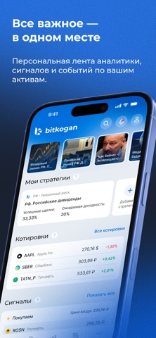
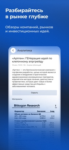
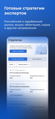
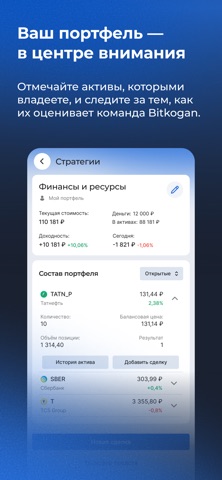
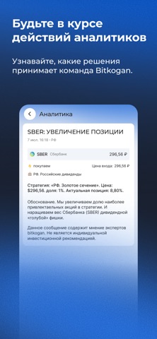
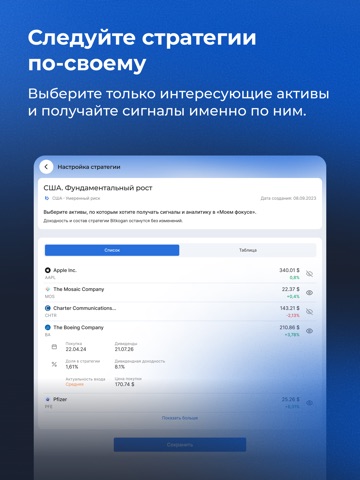
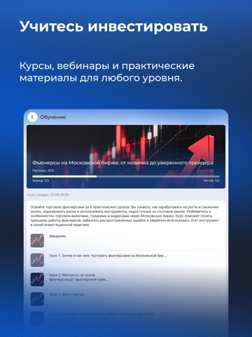
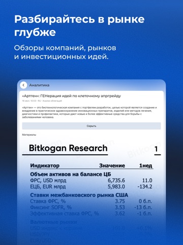
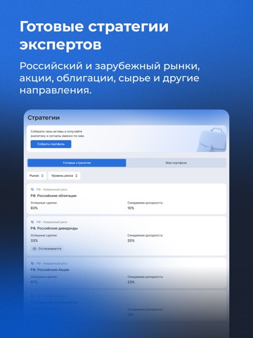
Bitkogan — стратегии и аналитика Все необходимое для самостоятельной работы с фондовым рынком — инвестиционные стратегии, профессиональная аналитика, сделки и собственные портфели в одном приложении. Не теряйтесь в потоке рыночной информации. Bitkogan помогает сфокусироваться на том, что действительно важно: следить за выбранными активами, разбираться в движениях рынка, вовремя принимать решения, которые влияют на инвестпортфель. МОЙ ФОКУС Ваш персональный поток информации о рынке. Выбирайте интересующие активы и стратегии, чтобы быстрее находить связанную с ними аналитику и важные события. МОЙ ПОРТФЕЛЬ Ваши инвестиции — в центре внимания. Выбирайте активы, формируйте портфели и получайте аналитику Bitkogan по интересующим вас компаниям и инструментам. СТРАТЕГИИ Инвестиционные стратегии команды Bitkogan для российского и зарубежных рынков. Изучайте состав и показатели стратегий, от…
App details
What you can learn from Bitkogan — инвестиции просто
Every shipping app on the App Store has gone through the same decisions you're working through right now: which screenshot goes first, what caption sits over it, which device frame to show, what color the background should be. The 16 screenshots above are Bitkogan — инвестиции просто's answers to those questions — they're public, they're real, and they made it through Apple's review.
What the numbers say: Bitkogan — инвестиции просто runs a dark set where the background shifts from screenshot to screenshot (first shot #246CDC) — each image has to stand on its own, so the captions carry more of the story. The accent colour we picked up, #1C2C4C, is the one to reuse for badges, arrows and highlighted words if you borrow this look. Hit Use this style to open the editor with these exact colours and drop your own screenshot in.
Notice the first screenshot in particular. It's the one users see in search results and on the product page, and it's where most apps spend their best caption and tightest design. Look at the proportion of background to phone, where the text sits, what one thing the image is trying to communicate.
Want to see how other News apps approach the same problem? Browse more News apps in the showcase.
Take what works into your own screenshots
Open LaunchShots and design your App Store & Google Play screenshots — pick a device frame, drop captions, ship in minutes. Free, in your browser.
Open the screenshot editor →Apps with a similar look
Closest background + accent colours among the listings we've analysed — useful when you want to see the same palette handled by a different team.