Chart position — tracked daily by LaunchShots
Screenshot style breakdown
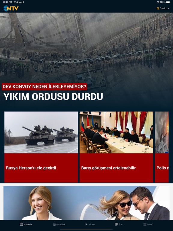
Sampled from 6 of NTV's App Store screenshots — background, accent and theme, measured by LaunchShots (not something Apple publishes).
#041424 bg
#273442
#9C0404 accent
#FFFFFF text
- #1Rusya Herson'un Kiev bombaların Uki merkezini ele gegirdi hedefi oldu sav Haberler Hızlı B
- #2Platform topuk KA ¥ Vi | Kıvanç Tatlıtuğ ile Başak Dizer'in bebeği
- #3PAZARINDAN ÇEKİLDİ USD 14,07 EUR 15,61 %1,36 %0,80
- #4RUSYA TELEVIZYON
- #6b Cesar Ödülleri $ (/ sahiplerini buldu \ 4
Captions read from the screenshots (OCR, may contain small errors): 5 headlines, 9 words on average (longest 14).
Screenshots


iPad screenshots


Icon palette
About this app
Yenilenen NTV uygulamasıyla Türkiye ve dünyadan son dakika haberleri, gündem, ekonomi, teknoloji, sağlık, yaşam, sanat ve eğitim başlıklarını tek yerden takip et. Öne çıkan özellikler: • Son Dakika Bildirimleri: Bildirim izni ver, kritik gelişmeleri anında al. • Canlı Yayın 7/24: NTV canlı yayınını kesintisiz izle; dijitale özel videolu haberler ve NTV programlarının tamamını takip et. • NTV Para: Döviz ve Altın verileri anlık gör. • Benim Sayfam: İlgi alanlarını seç, akışını kişiselleştir. • Okuma Rahatlığı: Ayarlardan haber içi yazı boyutunu ve bildirim tercihlerini dilediğin gibi düzenle. Görüşlerin bizim için değerli. Öneri ve geri bildirimlerini ntv.uygulama@dygdigital.com adresine yazabilirsin. Sizlerden gelen yorumlarla uygulamayı düzenli olarak güncelliyoruz. NTV’ye gösterdiğin ilgi için teşekkürler.
App details
What you can learn from NTV
Every shipping app on the App Store has gone through the same decisions you're working through right now: which screenshot goes first, what caption sits over it, which device frame to show, what color the background should be. The 19 screenshots above are NTV's answers to those questions — they're public, they're real, and they made it through Apple's review.
What the numbers say: NTV runs a mixed light-and-dark set where the background shifts from screenshot to screenshot (first shot #041424) — each image has to stand on its own, so the captions carry more of the story. The accent colour we picked up, #9C0404, is the one to reuse for badges, arrows and highlighted words if you borrow this look. Hit Use this style to open the editor with these exact colours and drop your own screenshot in.
Notice the first screenshot in particular. It's the one users see in search results and on the product page, and it's where most apps spend their best caption and tightest design. Look at the proportion of background to phone, where the text sits, what one thing the image is trying to communicate.
Want to see how other News apps approach the same problem? Browse more News apps in the showcase.
Take what works into your own screenshots
Open LaunchShots and design your App Store & Google Play screenshots — pick a device frame, drop captions, ship in minutes. Free, in your browser.
Open the screenshot editor →Apps with a similar look
Closest background + accent colours among the listings we've analysed — useful when you want to see the same palette handled by a different team.