Chart position — tracked daily by LaunchShots
Screenshot style breakdown
Sampled from 6 of Ensonhaber's App Store screenshots — background, accent and theme, measured by LaunchShots (not something Apple publishes).
#140C0C bg
#342E2E
#BC0C0C accent
#FFFFFF text
Screenshots
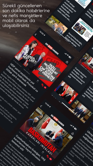
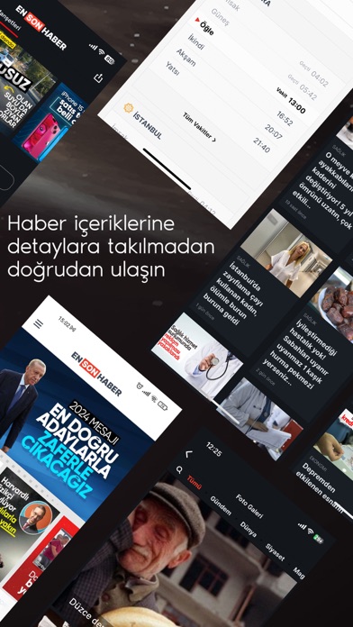
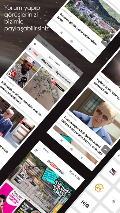
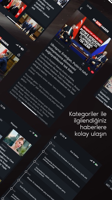
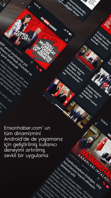
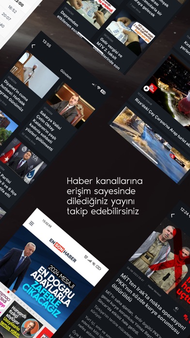
iPad screenshots
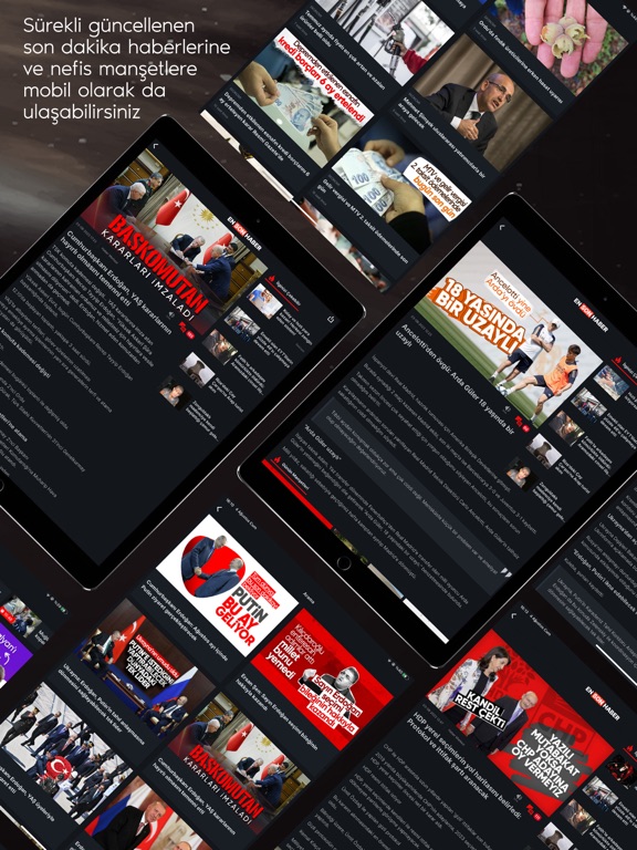
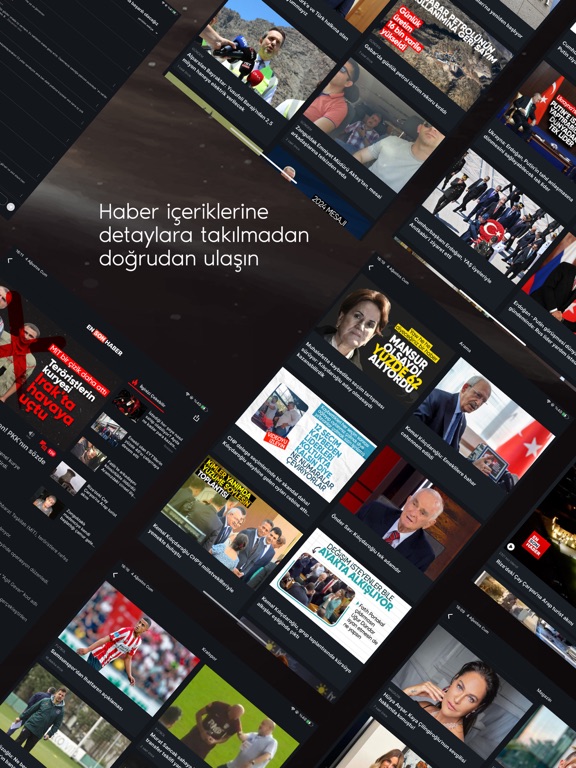

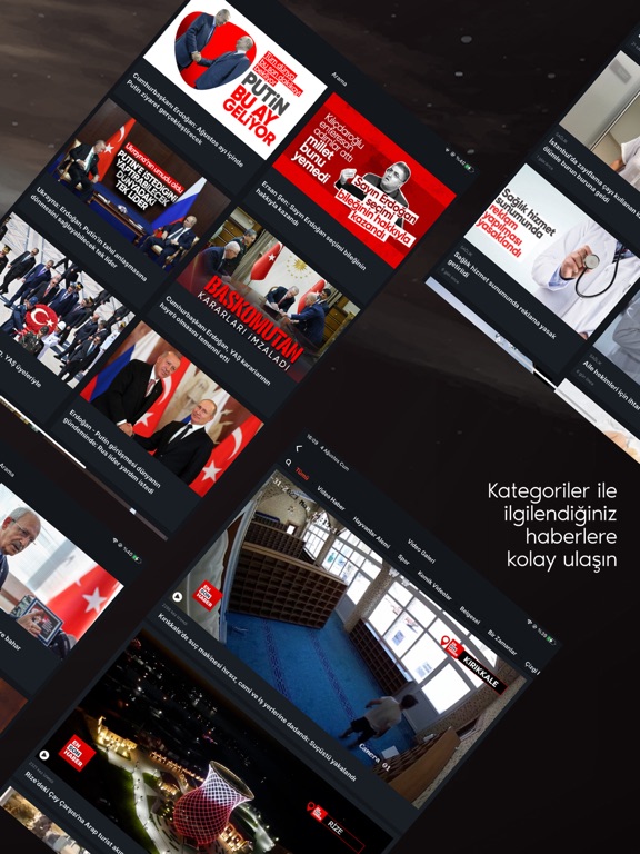
Icon palette
About this app
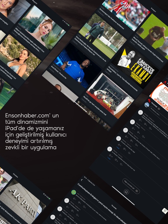
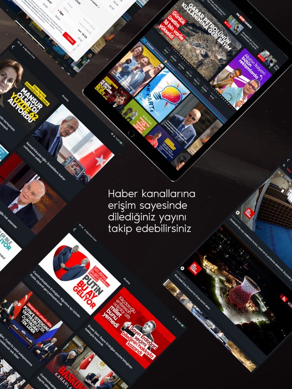
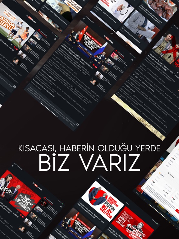
Ensonhaber.com'un tüm dinamizmini Apple ürünlerinde de yaşamanız için geliştirilmiş, kullanıcı deneyimi arttırılmış zevkli bir uygulama. Ensonhaber’i öne çıkaran nefis manşetlere ve sürekli güncellenen son dakika haberlerine mobil olarak da ulaşmanızı sağlayan uygulamada özellikle üyelik sistemi ve haber başlıklarına yorum yapabilme özelliği öne çıkıyor. Yorum yazıp kendi fikirlerinizi ve görüşlerinizi paylaşabileceğiniz sistem aynı zamanda bir çok özelliği de bünyesinde barındırıyor. Ensonhaber’e üye olan kullanıcılar haber başlıklarına yazdıkları yorumları kendi profil sayfalarından görüntüleyebiliyor, böylece beğeni sayısı, yanıtlar, takdirler ve daha fazla etkileşim üzerinde de kontrol sahibi olabiliyor. Doğrulanmış hesaba ait üyeler yorumlarını editör onayına takılmadan paylaşabilir ve aynı zamanda onaylı hesap olduğuna dair kullanıcı adinin yanında mavi bir simge görünür. Haber…
App details
What you can learn from Ensonhaber
Every shipping app on the App Store has gone through the same decisions you're working through right now: which screenshot goes first, what caption sits over it, which device frame to show, what color the background should be. The 16 screenshots above are Ensonhaber's answers to those questions — they're public, they're real, and they made it through Apple's review.
What the numbers say: Ensonhaber runs a mixed light-and-dark set where the background shifts from screenshot to screenshot (first shot #140C0C) — each image has to stand on its own, so the captions carry more of the story. The accent colour we picked up, #BC0C0C, is the one to reuse for badges, arrows and highlighted words if you borrow this look. Hit Use this style to open the editor with these exact colours and drop your own screenshot in.
Notice the first screenshot in particular. It's the one users see in search results and on the product page, and it's where most apps spend their best caption and tightest design. Look at the proportion of background to phone, where the text sits, what one thing the image is trying to communicate.
Want to see how other News apps approach the same problem? Browse more News apps in the showcase.
Take what works into your own screenshots
Open LaunchShots and design your App Store & Google Play screenshots — pick a device frame, drop captions, ship in minutes. Free, in your browser.
Open the screenshot editor →Apps with a similar look
Closest background + accent colours among the listings we've analysed — useful when you want to see the same palette handled by a different team.